
Northern Sentiments
The north of Armenia is a unique place, where high mountain frosty winds, mountain springs and the life-giving rays of the powerful sun meet. Spring is born from this unity, filling the mountain valleys with alpine greenery and multi-scented flowers. The unique nature of the north of Armenia is represented in the branding of the Northern Way project. Through the brand, natural products born in this area are brought to the
world and consumers, which are wrapped in the alpine green that is the basis of the brand, bold turquoise of mountains and highlighted by a visual interpretation of the four-petal oil flower that grows here. By creating the Northern Way brand, we wanted to make those who see it feel as if they were atop a mountain, surrounded by mountain flowers and absorbing the warmth of the brightest rays of the sun.
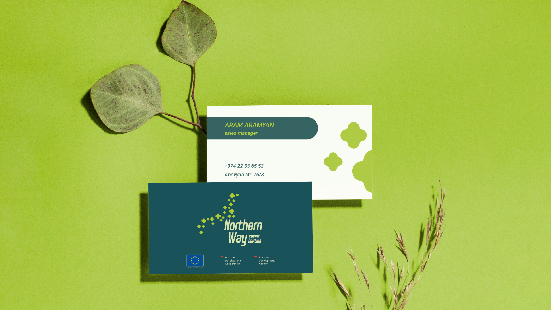
The Logotype
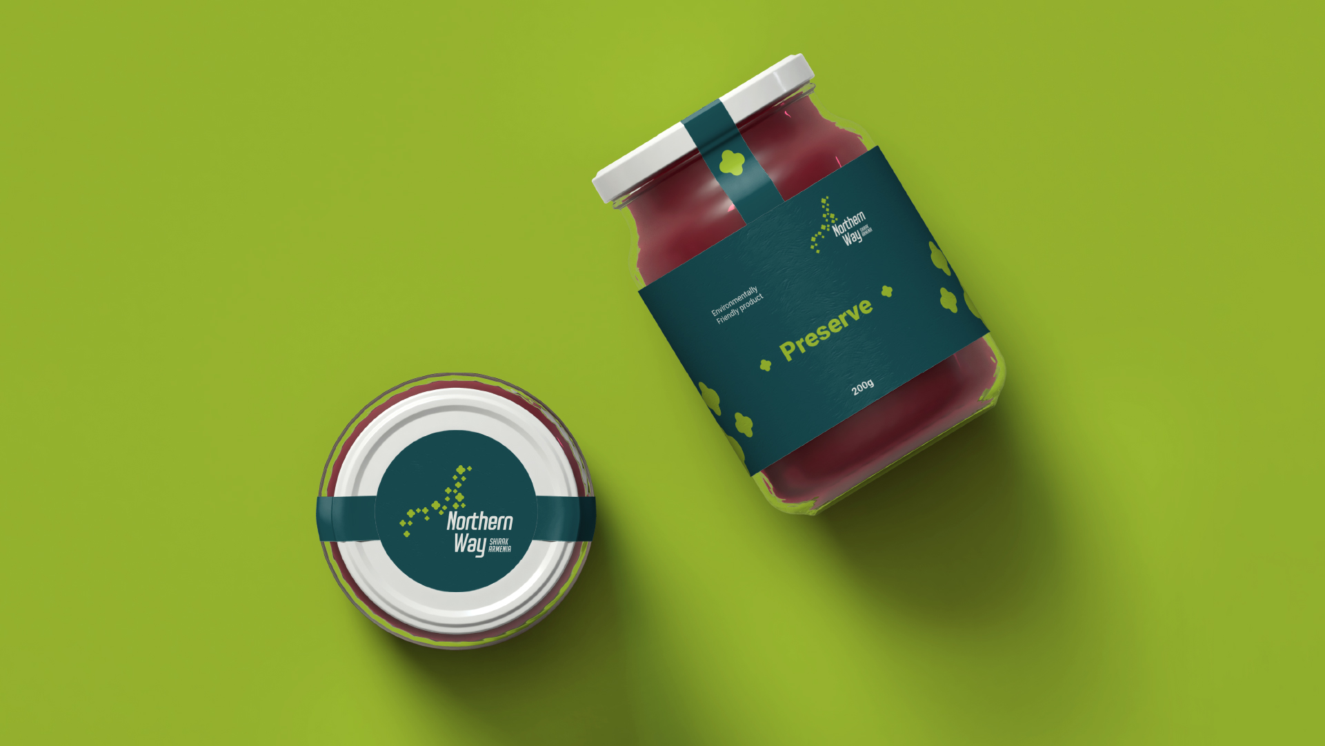
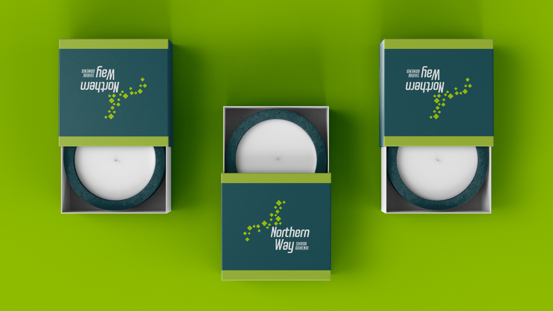
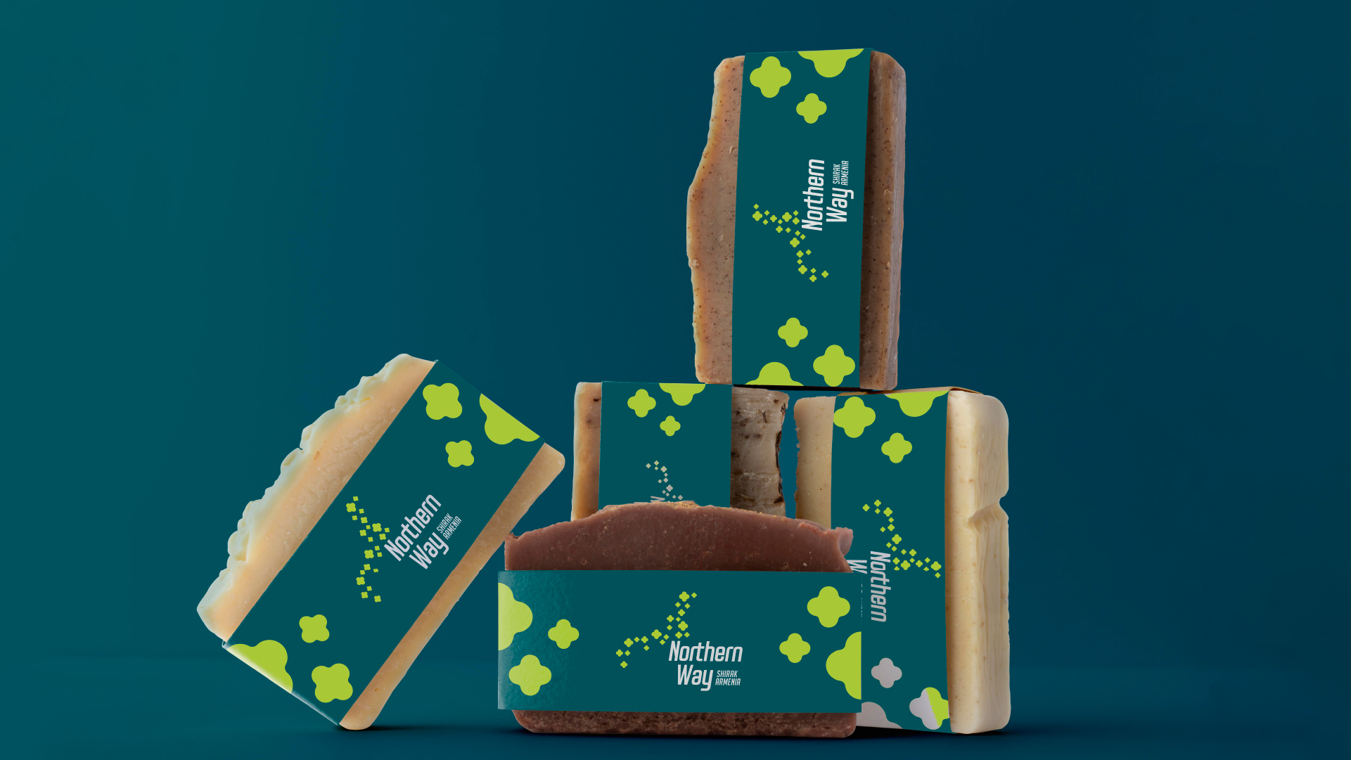
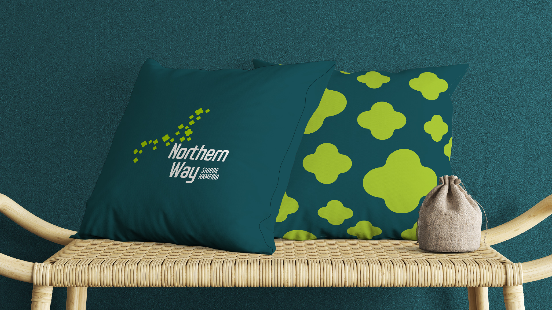
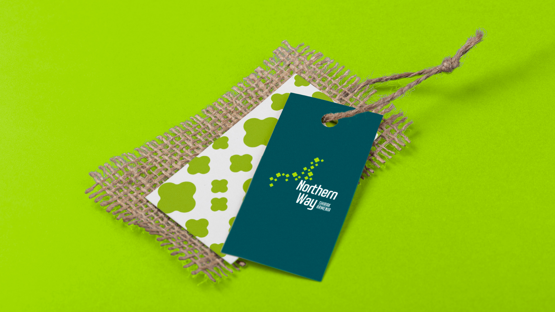
The logo consists of a symbol and a wordmark and is completed with an identificator. The symbol entails a set of different sized graphic images of buttercup flowers that appear to have been blown by the mountain wind. The symbol of the logo also repeats the outline Shirak region border, emphasizing the origin of the brand. The identifier written in capital letters is combine with the wordmark written in italic, elongated font.
The Color style
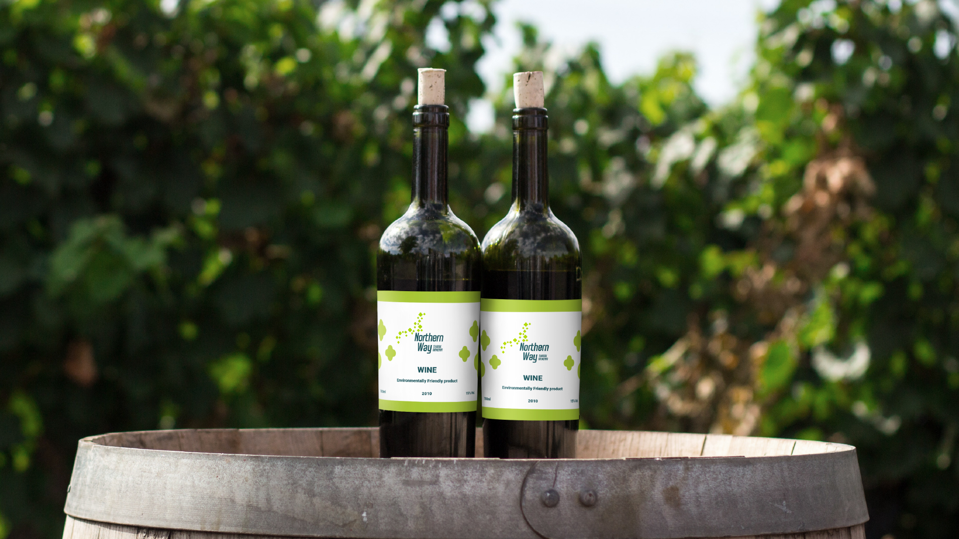
The two key colors of the Northern Way brand are Alpine baby green and bold turquoise. Green symbolizes the freshness of the grass growing here and emphasizes the naturalness of the presented products.
Dark turquoise, best combined with bright green, also symbolizes the high mountains that surround the Shirak region.
This color palette conveys the origins of the products, and speaks the language of the nature.
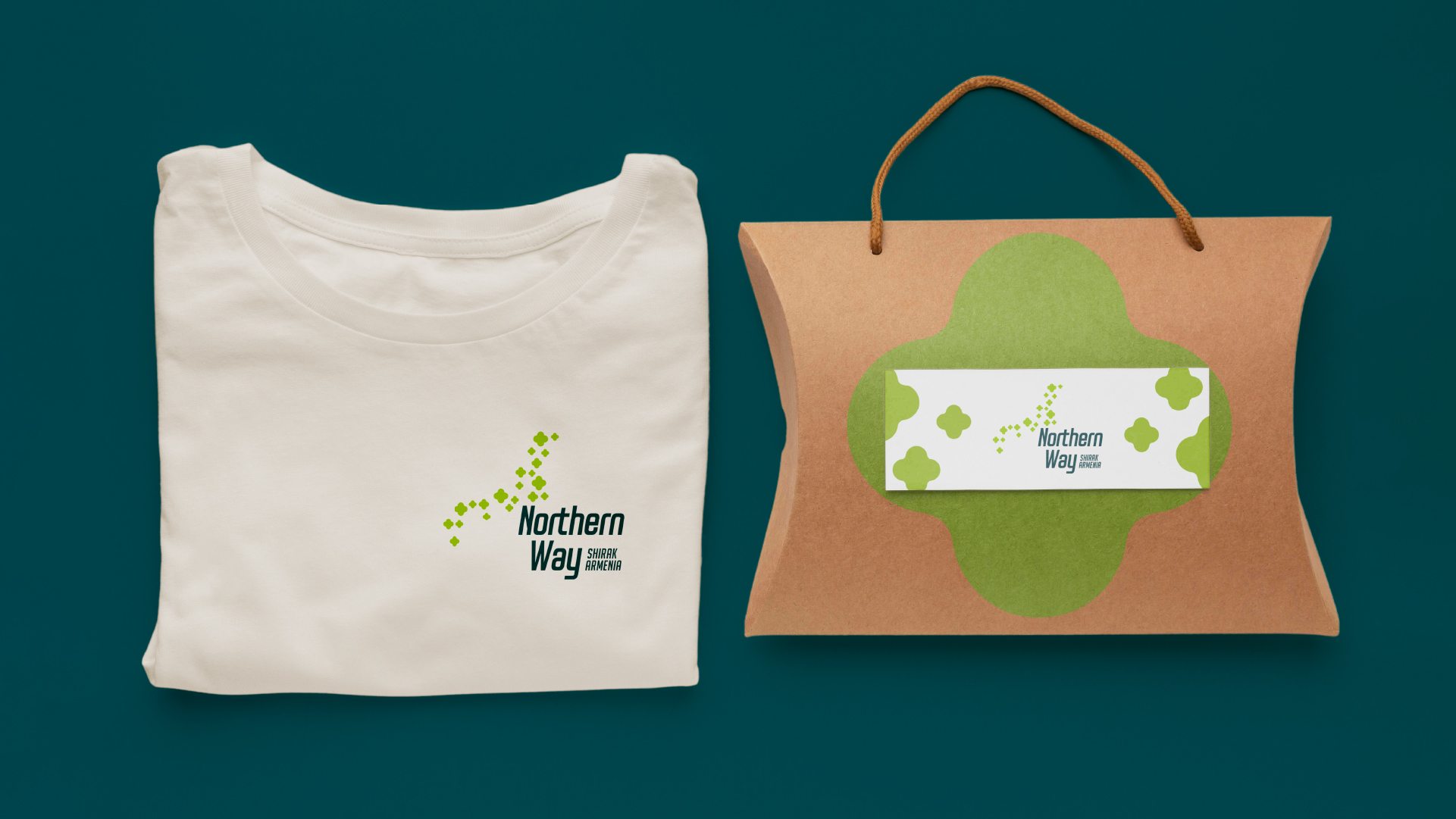
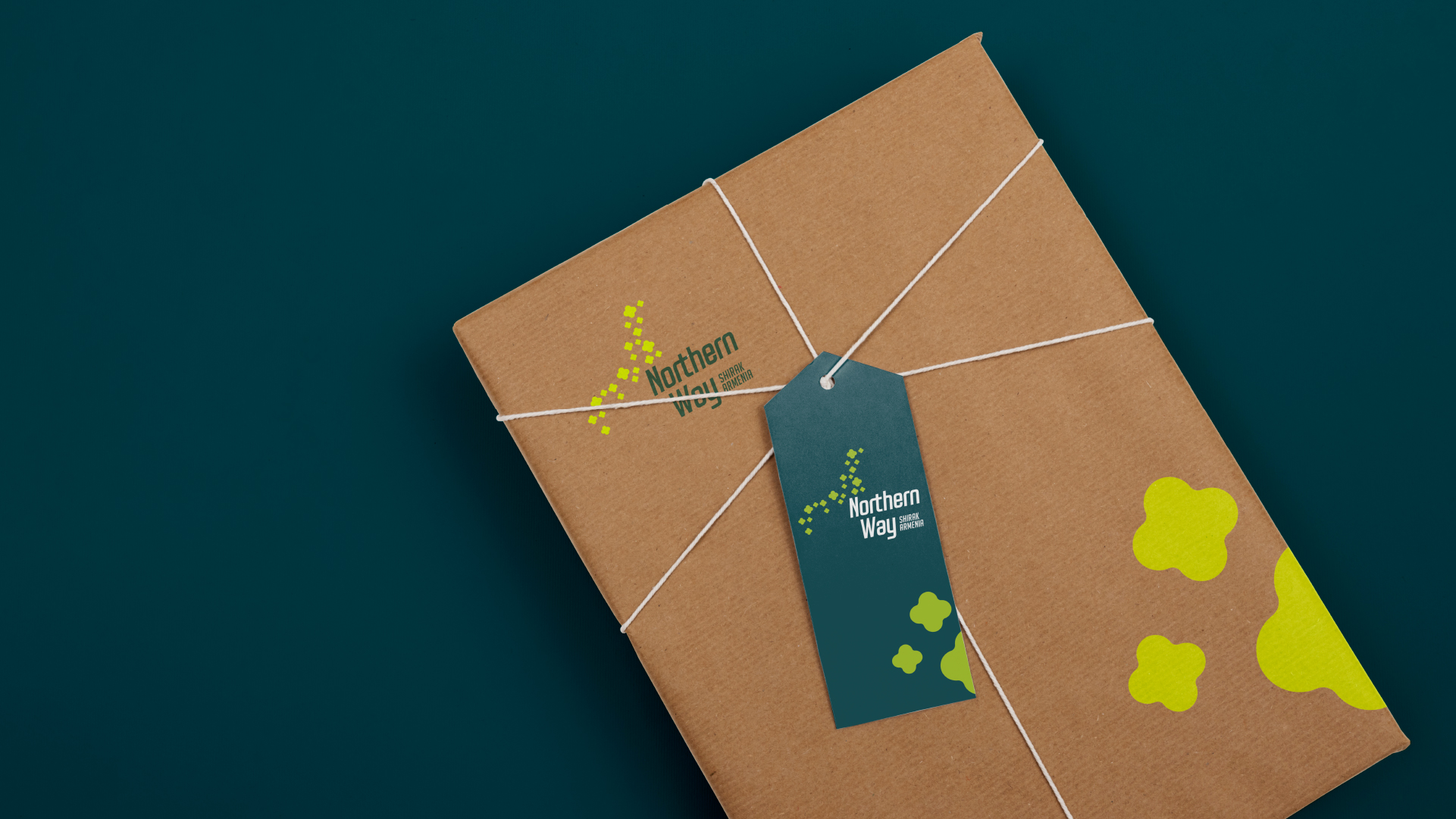

The Symbol
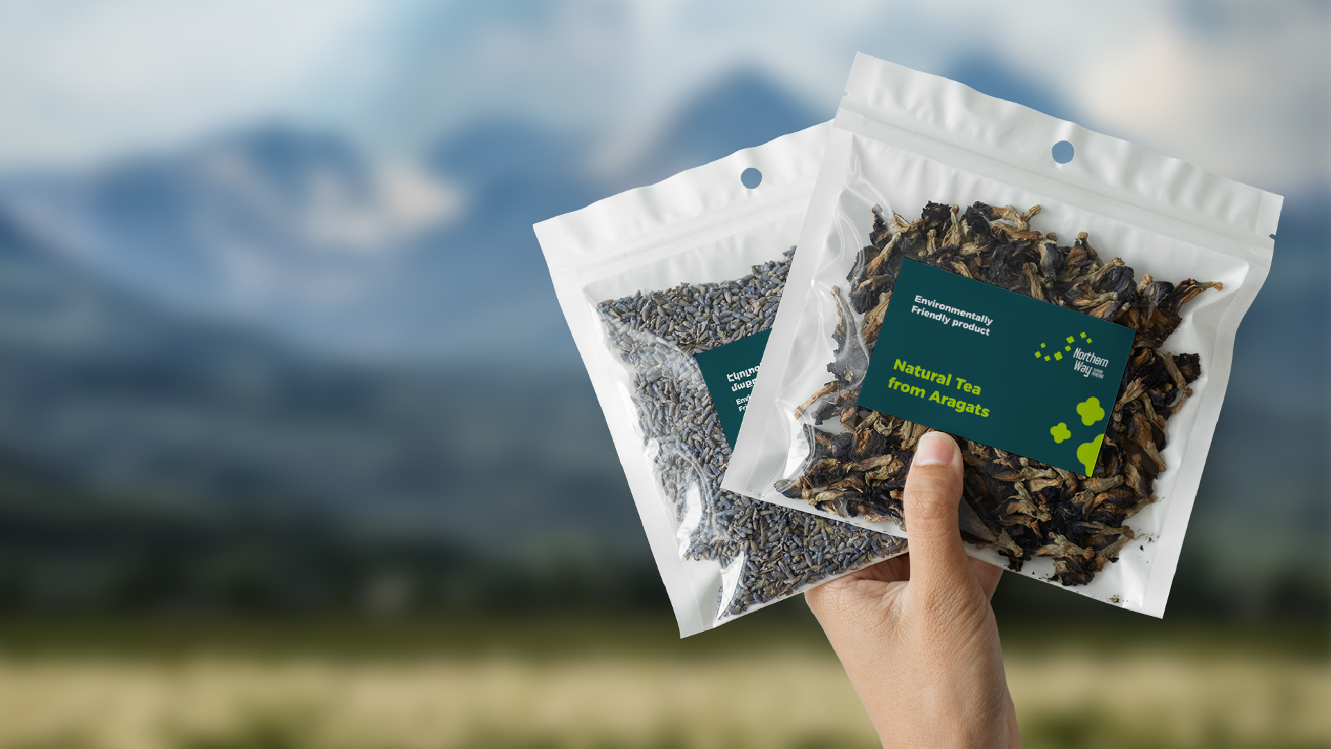
The symbol of the Northern Way brand is a stylized, graphic image of a four-petaled buttercup flower growing in a high mountain area. The symbol is used in branding in a variety of ways, highlighting the
features of the presented products, meanwhile emphasizing their natural origin. Various uses of the symbol enrich the brand, giving it freshness and a unique style.
The Essence of the Brand
Northern Way branding is the manifestation of nature and the natural, which are the core of the brand identity. It tells the love story of mountain winds,
sun and water sources. From there, the springs of the mountain valleys are born and the products presented under the Northern Way brand are created.
- Creative Direction: Eduard Kankanyan
- Project Strategy: Karen Babajanyan
- Project Management: Gayane Margaryan
- Graphic Designer: Shushan Gevorgyan
- 3D and Motion Graphics Vardan Harutyunyan
- Copywrighting Hrachuhi Mirozyan