

The Center: Shirak
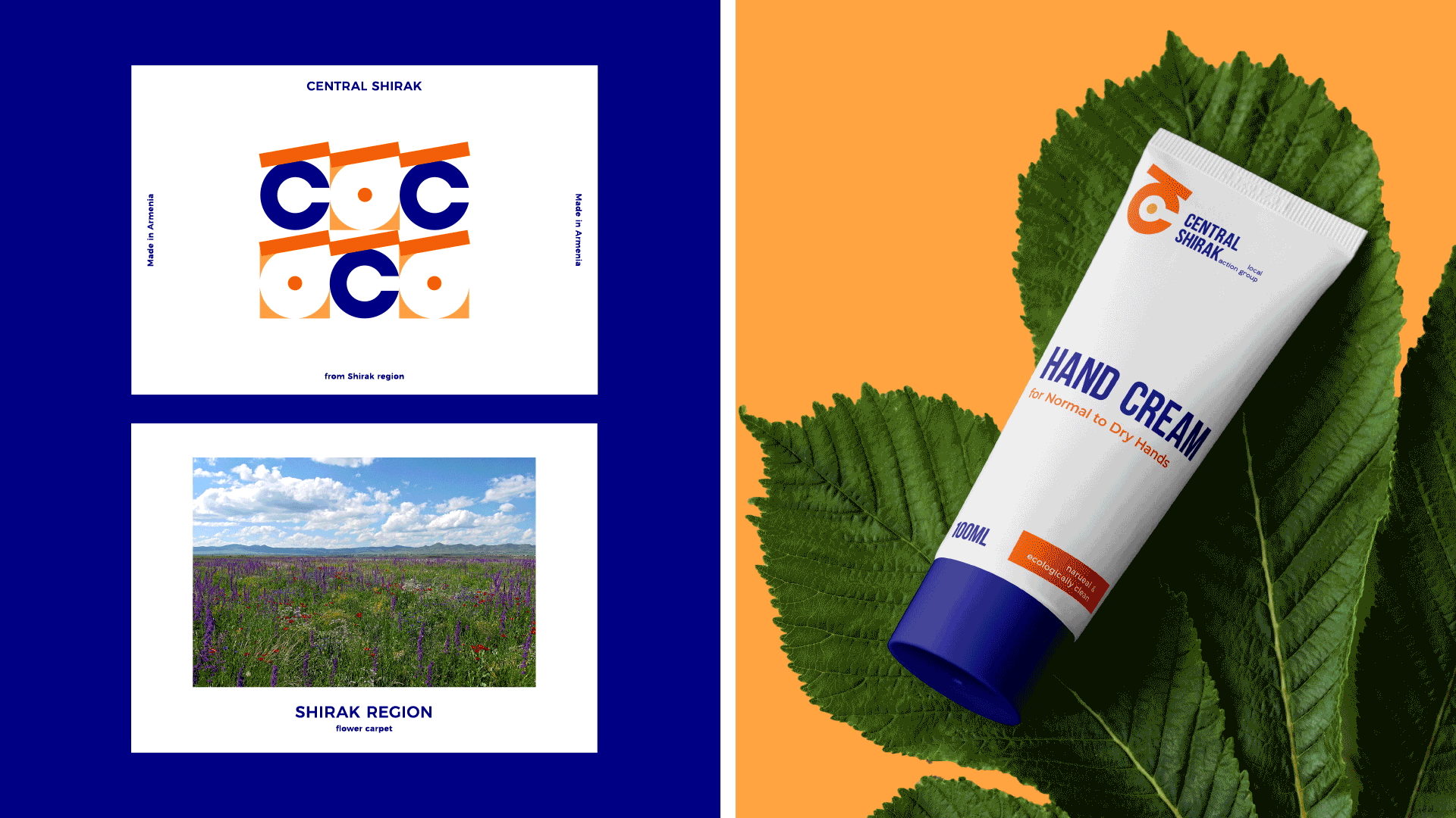
Shirak is the northern region of Armenia, which has exceptional hue, traditions and nature. People are granted with a unique character here. They consider Shirak to be the center of all, because many come here to discover life and the world from a different perspective. The idea of centrality is the basis of the "Central Shirak" brand. The project of the Action Groups,
which is aimed at the balanced development of regions, aims to present all directions of Shirak's development, which makes branding even more interesting and versatile. The basis of the branding is the letter “Շ” (sounds “SH”) of the Armenian alphabet, through which we emphasized the idea of the center by means of a dot inside the incomplete circle.

The Challenge
The main challenge of the branding for “Central Shirak” project was to find the idea that best describes the region. The identity of the brand should express the hue and nature of Shirak, and demonstrate people's ideas. It was also important to find
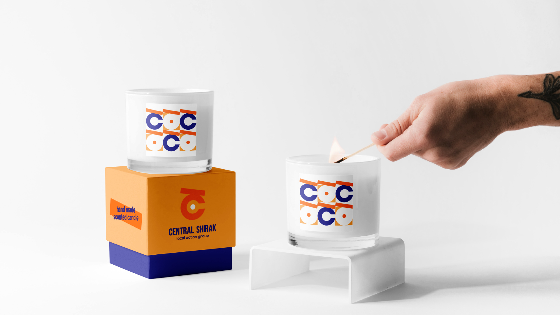
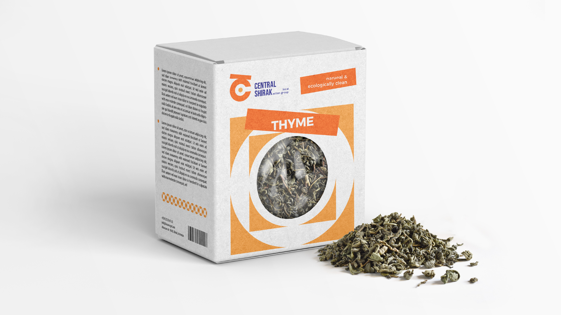
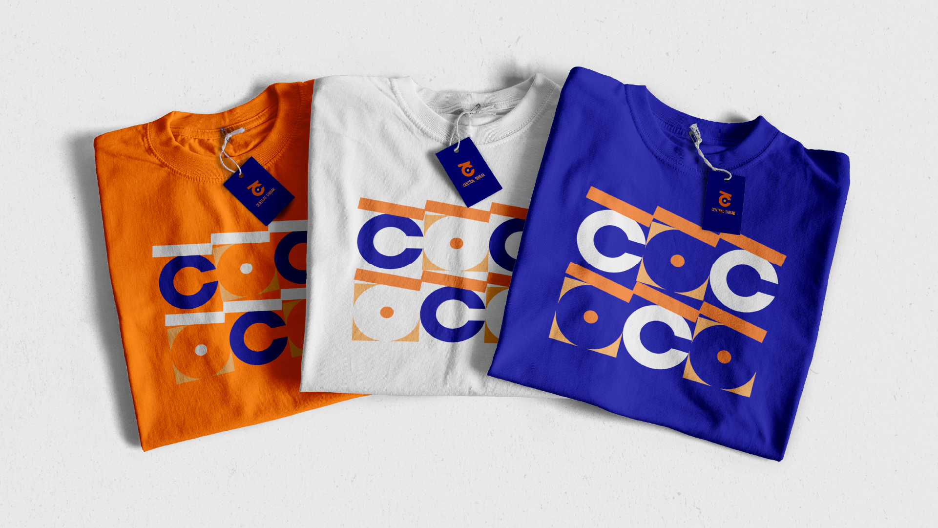
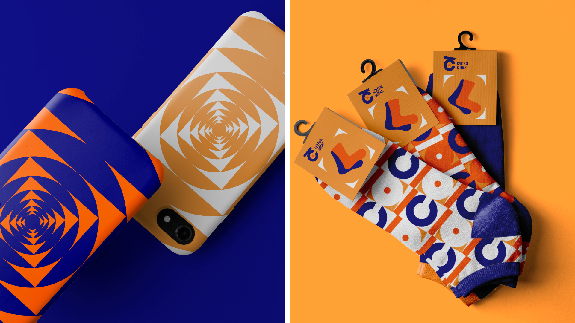
such design solutions that would allow its applications to a large number of branded items. The point is that throughout the project, everything from the service and hospitality sector to food, cosmetics, etc. will be branded.

The Solution
Placing the centrality of Shirak in the ideological basis of the brand identity allowed to solve several problems at once. Shirak’s centrality was presented through the logo. The palette was also chosen prudently, which
conveys Shirak’s hue, vividness and multi-colored. The logotype and color palette provide a wide opportunity to apply the brand identity, as demonstrated by the elements presented in the brandbook.
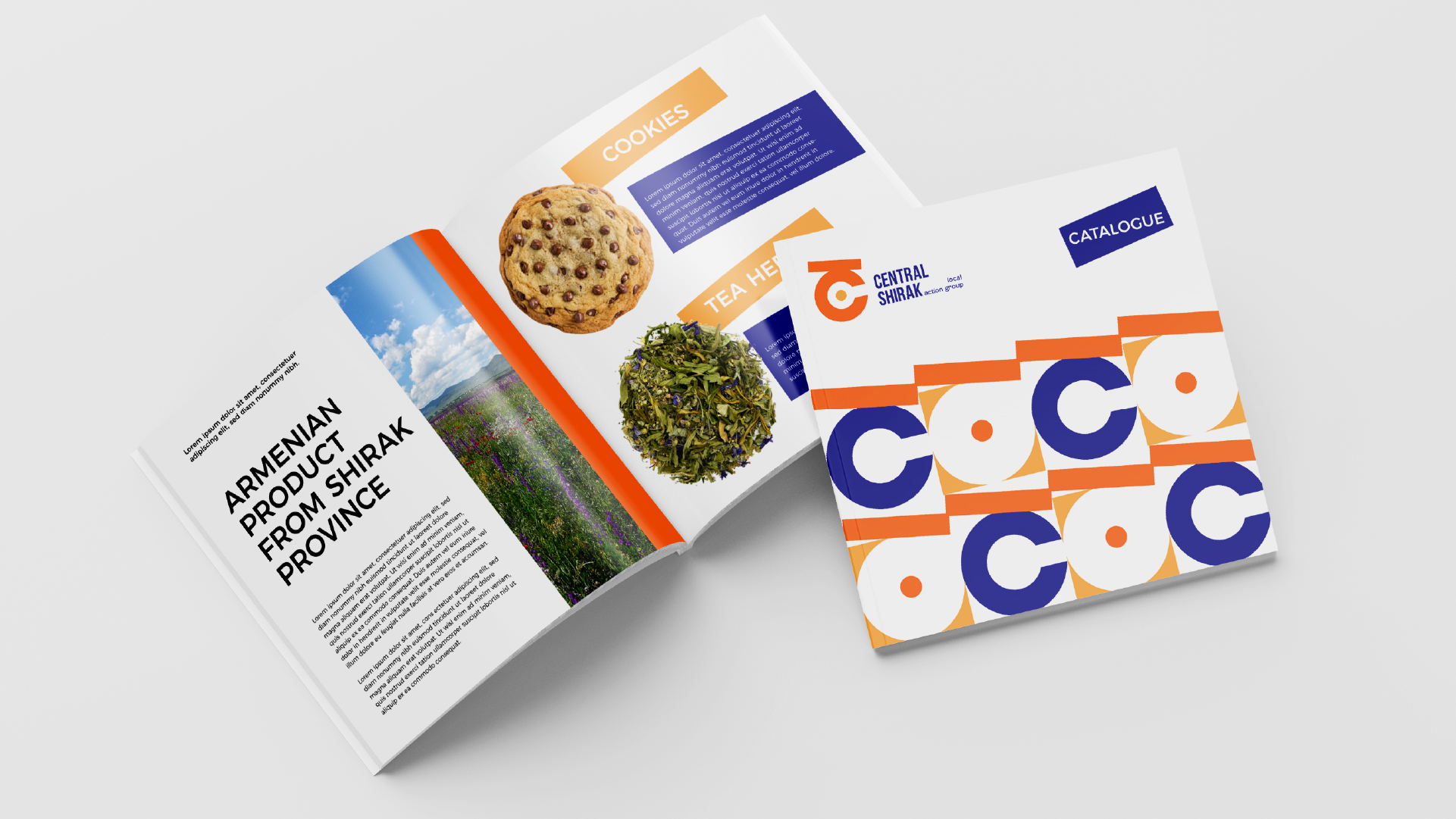
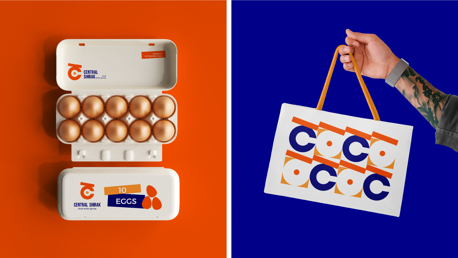
The Logotype
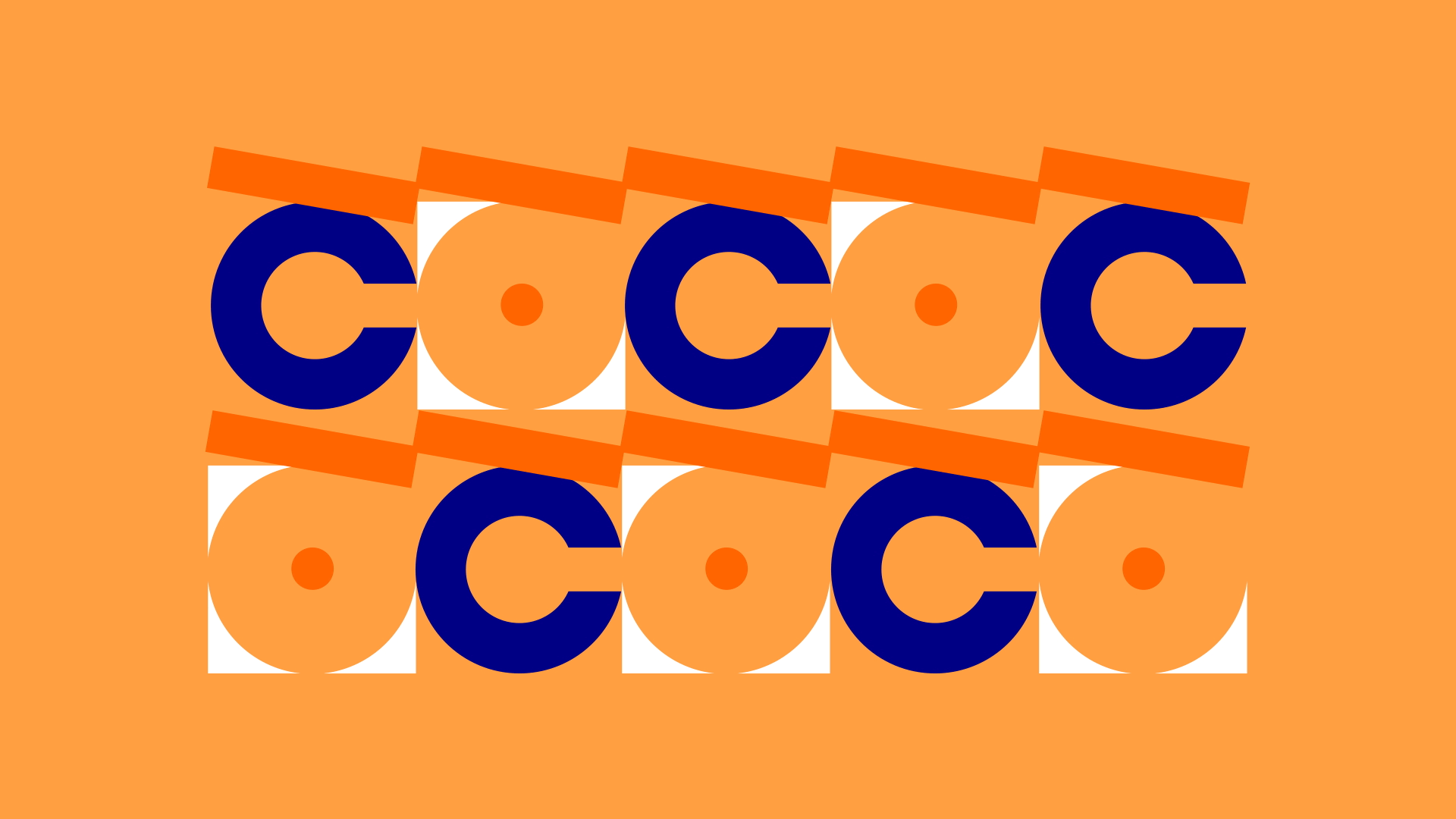
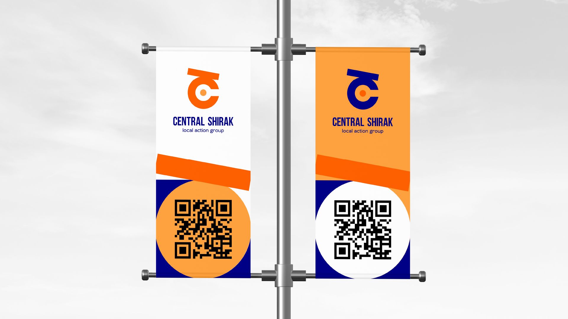
The symbol of the logo is the Armenian letter «Շ», the incomplete circle of which is used to emphasize the idea of the center. As a stylistic element, we have also given different applications to the upper dash of the letter.
As a symbolic manifestation of the "center", we use the combination of a circle and a square, which is also visible in the symbol of the logo. The logo is a rectangle with the logo symbol on the left, the main text in the middle, and the identifier on the far right.
The Colors
The color palette is as bright as the hue of Shirak and vividly represents the colors of the region. The combination of deep inky and dark carrot is complemented by the background orange.
White is used as an auxiliary color. A monochrome version of the logo is not presented, as a one-color logo will not be able to convey color non-verbal communication either.
- Creative Direction: Eduard Kankanyan
- Branding Director: Karen Babajanyan
- Project Management: Gayane Margaryan
- Motion and Graphic Designer: Lilit Avetisyan
- Copywrighting: Hrachuhi Mirozyan