Coffee House
Company Rebranding
- Country: Armenia
- Year: 2021
- Industry: Food & Hospitality
- Service: Brand Concept, Logo, Visual identity, Packaging
Cup Filled with Coffee and Love
There is nothing more refreshing than morning coffee, and there is no higher aspiration than love. The cups of Coffee House are full of both of these.
In today's fast-paced world, coffee culture penetrates deeper into our lives every day, giving us freshness, drive and motivation to reach new heights.
Coffee House's branding project has this vibe: youthful, active and unrepeatable. Performance of this stylish and modern brand is characterized by popart and stickier approaches, color palette, and, of course, freshness.
The Challenge
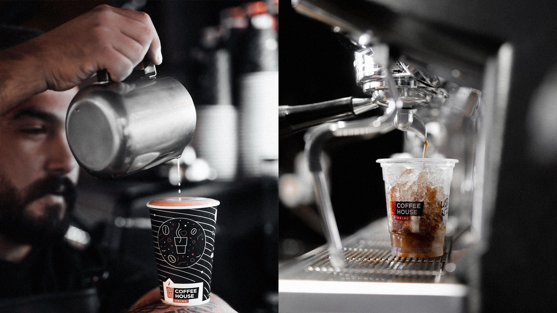
A key challenge of the branding project was to convey a youthful approach, becoming the image of an active lifestyle.
It was also imperative to move away from classic "coffee" approaches, which mainly contain messages of
a calm and relaxing environment.
It was necessary that coffee, which is an integral part of young people's lives, and the love that Coffee House has, could be seen, experienced and felt even in the smallest details of branding.
The Solution
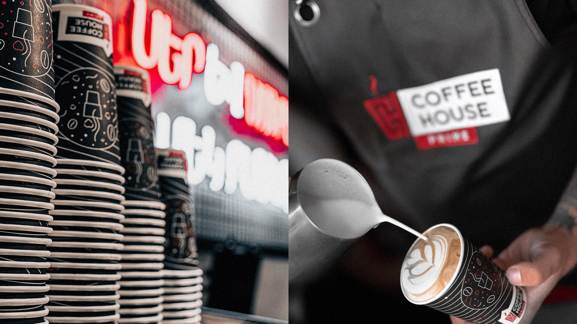
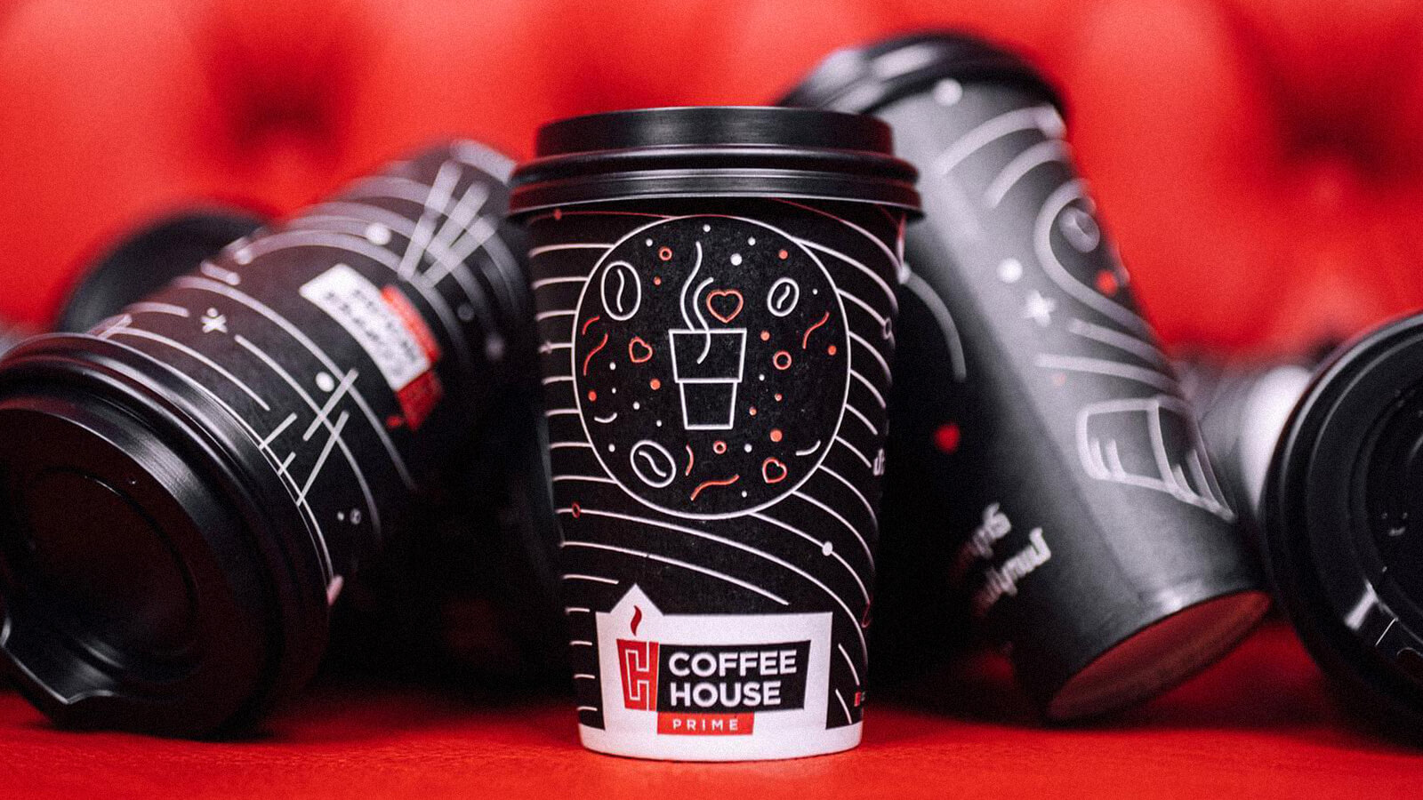
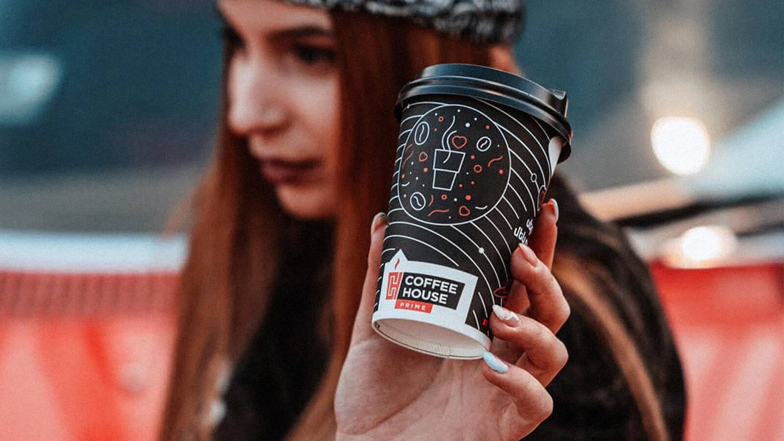
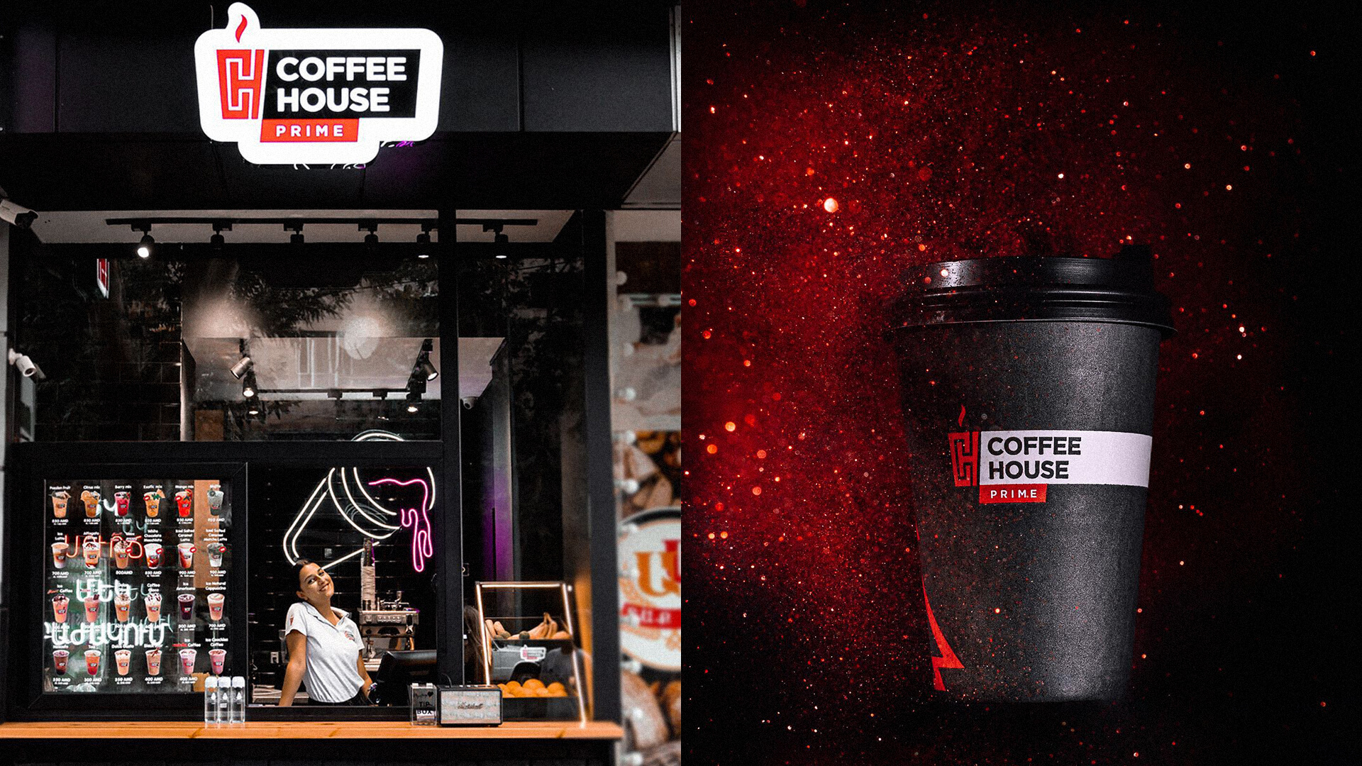
The solution was to eliminate stereotypes. The bold black and red combination came to replace the traditional coffee brown shades. We opted for a pop art approach instead of providing rounded images.
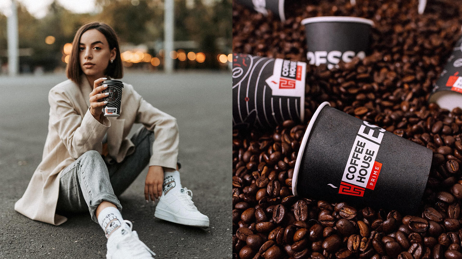
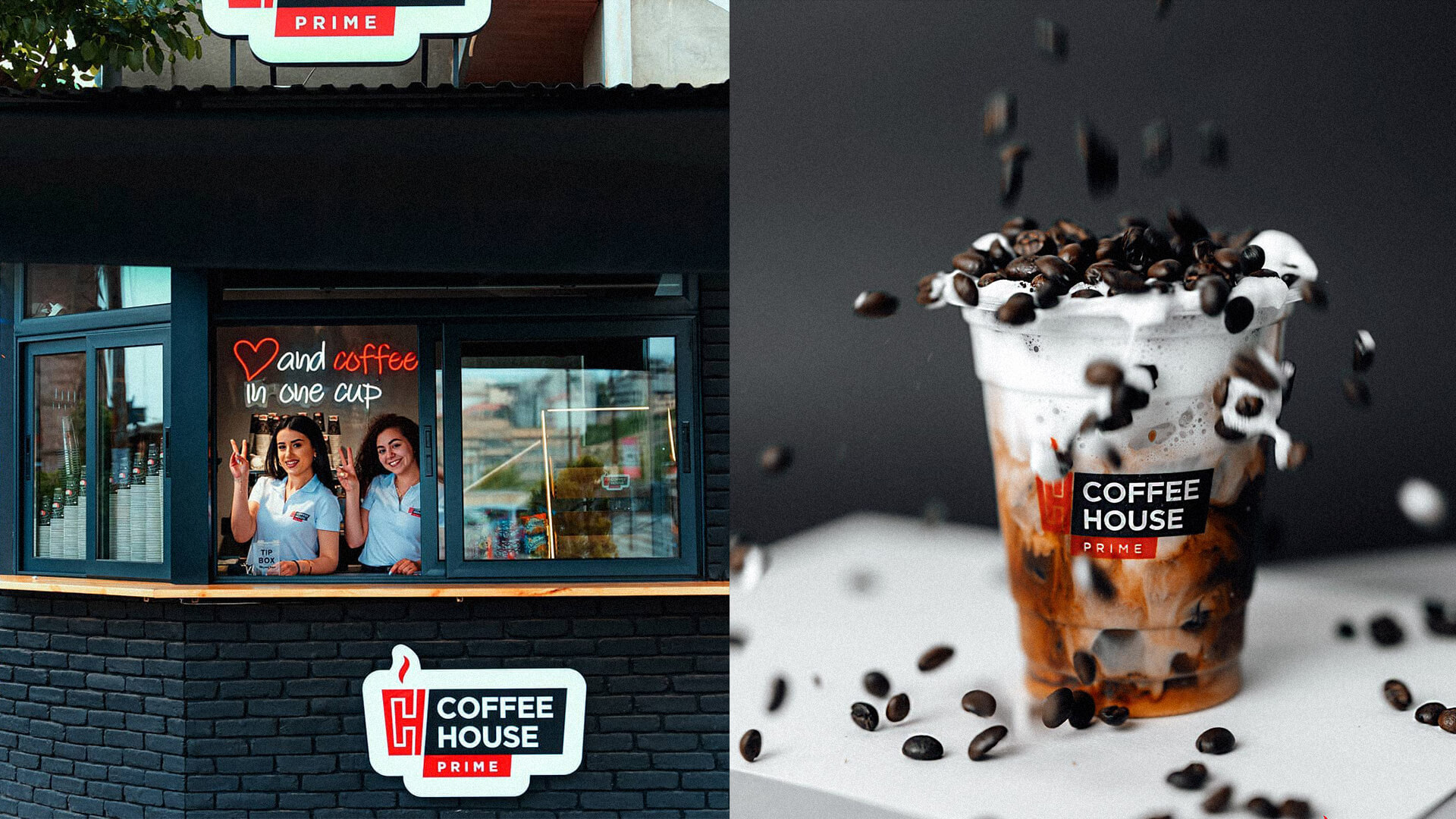
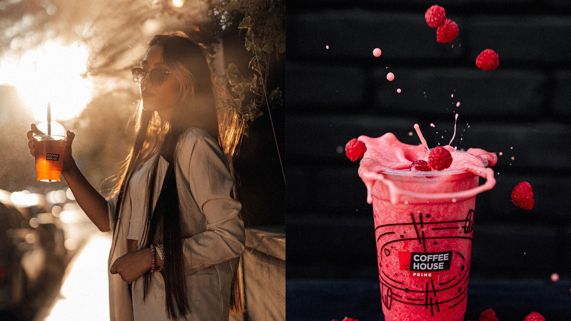
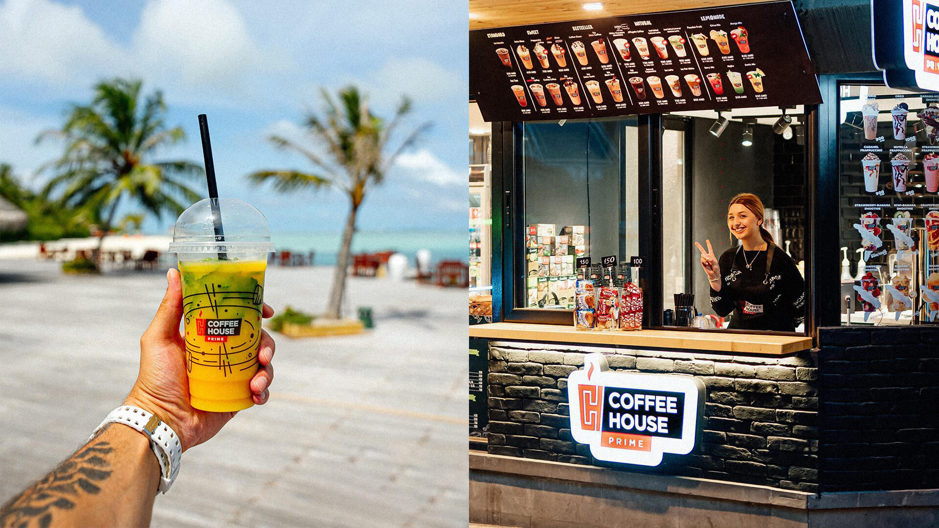
Brand elements were manifested on the take-away coffee cups. The brand's identity was based on an active, youthful, light lifestyle, which contrasts with a calm, elite environment.

.jpg)

The Logotype
The logo is composed of a symbol and a wordmark. The logo is a stylized large coffee cup made from a combination of the Latin letters C and H, with a steam symbol rising above them to indicate warmth. A round font is used for the wordmark, which is in capital letters to the right of the symbol. In the lower part of the
text is the identifier. All these components are placed on a white background, which is a symbol of a stylized house. The brand's logo symbol is red, representing the hotness of the drink. The text and image of the house are either white or black, depending on the background.
Style and Aesthetics
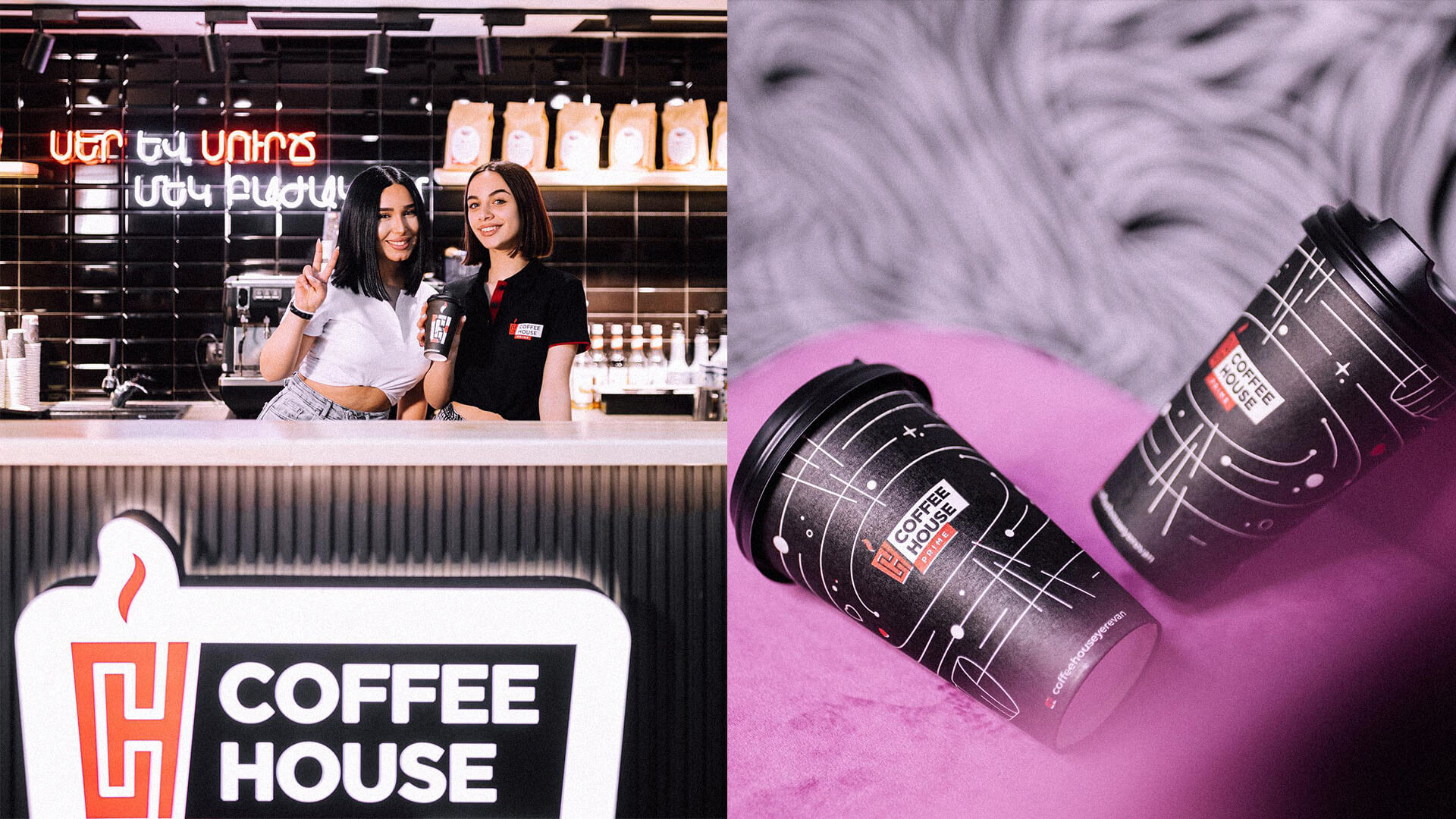
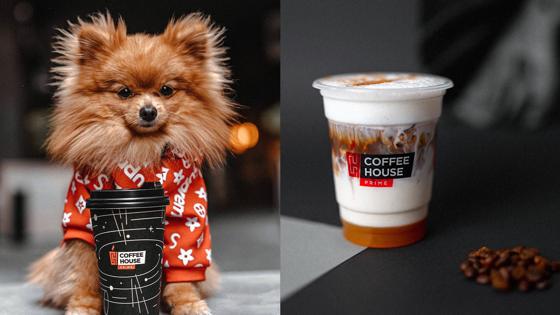
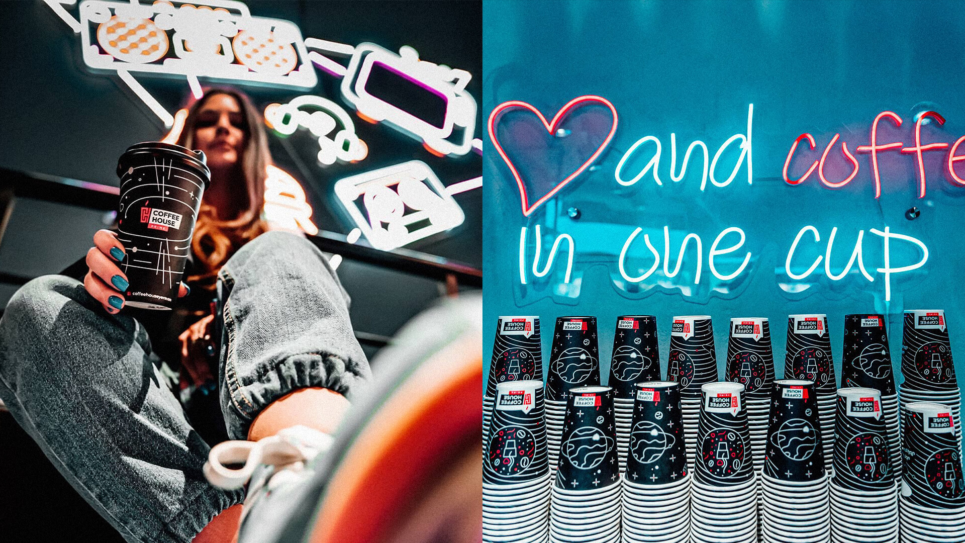
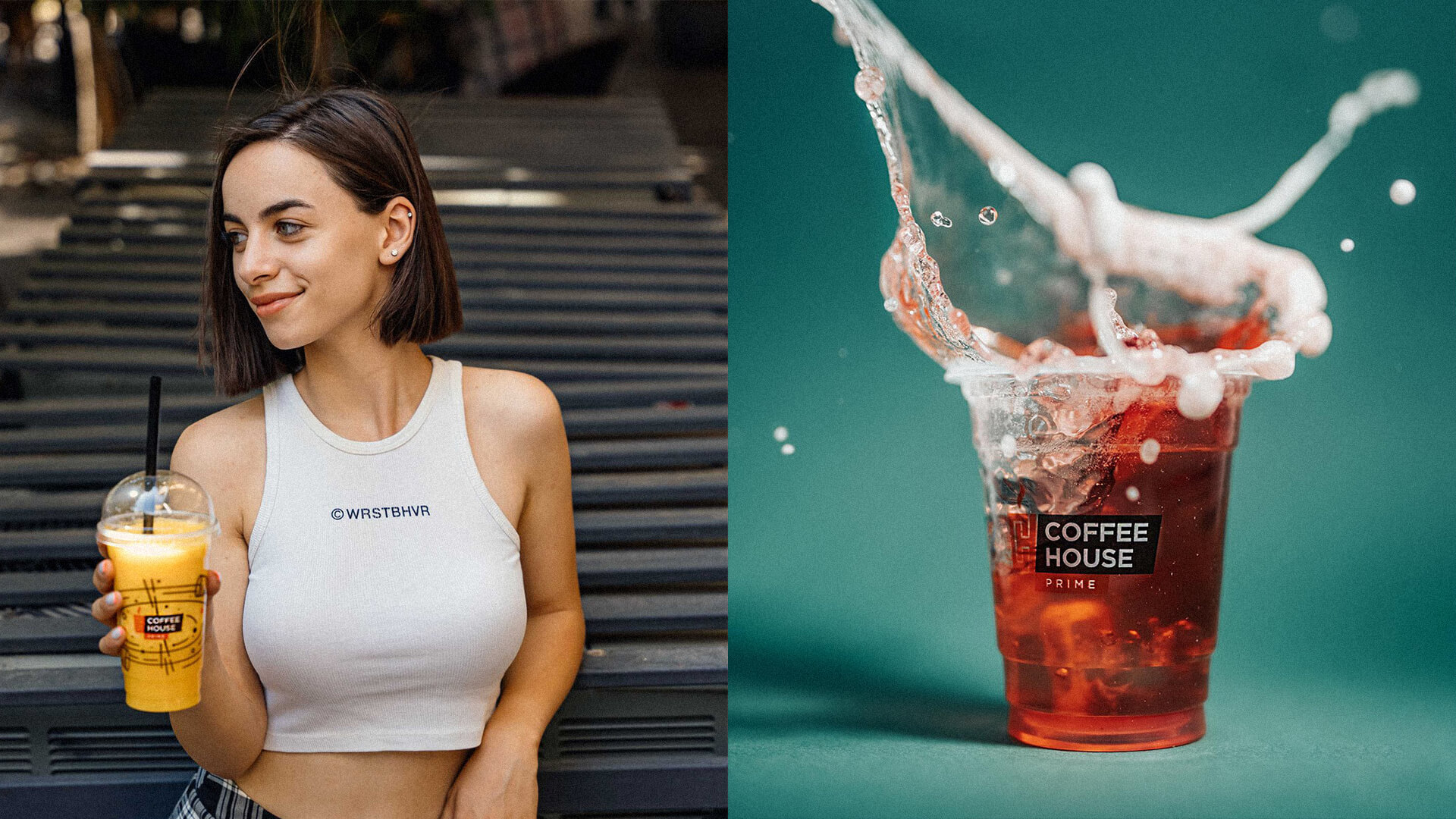
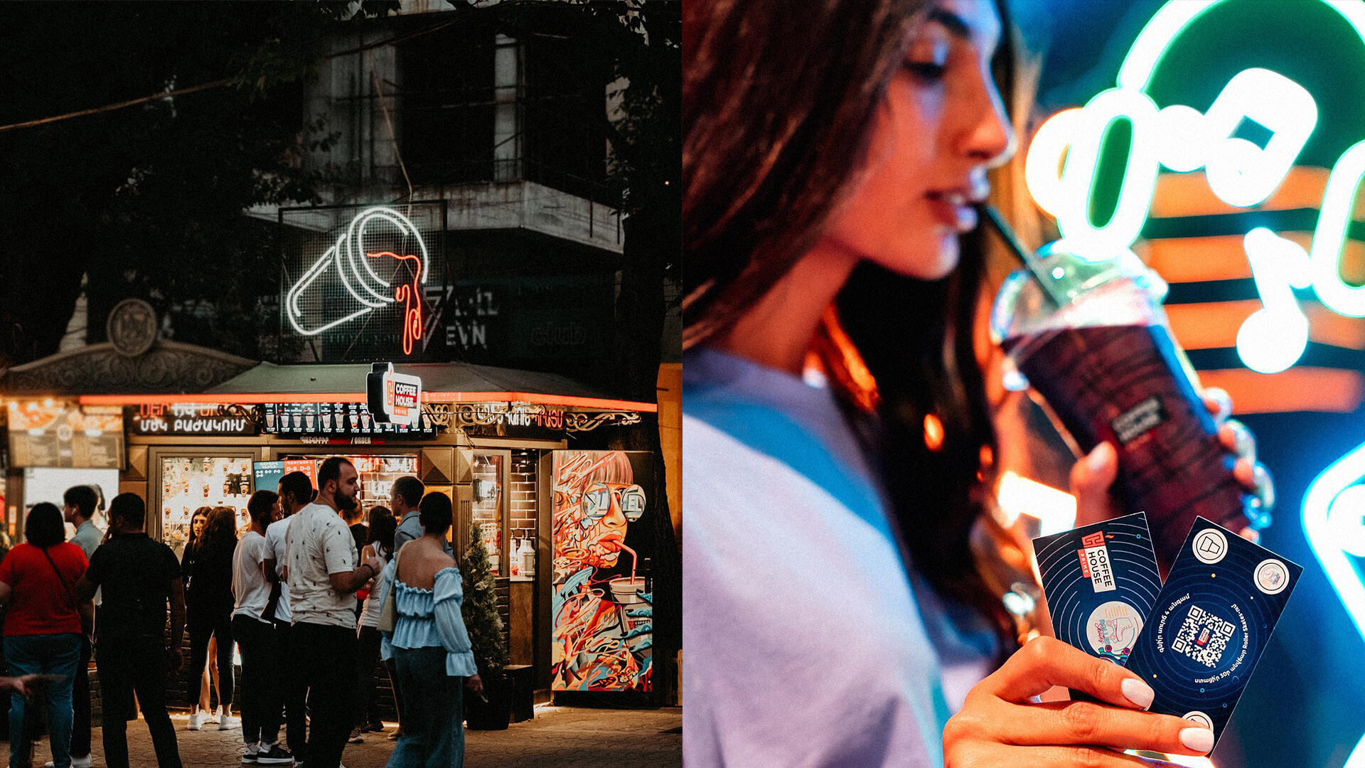
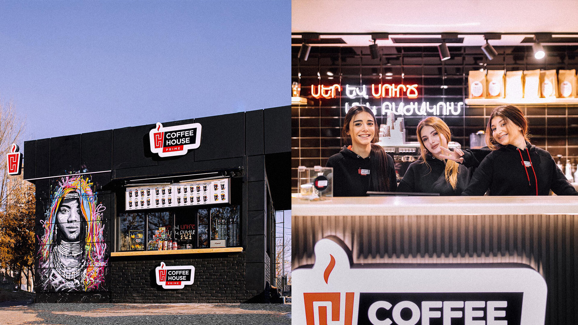
The general stylistic approach of Coffee House is a modern, active and youthful aesthetic. This approach is fixed both through the palette and other elements of the visual identity. The coffee symbols depicted on the cups are also an integral part of the style. Both the staff's clothes and the environment convey the selected aesthetic.
.gif)
.gif)


Similar Projects
Project Team
- Creative Direction: Eduard Kankanyan
- Project Strategy: Karen Babajanyan
- Project Management: Gayane Margaryan
- Graphic Designer: Sen Olqian
- 3D and Motion Graphics: Vardan Harutyunyan
- Copywrighting: Hrachuhi Mirozyan
