Someone wants to rebrand the TTC amid widespread negative public perception
- Published: Feb 03, 2023
- Article: Jack Landau | BlogTo
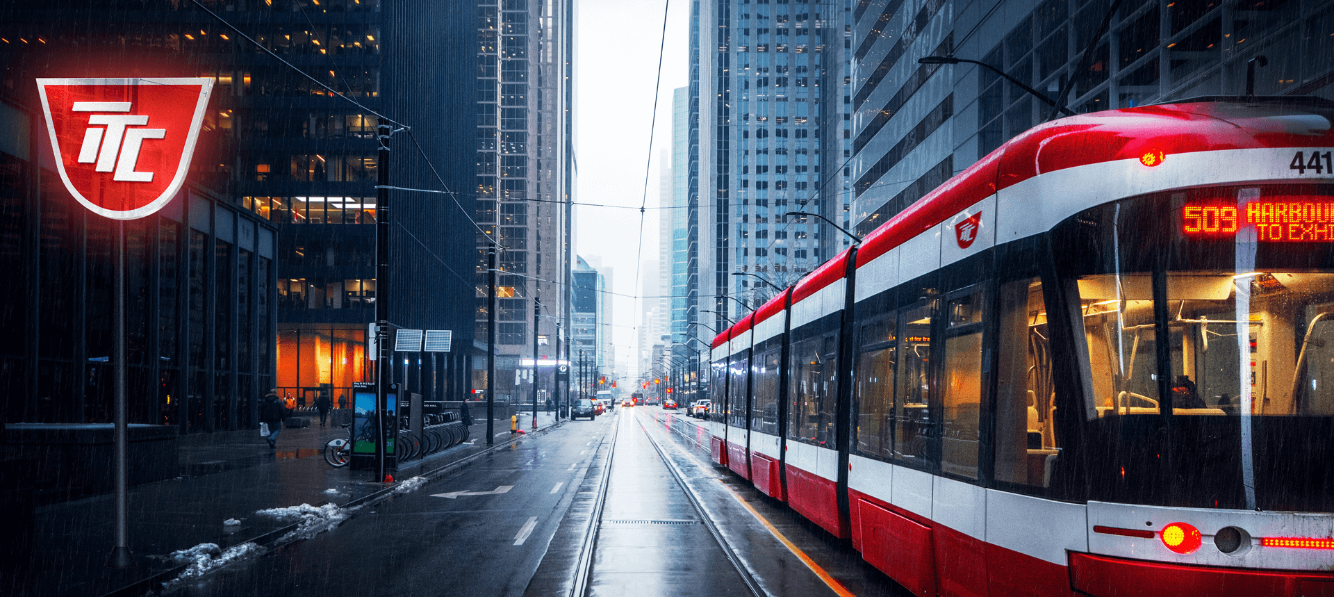
The TTC has been the subject of all sorts of negative headlines in the first weeks of 2023, fuelled by surging crime on public transit and unpopular service cuts. As widespread negative publicity surrounding the TTC persists, one design firm is offering up a rebranding for the public transit service, suggesting that a refresh to the iconic red and white logo could help the network open up a new, more positive chapter. Eduard Kankanyan and his design company, Braind, set out to update the classic symbol of Toronto for a new era. Rethinking such a well-established logo was a bit easier for Kankanyan, who was able to approach the project as a new Canadian arrival without the long-term attachments to the logo some of us may be burdened with.
"I just moved to Toronto, and the first thing that I noticed is the TTC with its dated branding," Kankanyan tells blogTO. "I understand the [logo's] huge legacy, but nowadays, when you have all these transformations going on in the world, I think it looks and feels a little bit old."
"Adding to that, all the violence and negative perceptions of the TTC, I just thought that it would be a great idea to update and modernize the brand. Especially when, besides all the negative things, there are also good things happening in the transportation system," says Kankanyan, noting new lines under construction and future transit expansion plans.
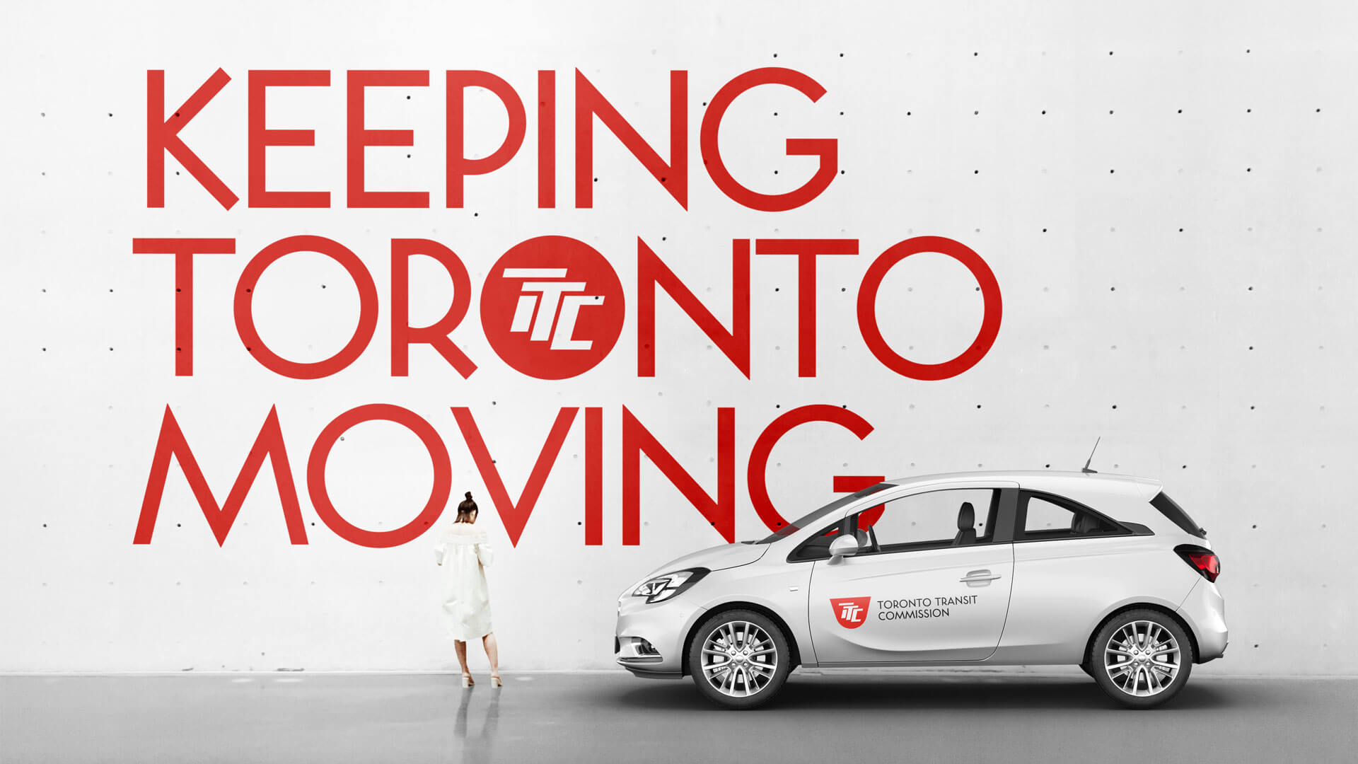
Kankanyan acknowledges the current logo's importance to Toronto residents, explaining that "we didn't try to erase the history and just come up with something totally different."
"First, we were trying to play with the shape to keep the identity and not lose everything. We had tons of options, but the final version was the simplest one."
Kankanyan retained core elements of the current TTC logo, focusing instead on the typography he characterizes as feeling "very old." He also notes that, while the logo may be easy to read for those who have spent much of their lives familiar with the branding, it can be difficult for new Canadians — especially those hailing from locations that don't use the Latin alphabet — to make out the retro typeface.
"We made them more modern, made them more dynamic, and more readable. So they are moving forward," he said. "They are dynamic, and they keep the spirit current logo."
The project also pitches new TTC in-station ads and messages following the proposed branding cues. Braind hasn't settled on just redesigning the logo and creating convincing mockups incorporating it into TTC vehicle livery, signs, seat backs, and shelters. The company also recognizes that branding plugs into the service's identity beyond just moving Toronto residents from A to B. Any TTC fan out there owns at least one item of transit merch, and this proposed rebrand includes all sorts of branded items ranging from coffee cups to condoms.