Toronto Transit Commission (TTC) Rebranding Concept
- Country: Canada
- Year: 2023
- Industry: Transportation
- Service: Rebranding
- Client: Braind
From Negativity to Positive Perception: The TTC Rebrand
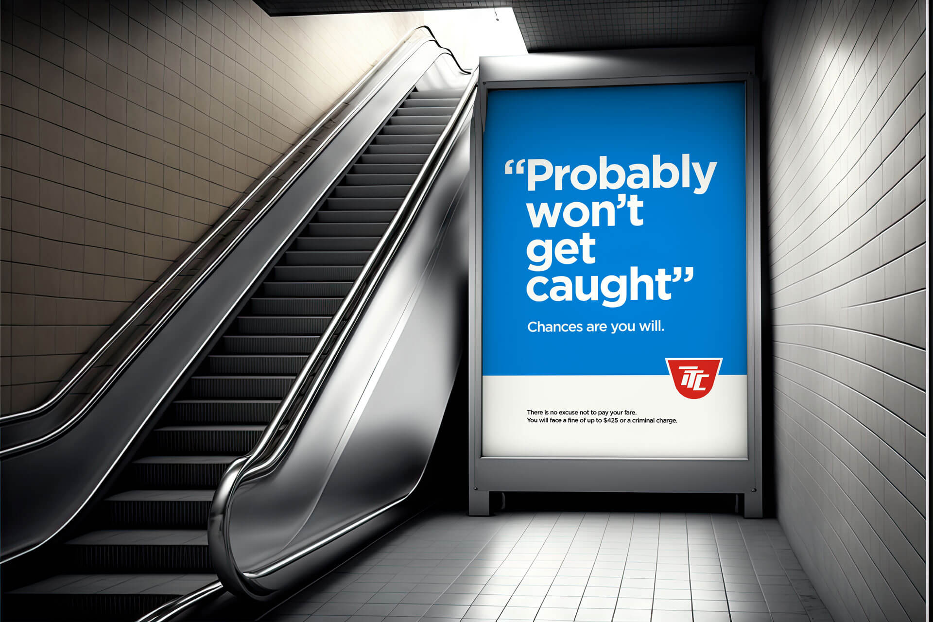
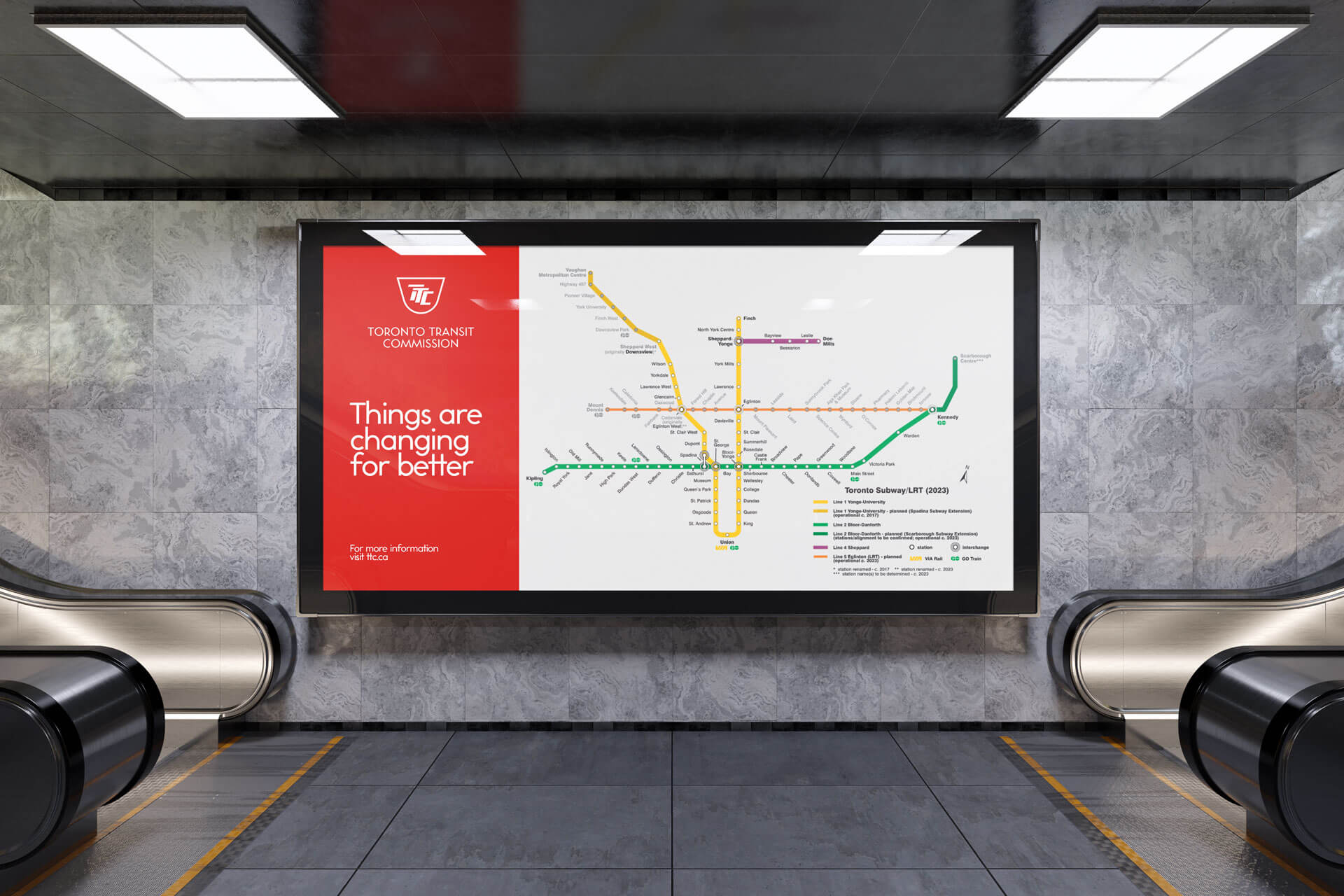
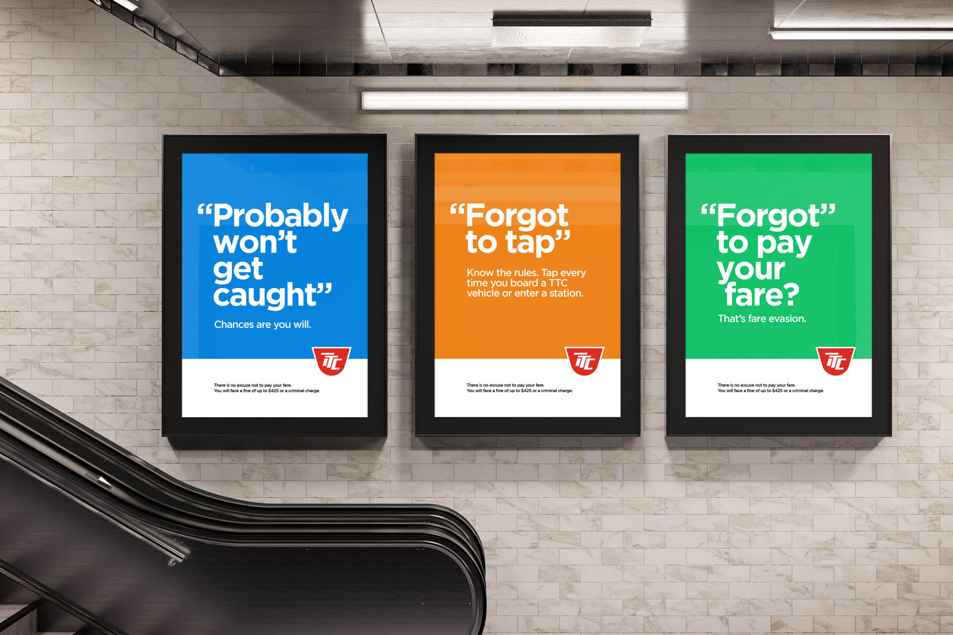
The Toronto Transit Commission (TTC) is in need of a modern, refreshed image to better serve its riders and reflect its role as a vital part of Toronto's transportation system. Braind's rebranding concept proposal aims to address the current negative perception of the TTC and position it as a forward-thinking, innovative organization. The proposal focuses on modernizing the visual identity, incorporating modern design elements, and creating a consistent look and feel across all communications. By updating the TTC's image, we can improve the rider experience and better communicate the value and importance of public transportation in Toronto. With our experience in successful rebranding projects, Braind is confident that this proposal will help the TTC create a positive and memorable brand that will serve the city for years to come.
The Legacy of the TTC Logo
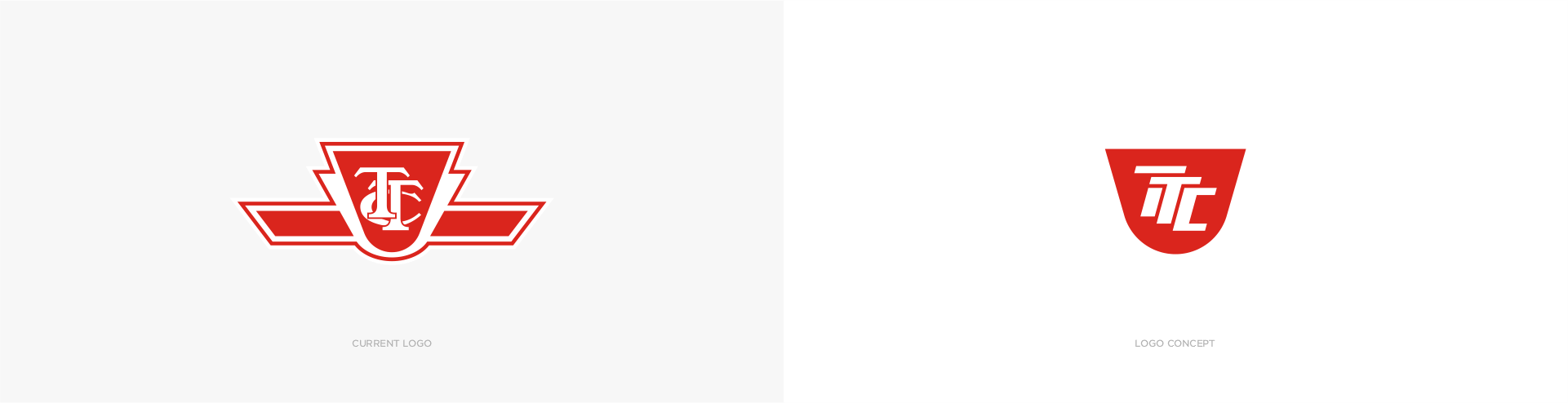
The Toronto Transit Commission has a rich history, and its logo has been an iconic part of its identity for many years. The original logo, which featured the silhouette of a subway train, was designed in the 1970s and has remained largely unchanged since then. While the logo has served the TTC well, it has become dated and is in need of an update to reflect the modern and forward-thinking nature of the organization.
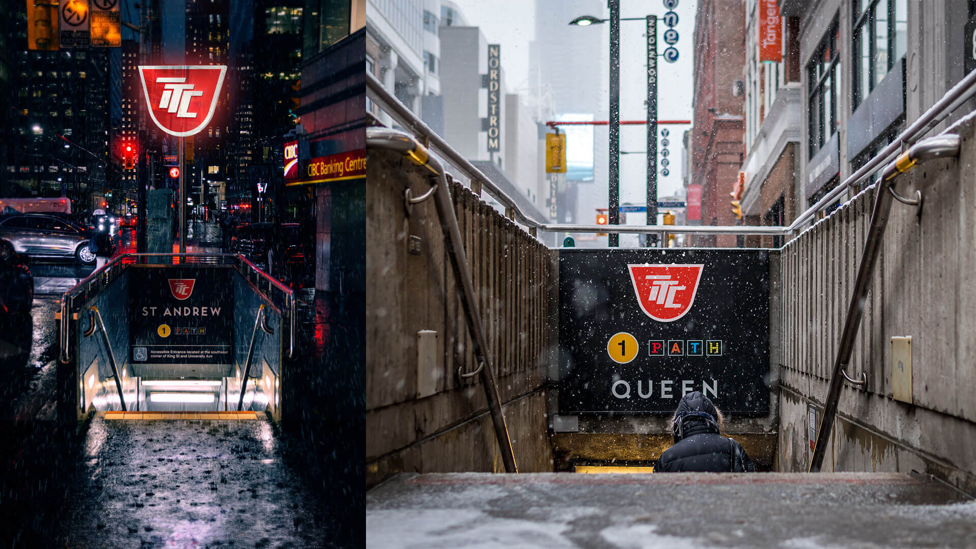
A Modern Take on the TTC Logo
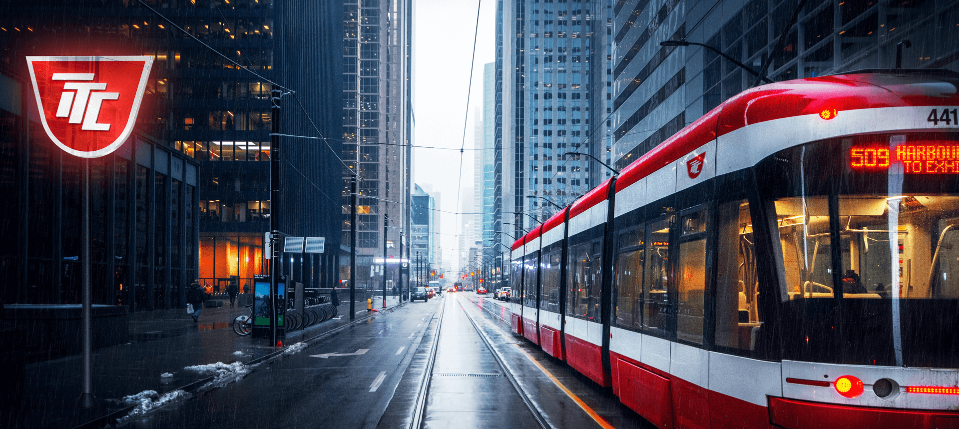
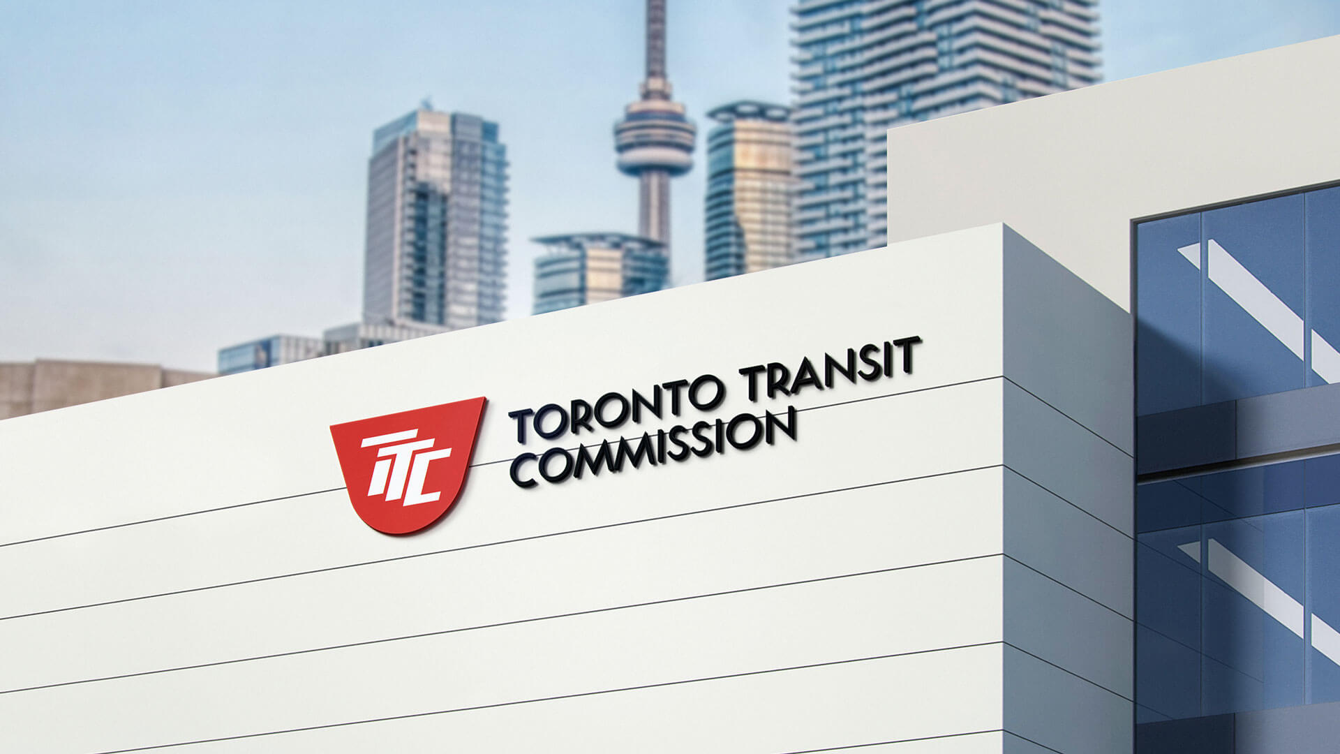
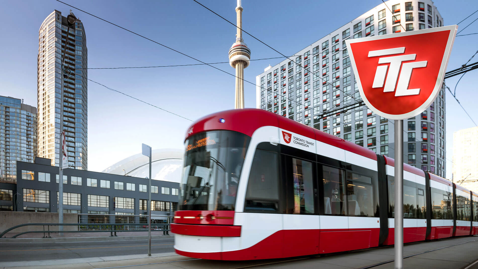
Braind's rebranding proposal includes a modern update to the TTC logo that builds on the legacy of the original design. The new logo concept features the abbreviation "TTC" in a more modern and dynamic style, while maintaining the recognizable silhouette of the original logo. This updated design will help position the TTC as a cutting-edge organization and create a strong, memorable image that connects with riders and stakeholders. The new logo will be an integral part of the TTC's revitalized visual identity and will help to build a positive and memorable brand.

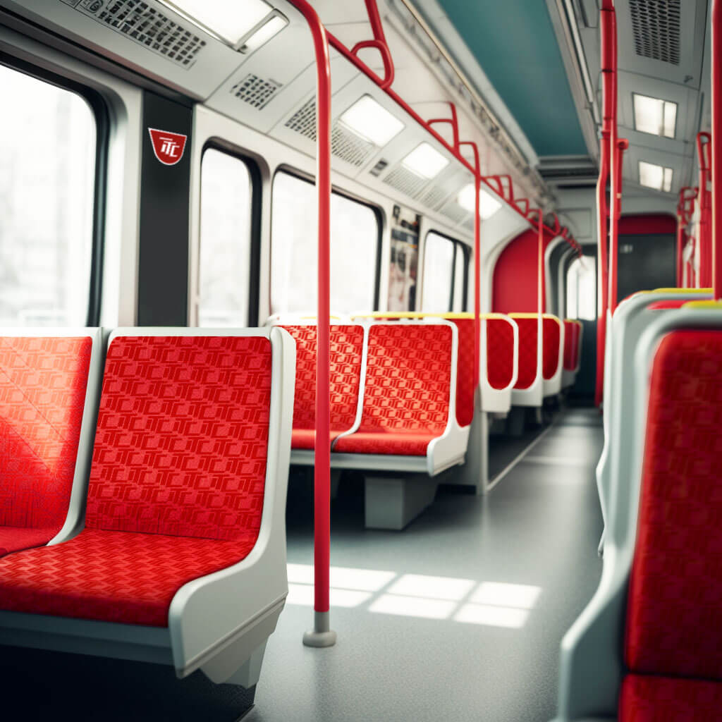
TTC Brand Pattern
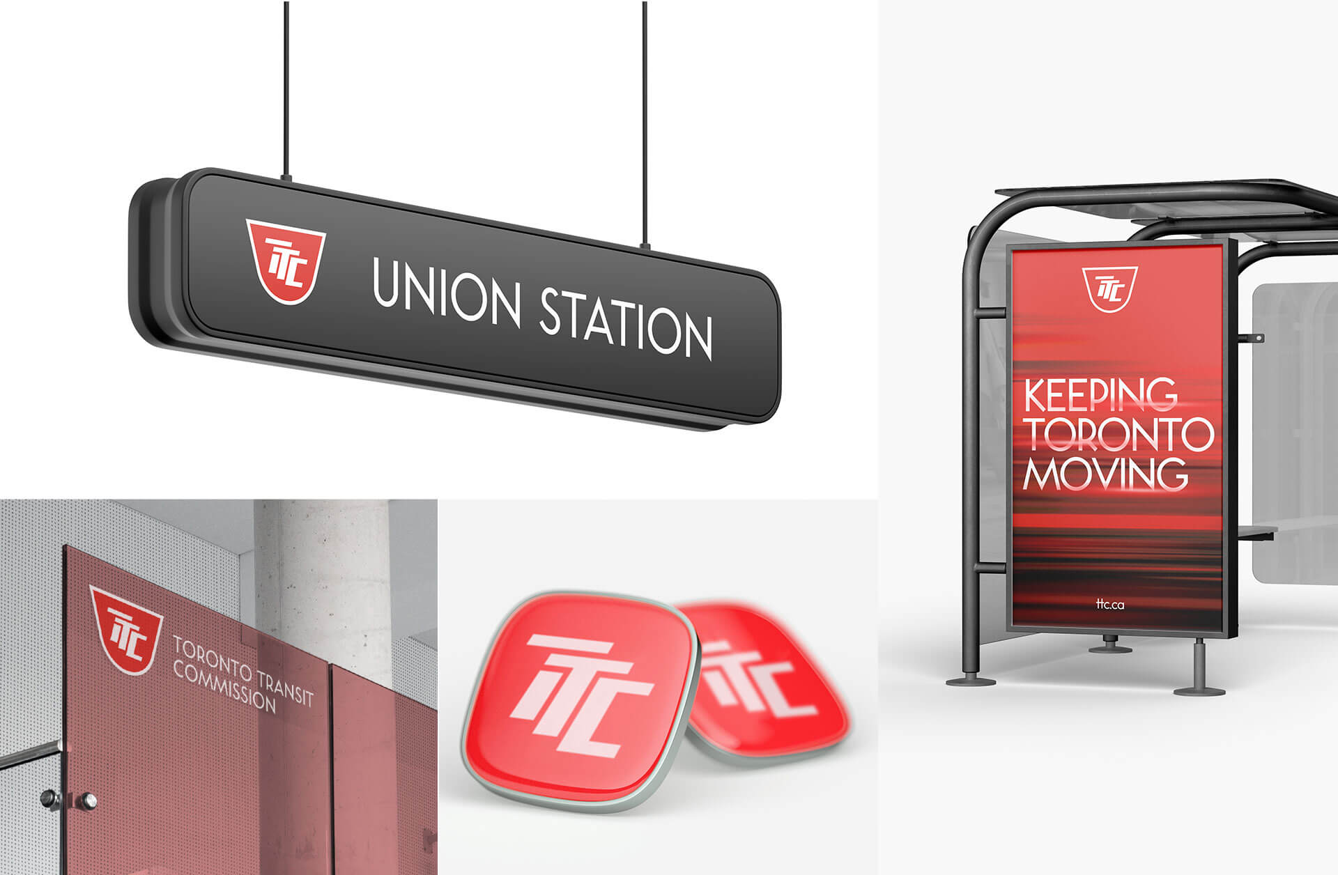
In addition to updating the TTC logo, Braind's rebranding proposal also includes the creation of a brand pattern that will be used across all TTC communications. The brand pattern is made up of repeated TTC logos, creating a consistent and recognizable look that will help to reinforce the TTC's brand identity. The brand pattern will be used in a variety of applications, from signage and station graphics to print materials and digital communications.


One of the key ways the TTC brand pattern will be used is on the seats of buses, streetcars, and subways. By incorporating the brand pattern onto the seats, the TTC will create a visually impactful and memorable experience for riders. The pattern will help to create a sense of unity across the various modes of transportation, reinforcing the TTC's brand identity and building a consistent image. Incorporating the brand pattern into the seat design will also help to create a unique and recognizable look that sets the TTC apart from other transportation systems. This will help to build brand recognition and make it easier for riders to quickly identify a TTC vehicle. Additionally, the use of the brand pattern on the seats will provide a cost-effective way to refresh the appearance of the TTC's fleet and create a fresh and modern look.

- Concept & Design: Eduard Kankanyan