
The Four Peaks' Sunset
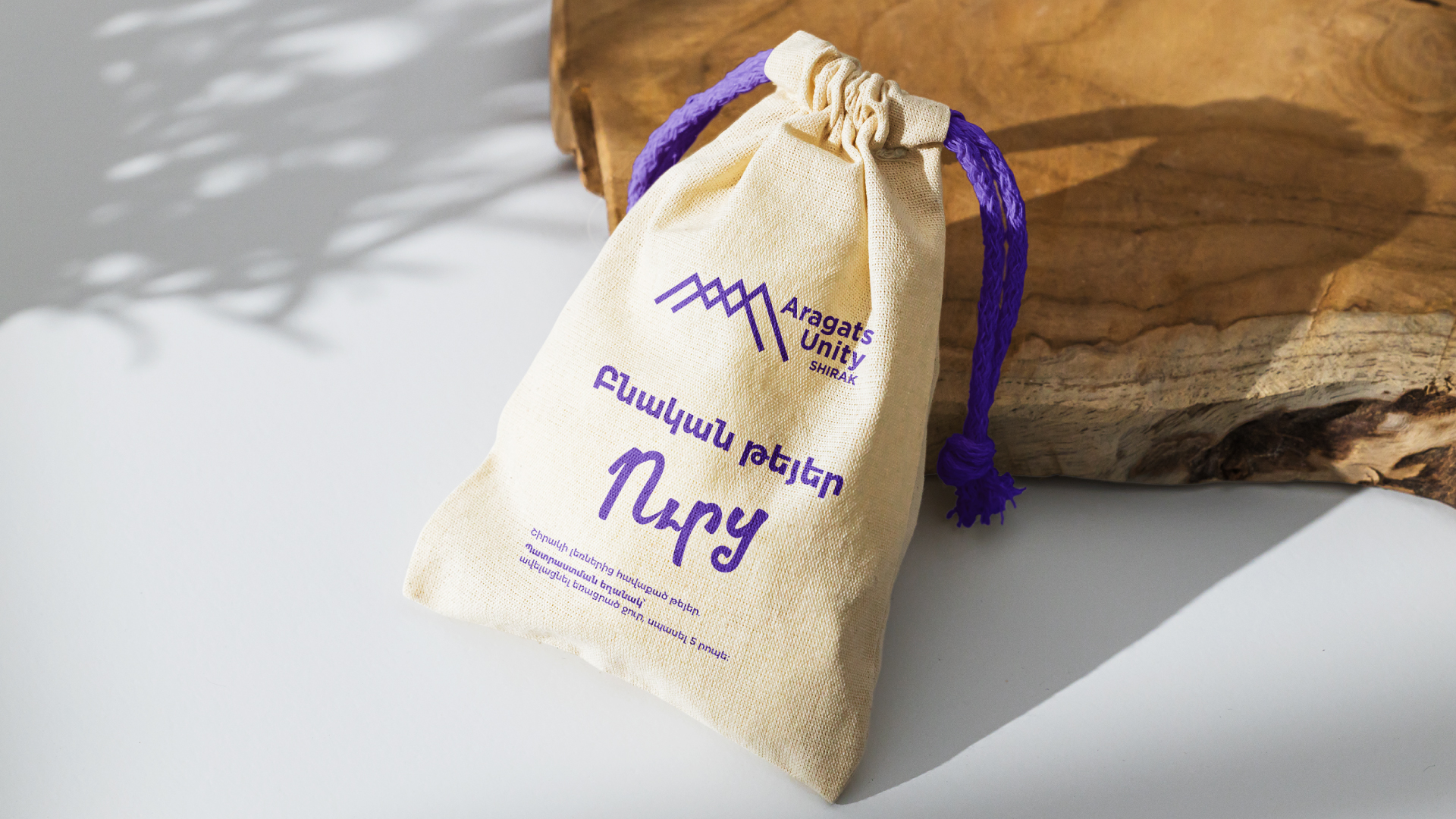
Being the highest peak in Armenia, Aragats is an endless source of inspiration. It is also the basis of the newly launched Aragats Valley branding project. With the logo taken from the sunsets of the mountain and the four peaks' togetherness as the base, the branding created for the local activity groups of Aragats promotes the natural products twisted here.
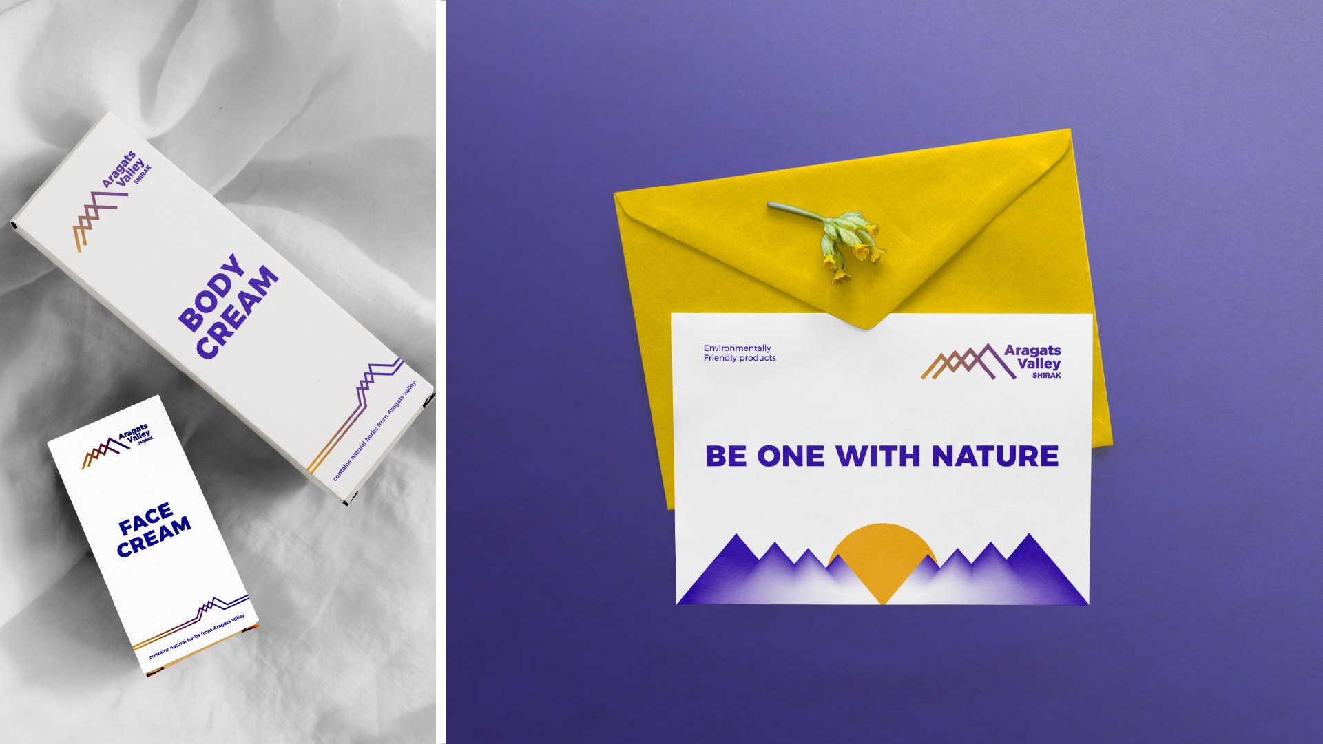
As part of branding, eternity keystone squares are used in different ways, emphasizing different features of products, presenting their benefits and adding style, as well as communicating their quality. The Aragats Valley project is about the four peaks and sunsets of Aragats, devotion to nature and inspiration from it. It is about the new days starting here for millenia.
The Logotype
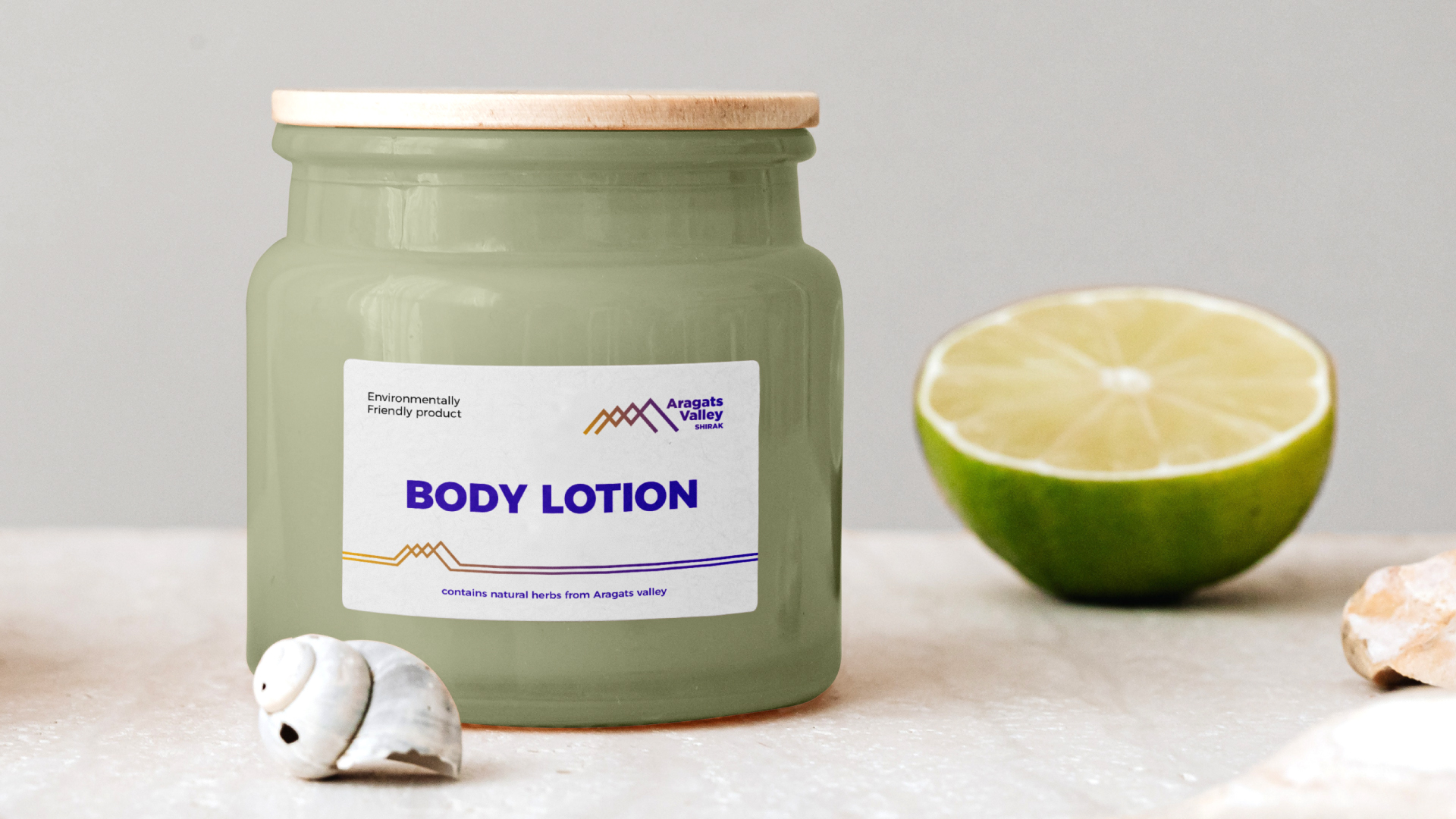
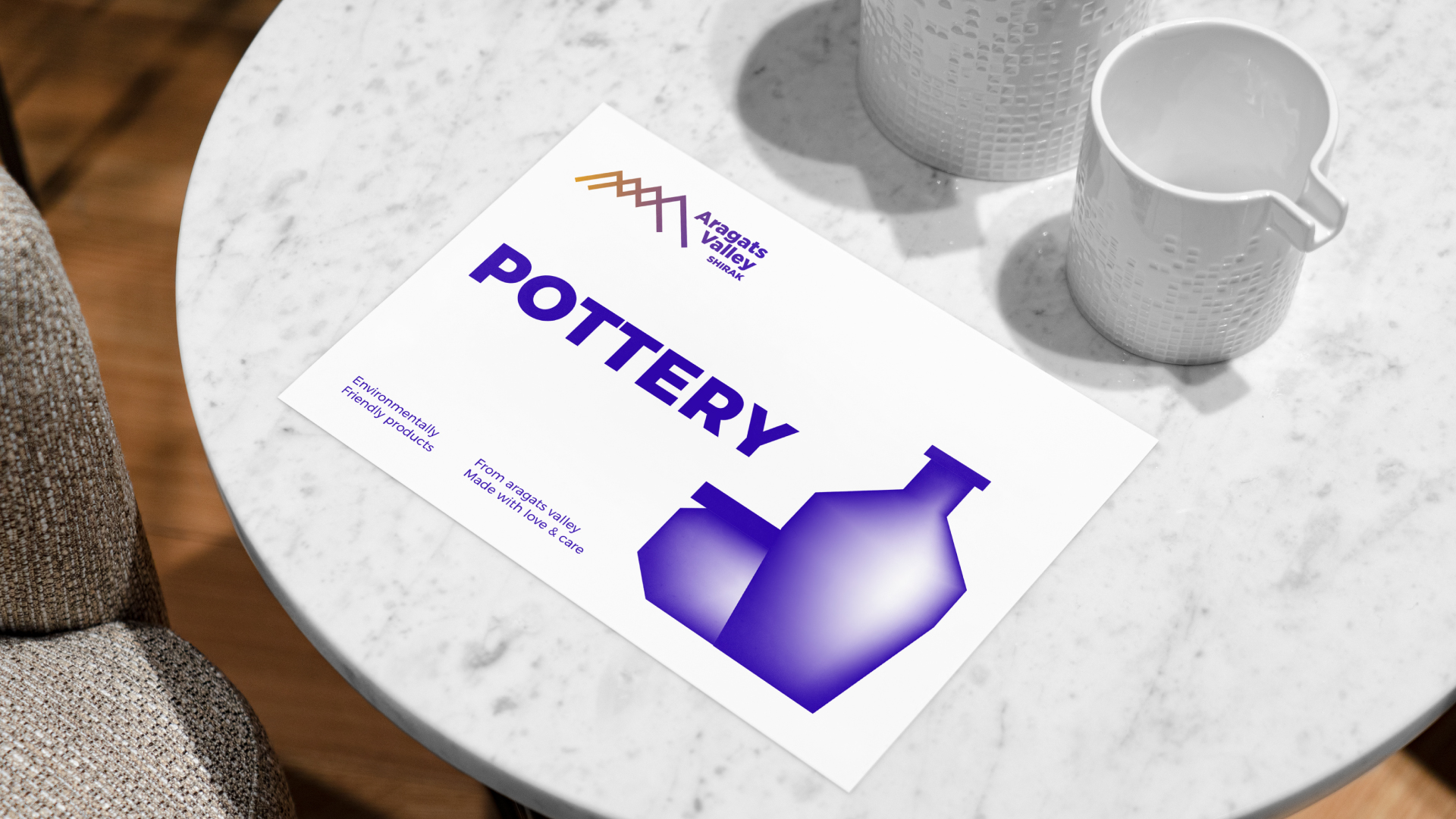
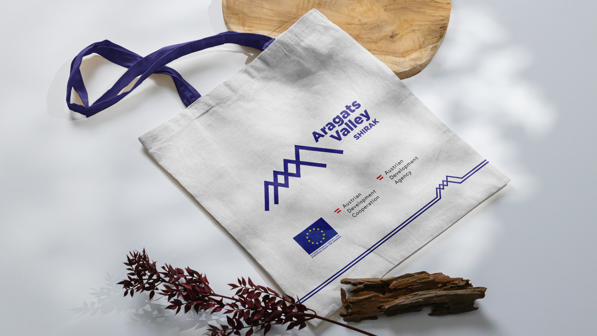
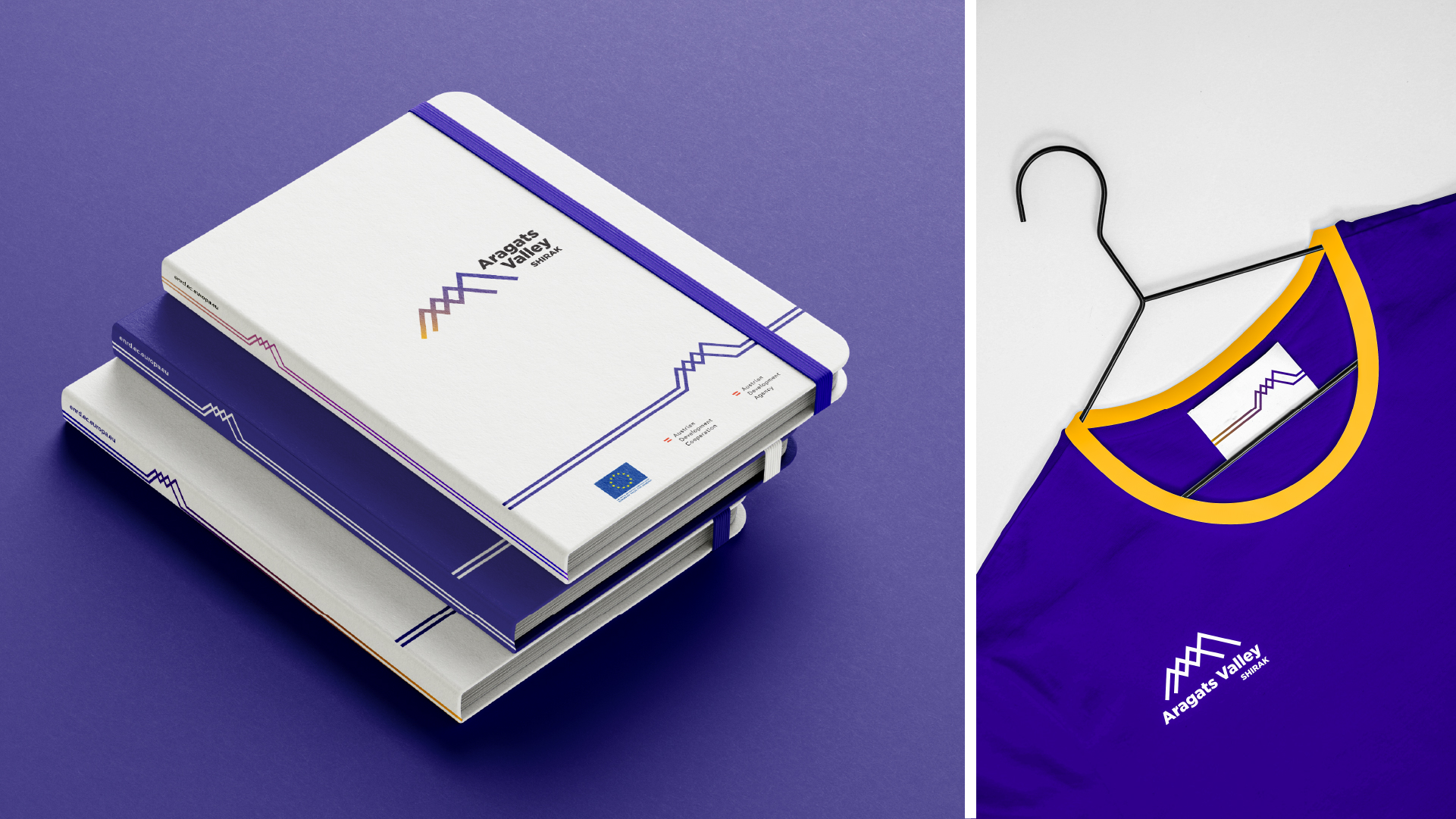
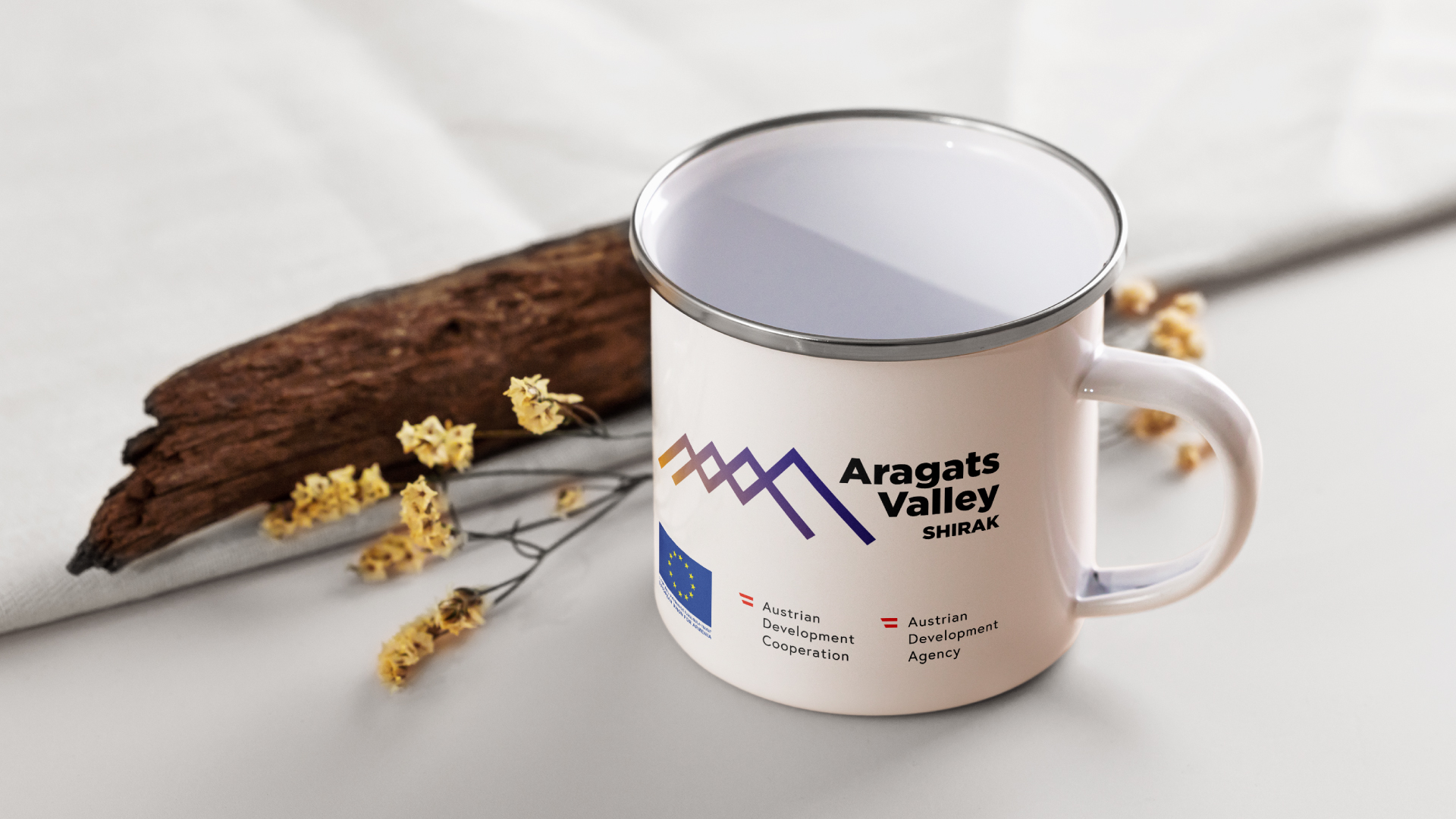
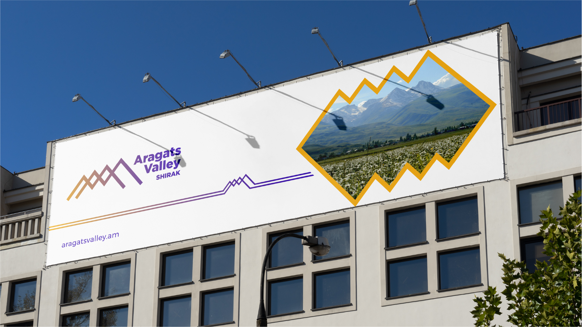
The Aragats Valley logo consists of a symbol and a wordmark and is completed with an identifier. The symbol is a graphic outline of the four peaks of Aragats, with gradually increasing heights, as it is in reality. The wordmark is on the right side of the symbol, in the lower part of which the identifier is presented,
in this case with emphasis on the location. A modification of the logo symbol is also the combination of symmetrical squares, which is used in branding as an element of the brand and aims to emphasize the different properties of the manufactured products and complete the branding.

The Colors
The color gamut imitates the shades of dawns and sunsets of Aragats. The combination of two active colors - deep purple and bright yellow - is presented in a gradient solution in the logo symbol. However, in the
branding of various products, the colors also appear separately, combining with pure white, which is considered a secondary color. The purple represents the depth of connection with nature, while the yellow symbolizes energy.
The Stylized Symbols
Aragats Valley branding uses geometric images: angles, squares and a circle. These symbols are also directly related to nature and the images of Mount Aragats, which are presented on the brand
platform. The symmetrical geometric figures symbolize the perfection of nature and emphasize the naturalness of the products under this brand name, meanwhile mentioning the origin.

- Creative Direction: Eduard Kankanyan
- Project Strategy: Karen Babajanyan
- Project Management: Gayane Margaryan
- Graphic Designer: Shushan Gevorgyan
- 3D and Motion Graphics Vardan Harutyunyan
- Copywrighting Hrachuhi Mirozyan