

A roof that is safe, stable, and modern
What are people really looking for when they want to find their dream home or apartment? In addition to the fact that a roof over one’s head gives a sense of security, it is also a symbol of stability, especially when looking at the sector from the investment perspective. We wanted to convey these emotions when launching the branding project for Red Invest.
Meanwhile, the company's "lightness" in communication and modernity were mandatory component of the brand identity. Thus, we crafted the branding of the company with a combination of classical and modern, conveying to future customers the working principles of the company: safety, stability, with modern and innovative approaches.
The Challenge
The main challenge of the Red Invest project was to find such branding solutions to convey stability, solidity and classicism, while avoiding having the "heaviness" of concrete. The branding should be modern and unimpeded.
This is especially important for businesses in the real estate industry, where it is necessary to pay special attention to the expectations of the target market and meet them, especially through branding.

The Solution
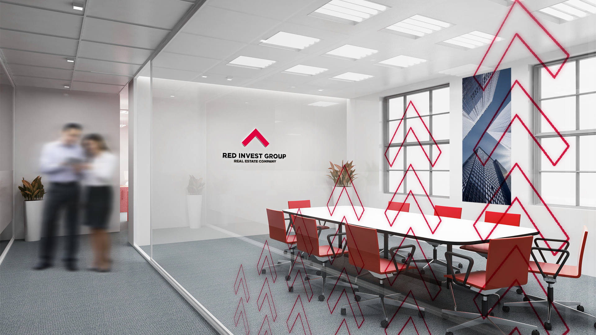
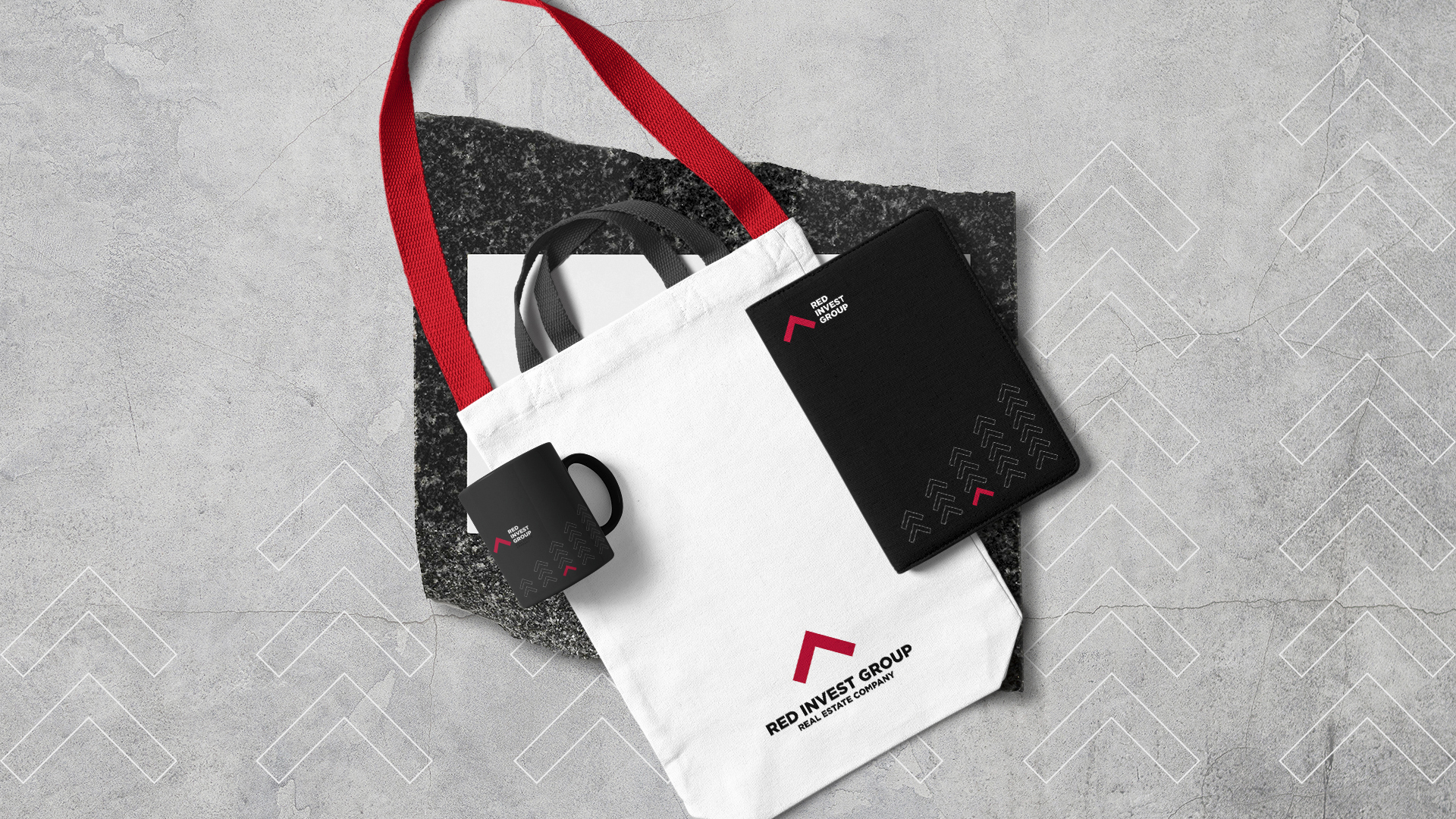
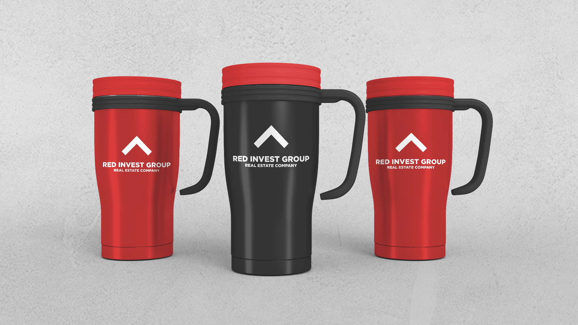
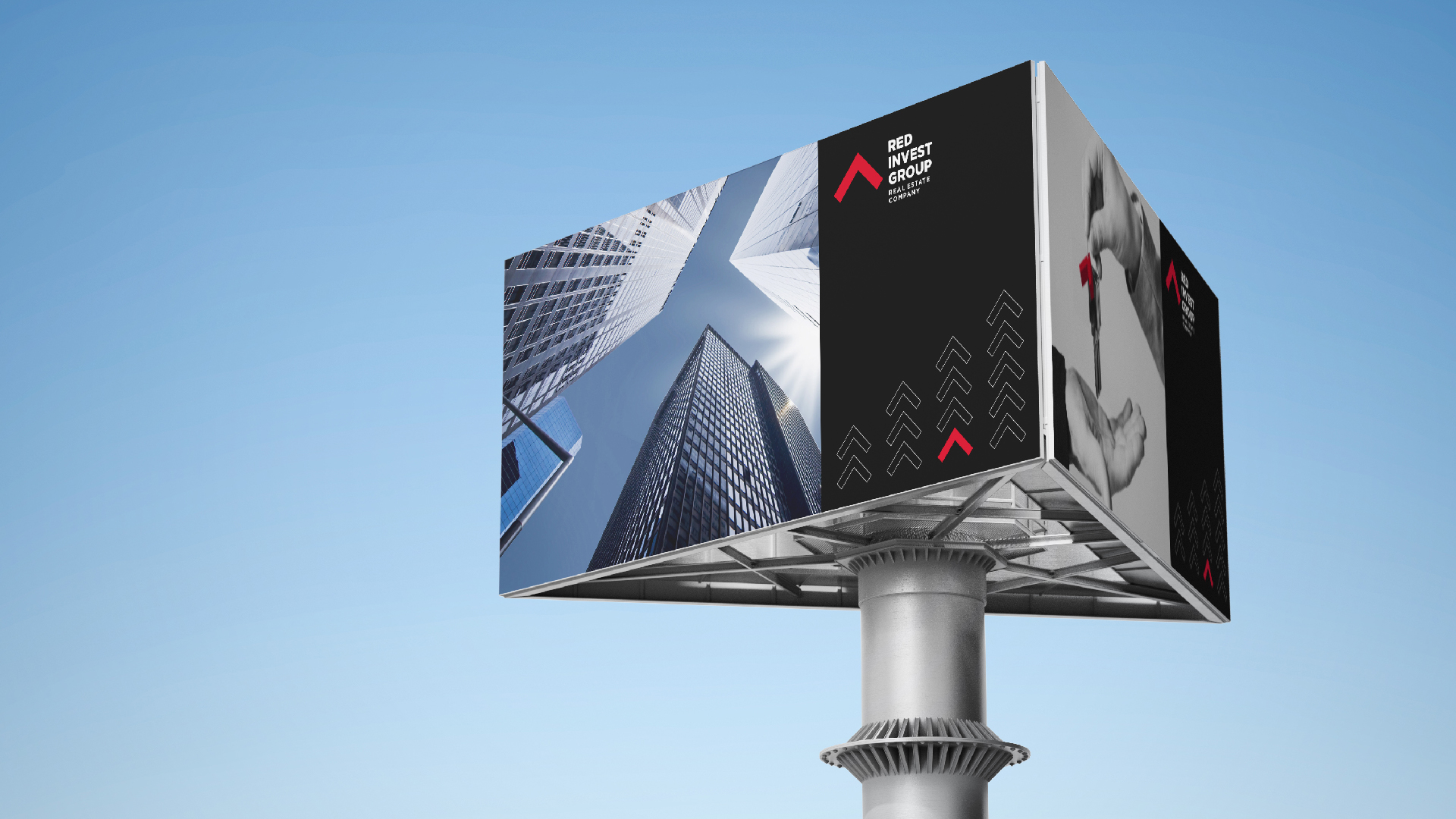
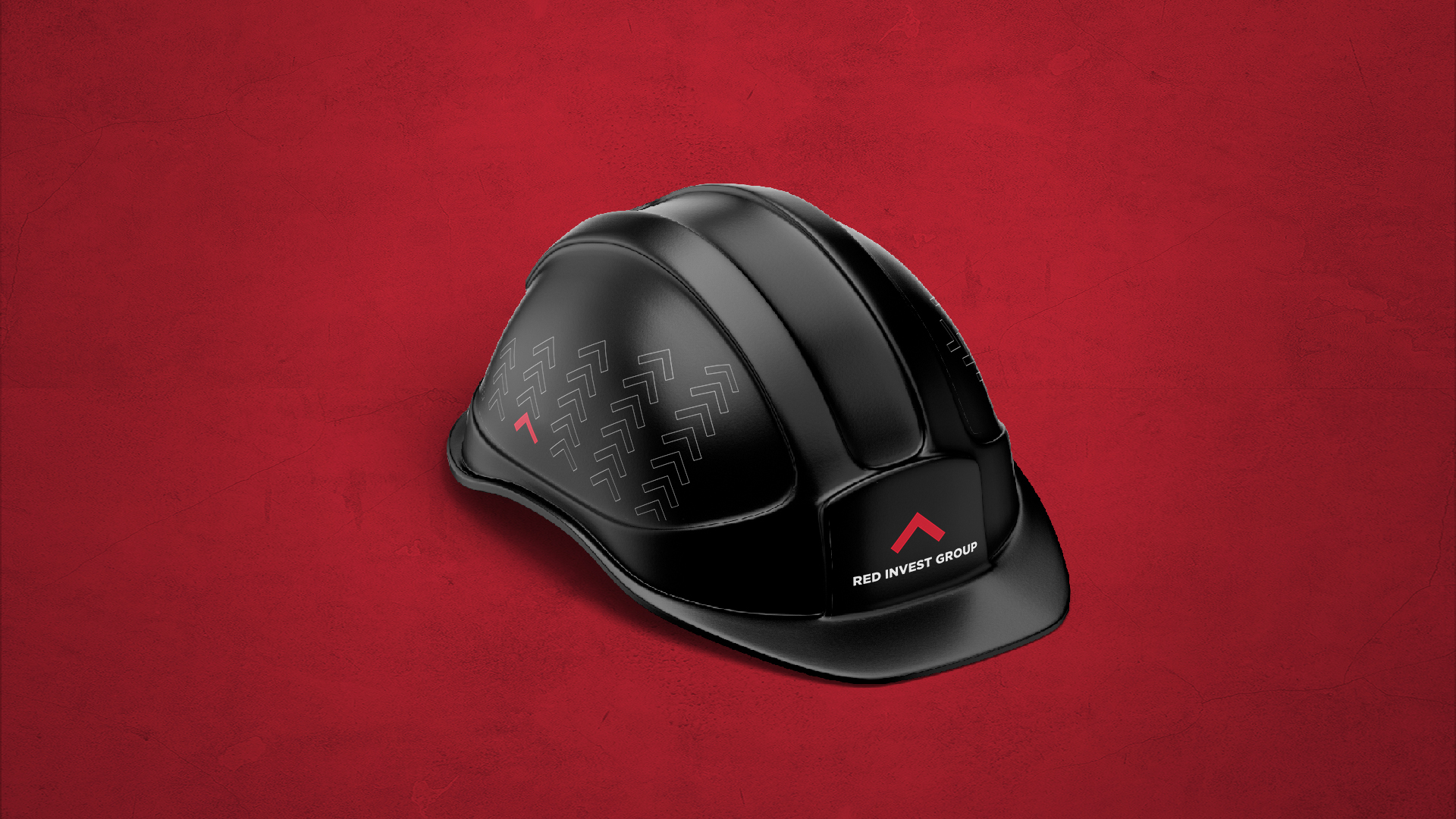
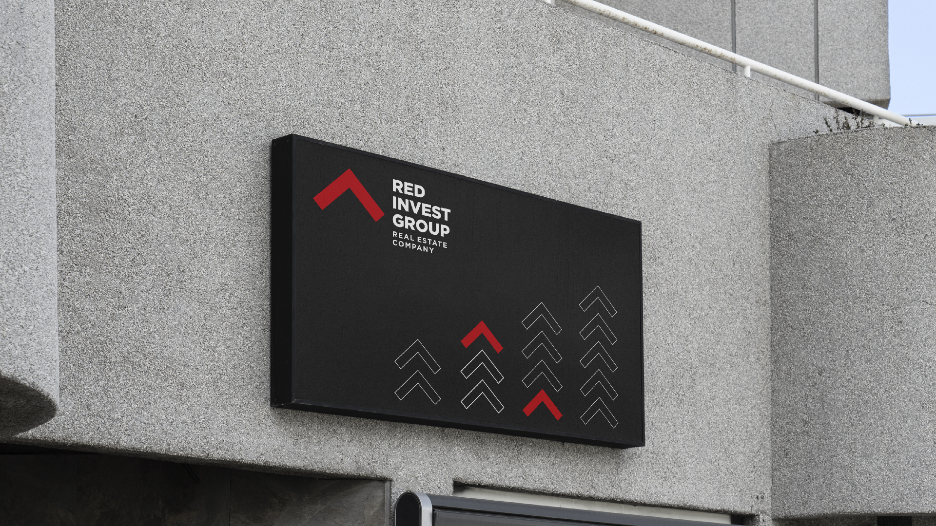
In the case of Red Invest, the "pulling" color was obvious from the naming. Focusing on the classical black-red color palette, we conveyed sustainability. We have used the stylized image of the roof, which is the symbol of
the logo, being used also as an arrow, emphasizing the trend towards the future. Through the simplicity of the color palette and forms, we communicated stability, closeness, and modernity.
The Logotype
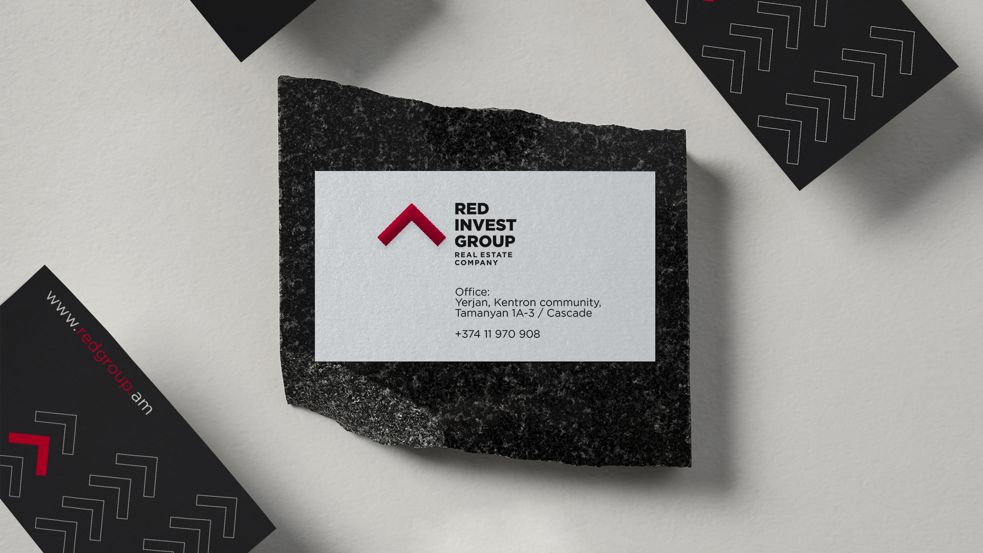
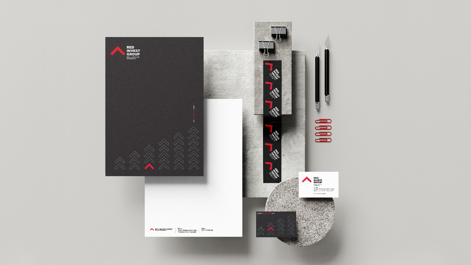
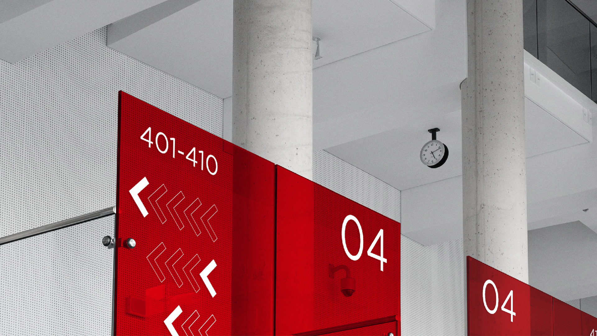
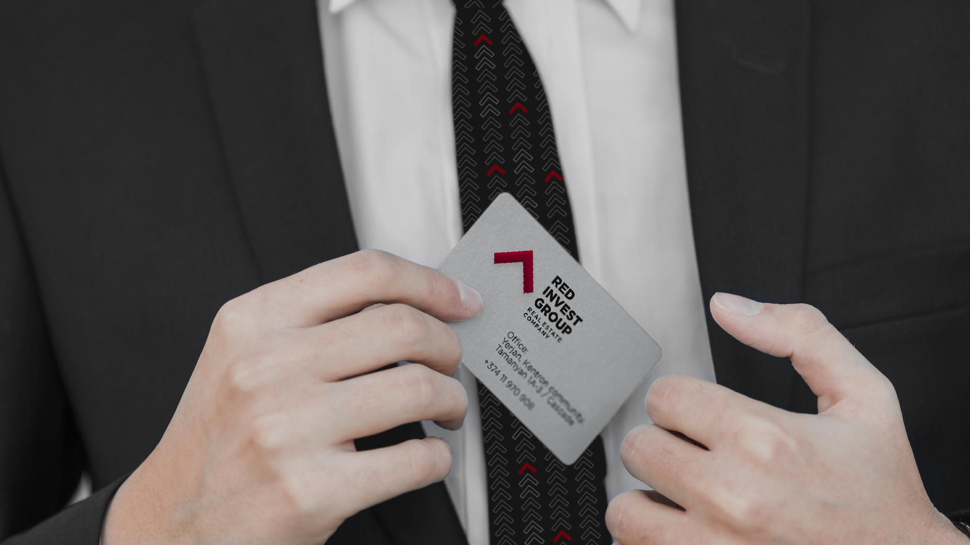
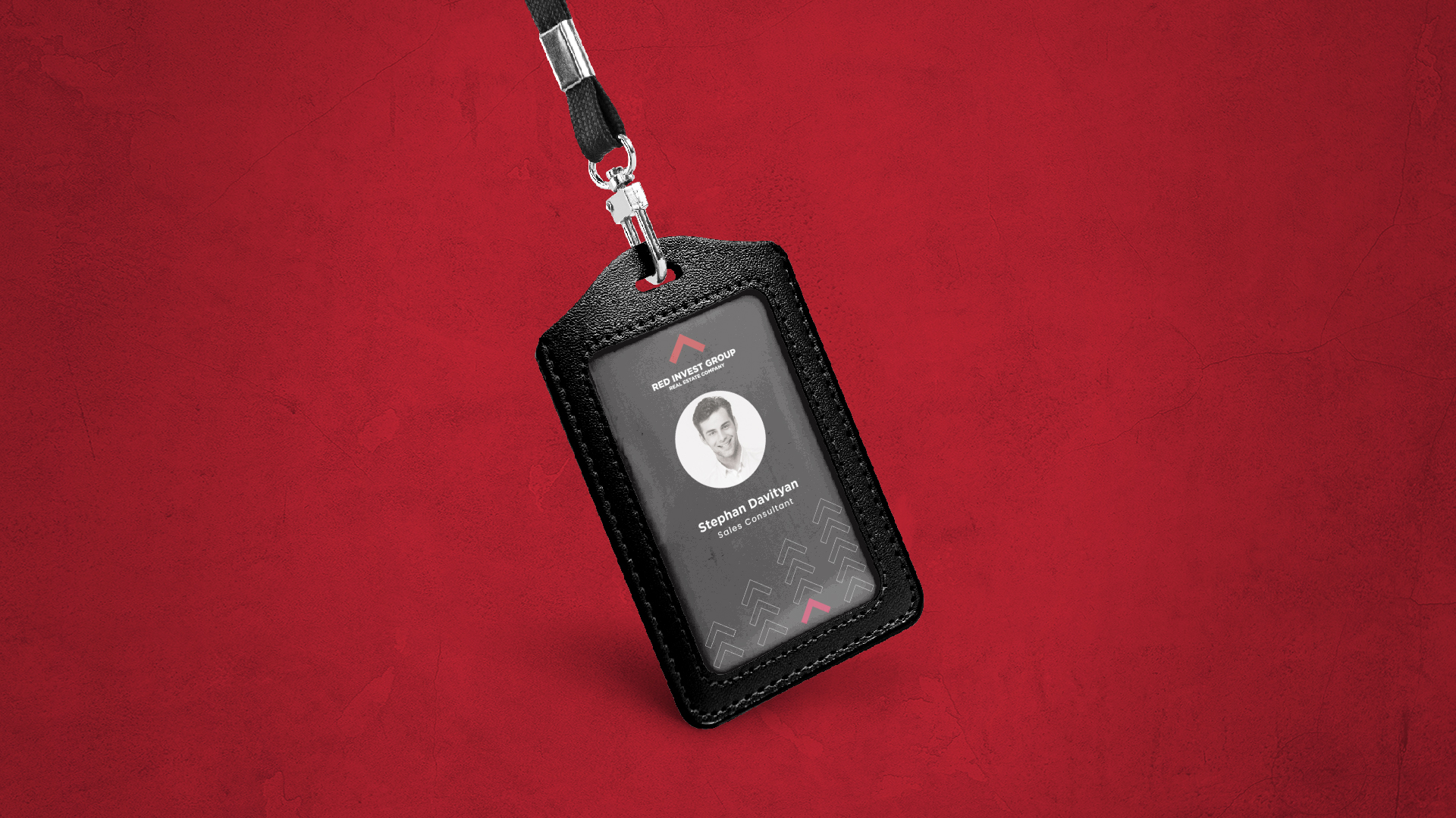
The symbol is positioned on the left side of the logo, demonstrating the idea of a roof. To the right of it the name of the organization is presented, and in the lower line is the identifier. The symbol is colored bright red, while the black is used for the fonts.
The applied sharp fonts repeat the straight angle of the roof. There are two forms of logo application: vertical, which is the primary one, and square, which is secondary. The logo symbol is also used separately as a brand element.

The Colors
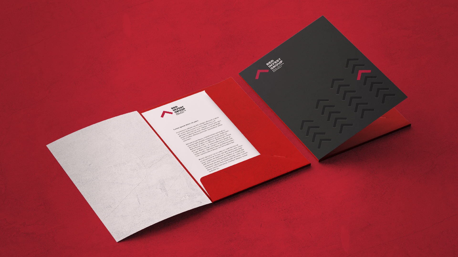
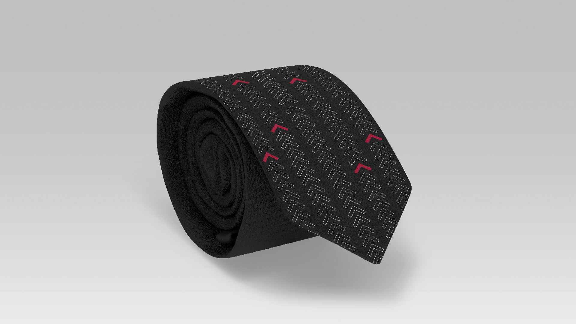
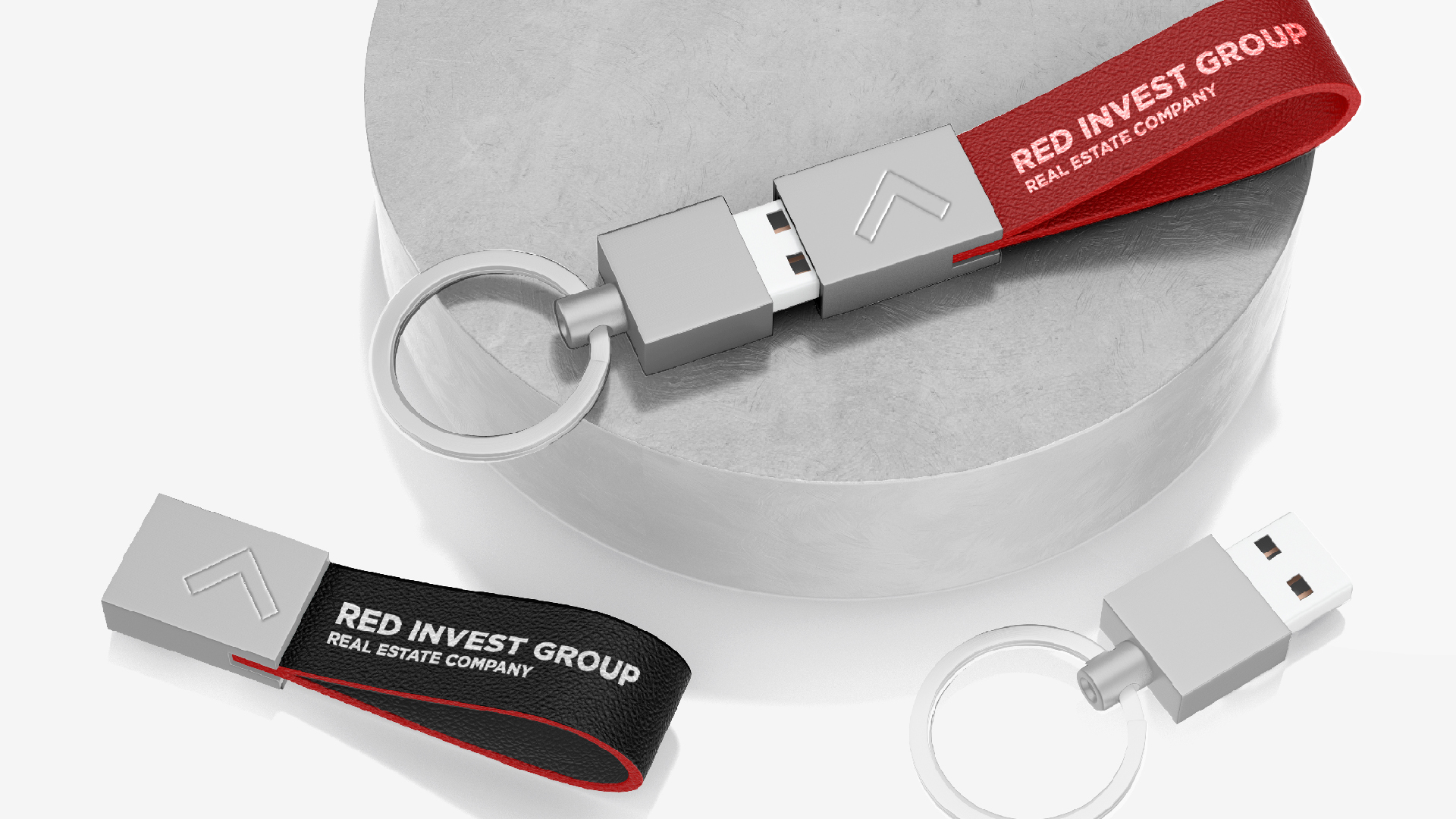
Since it was necessary to convey a sense of stability, the classical black-red combination is used. As a substitute for black, white can also be applied.
The combination of these colors allows a wide range of applications, as a result of which the need for a monochrome logo is abridged.
- Creative Direction: Eduard Kankanyan
- Branding Director: Karen Babajanyan
- Project Management: Gayane Margaryan
- Graphic Designers: Arlin Vartanian
- Motion Designer: Lilit Avetisyan
- Copywrighting: Hrachuhi Mirozyan