A Simple Divine Delight
At Pomona every customer feels a bit divine. The new Pomona, the Roman goddess of fruitful abundance, is born in this cafe in Los Angeles, where a great environment meets the ideal coffee. In this branding project we convey the lively, positive atmosphere of the cafe through the active colors and branding solutions.


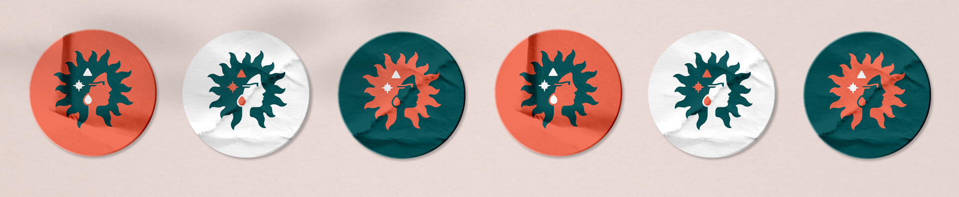
The Logotype
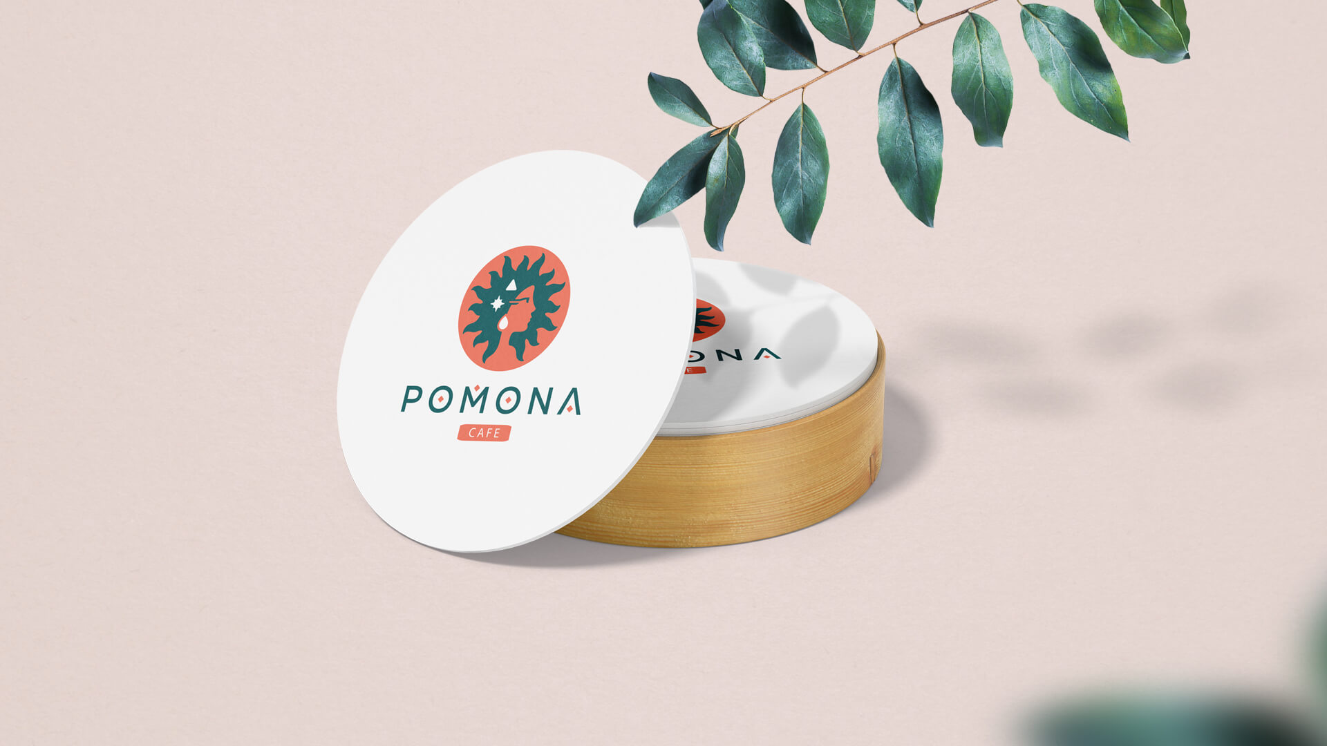
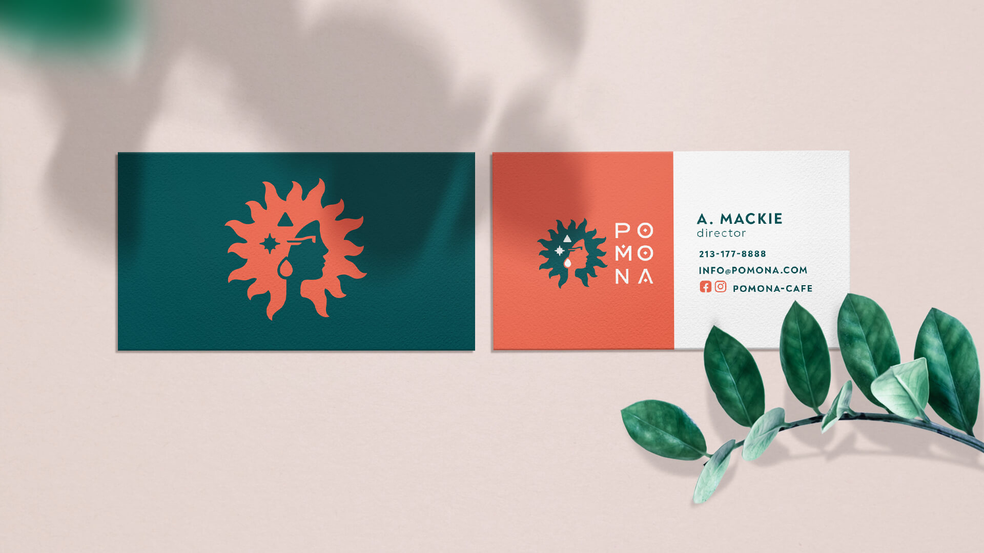
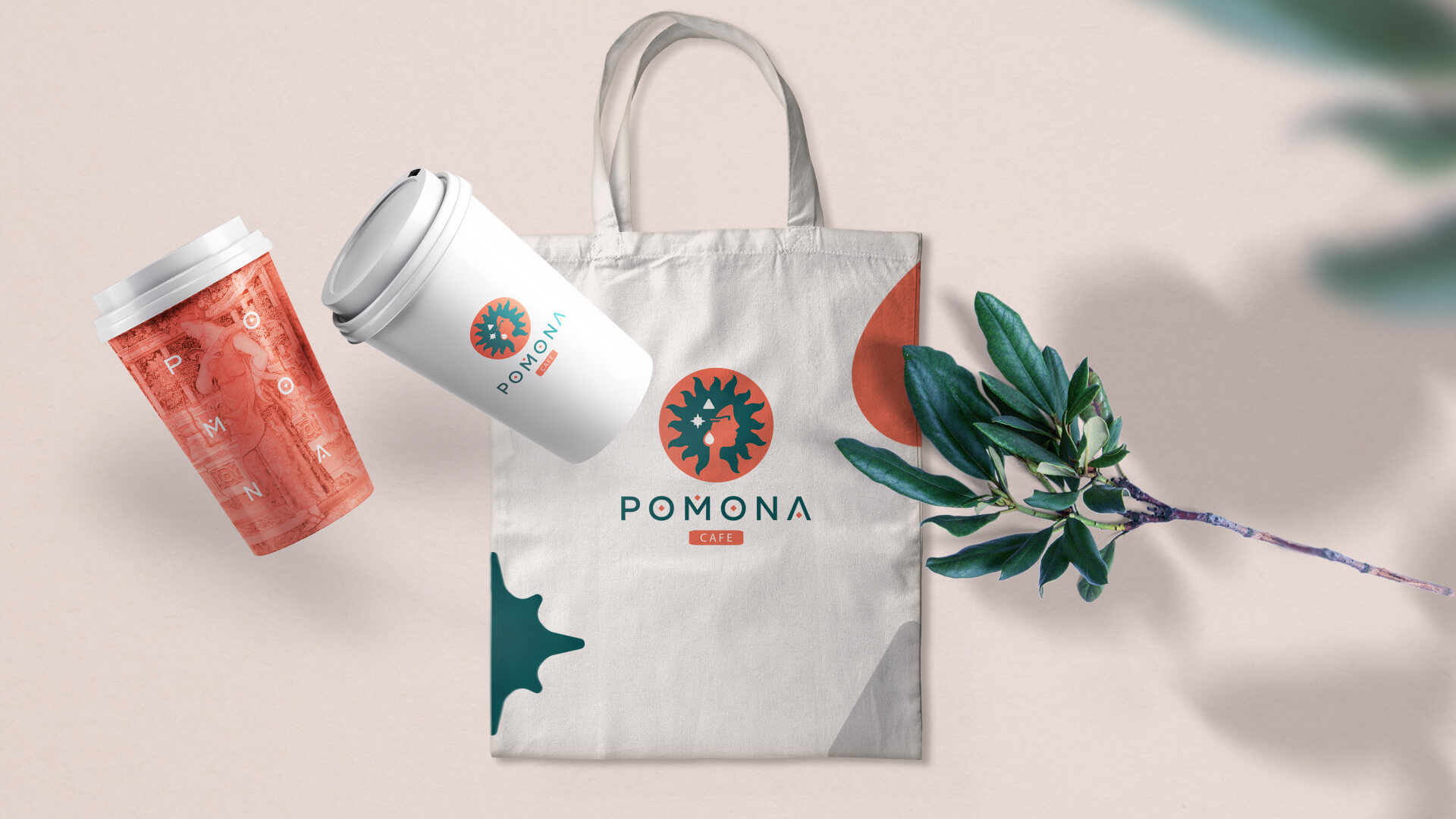
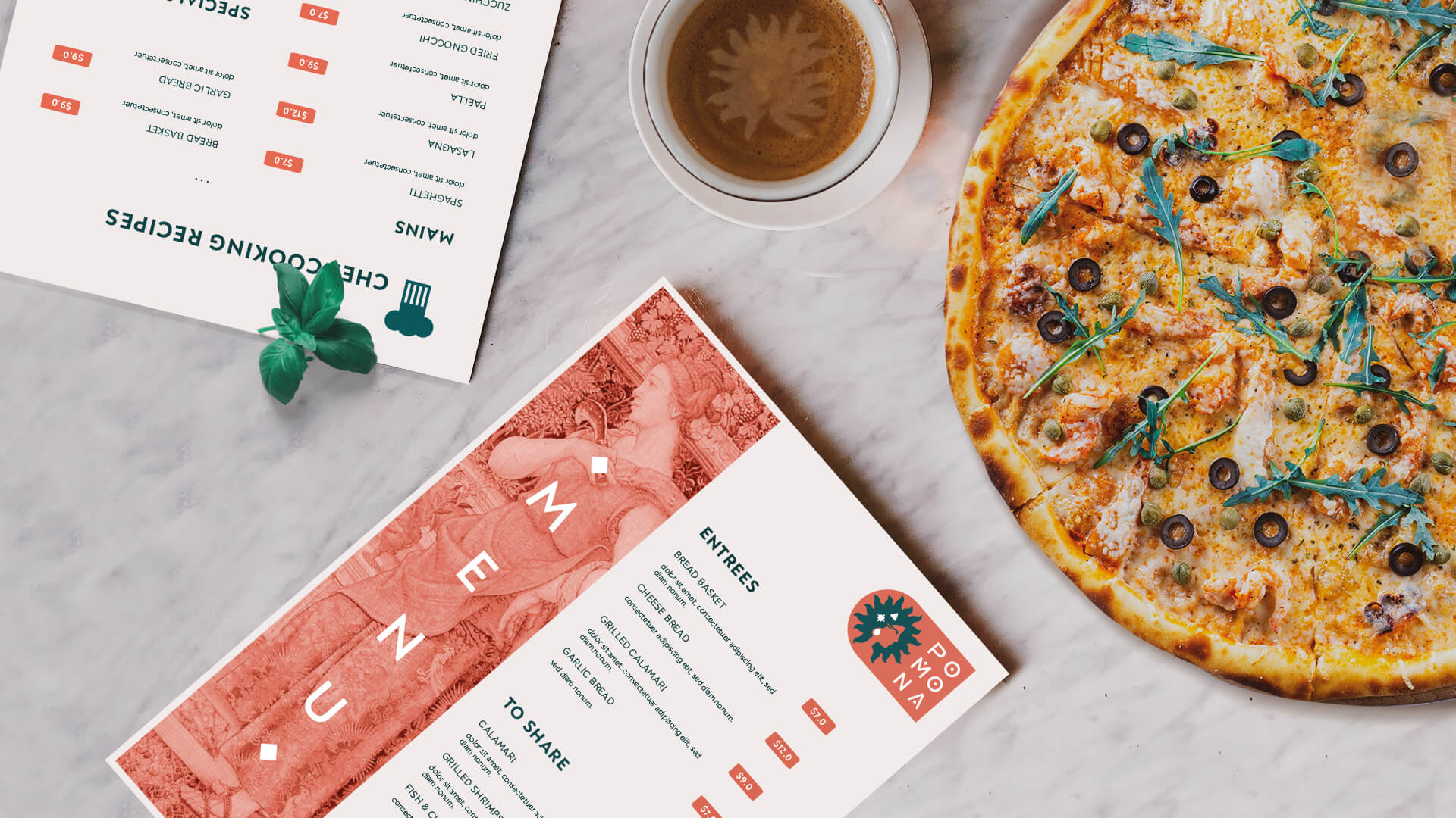
The logo consists of a woman's image and name accompanied by an industry-specific identifier. The symbol is a graphic representation of the goddess Pomona.
Of particular importance are the symbols used in the symbol and the wordmark, which symbolize abundance: soil, sun and water. The wordmark is only in capital letters, which emphasizes the Roman nature of the name.

Style and Aesthetics
The bright image of Pomona was expressed in every detail of the brand. Colors - terracotta and muted dark green - were used to convey youth and dynamism. The symbols that are the basis of the brand's aesthetics, the image of the Roman goddess, combined with the colors, create the brand's lively and dynamic character.


- Creative Direction: Eduard Kankanyan
- Branding Director: Karen Babajanyan
- Project Management: Gayane Margaryan
- Graphic Designer: Sen Olqinyan
- Graphic Designer: Anush Ghandilyan
- Motion Designer: Vardan Harutyunyan