Park Bridge Branding
- Country: Armenia
- Year: 2022
- Industry: HoReCa
- Service: Brand Concept, Logo, Identity Design
- Client: Park Bridge
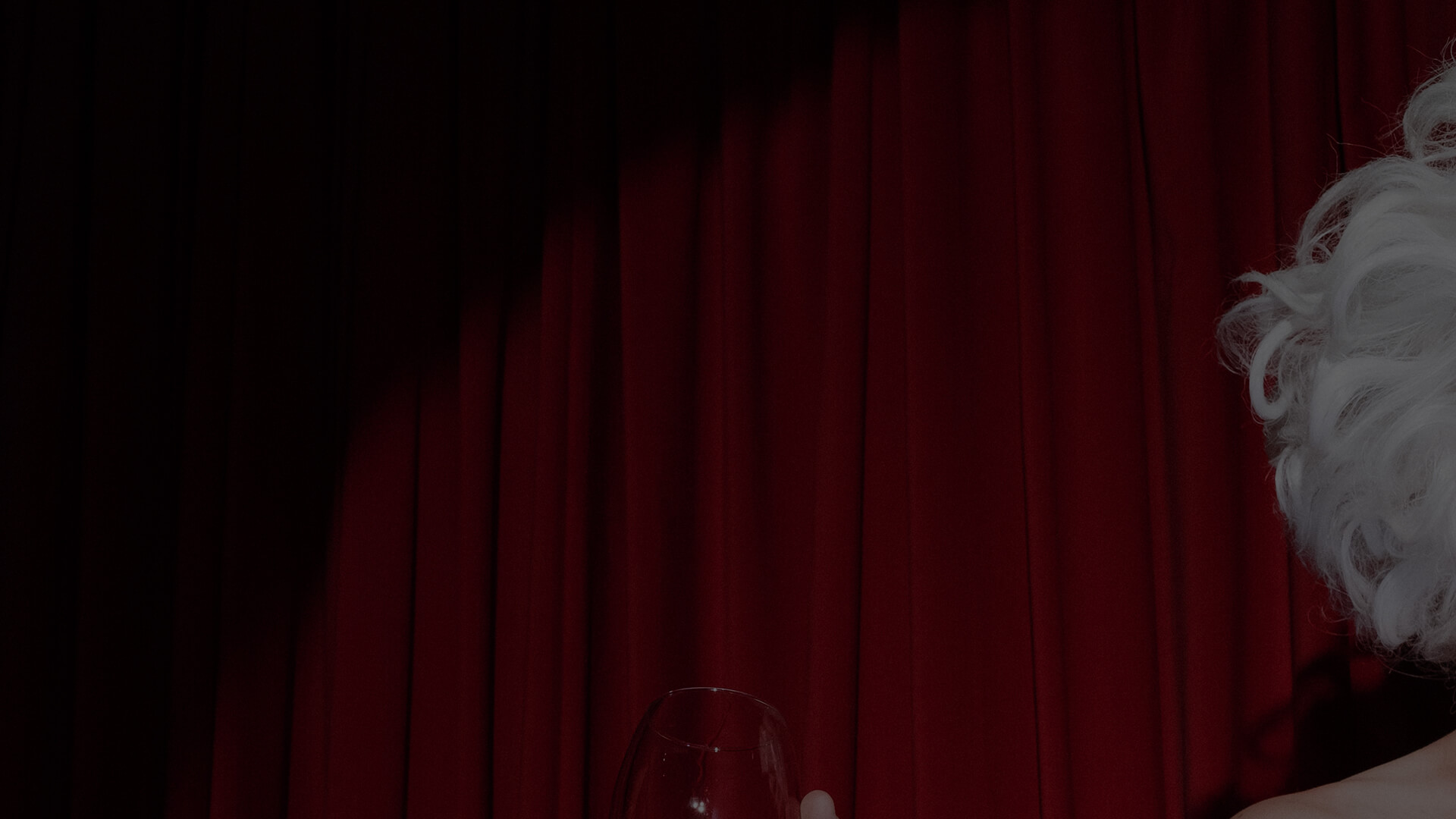
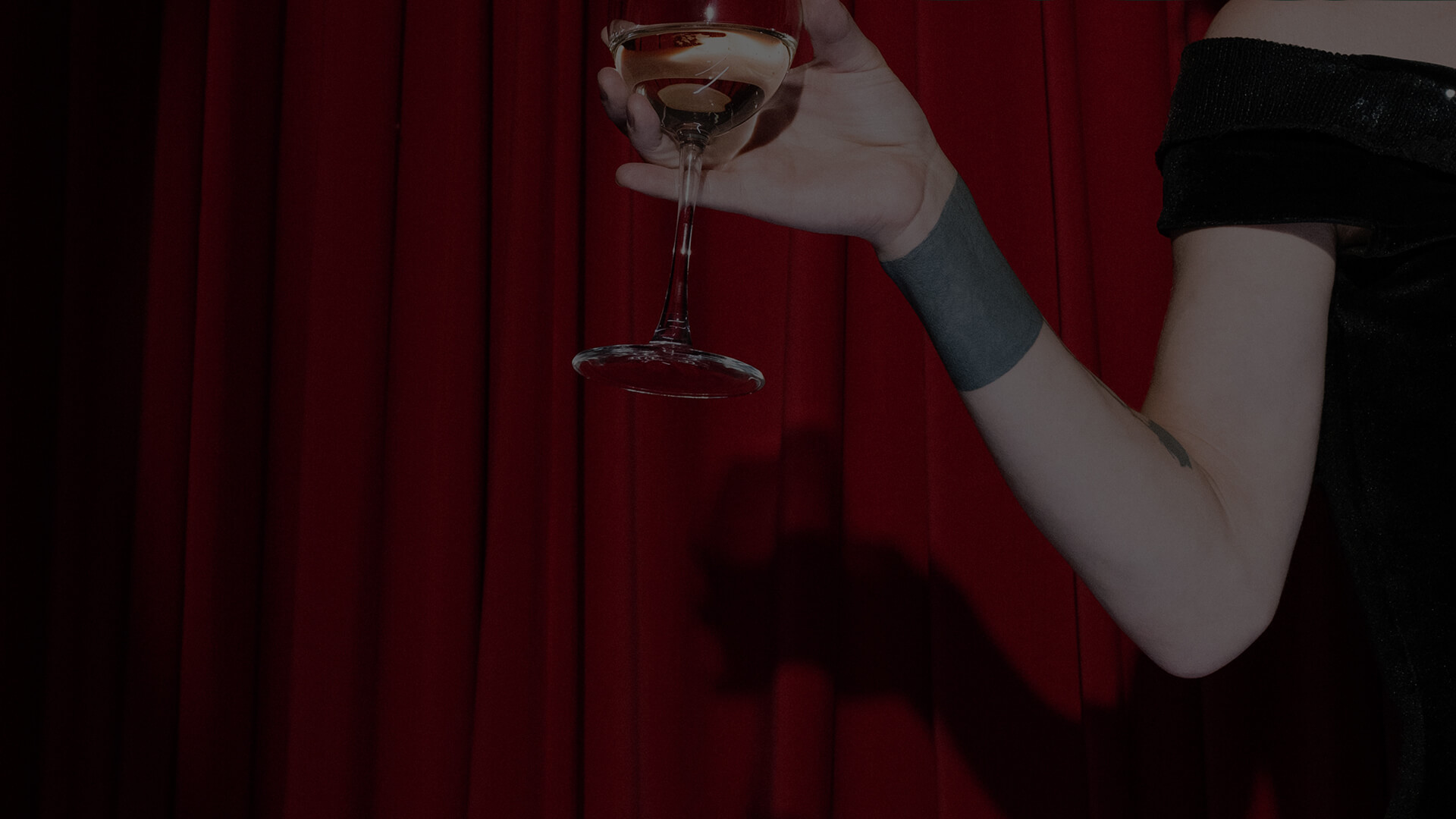
Sounds and Calm of the leisure
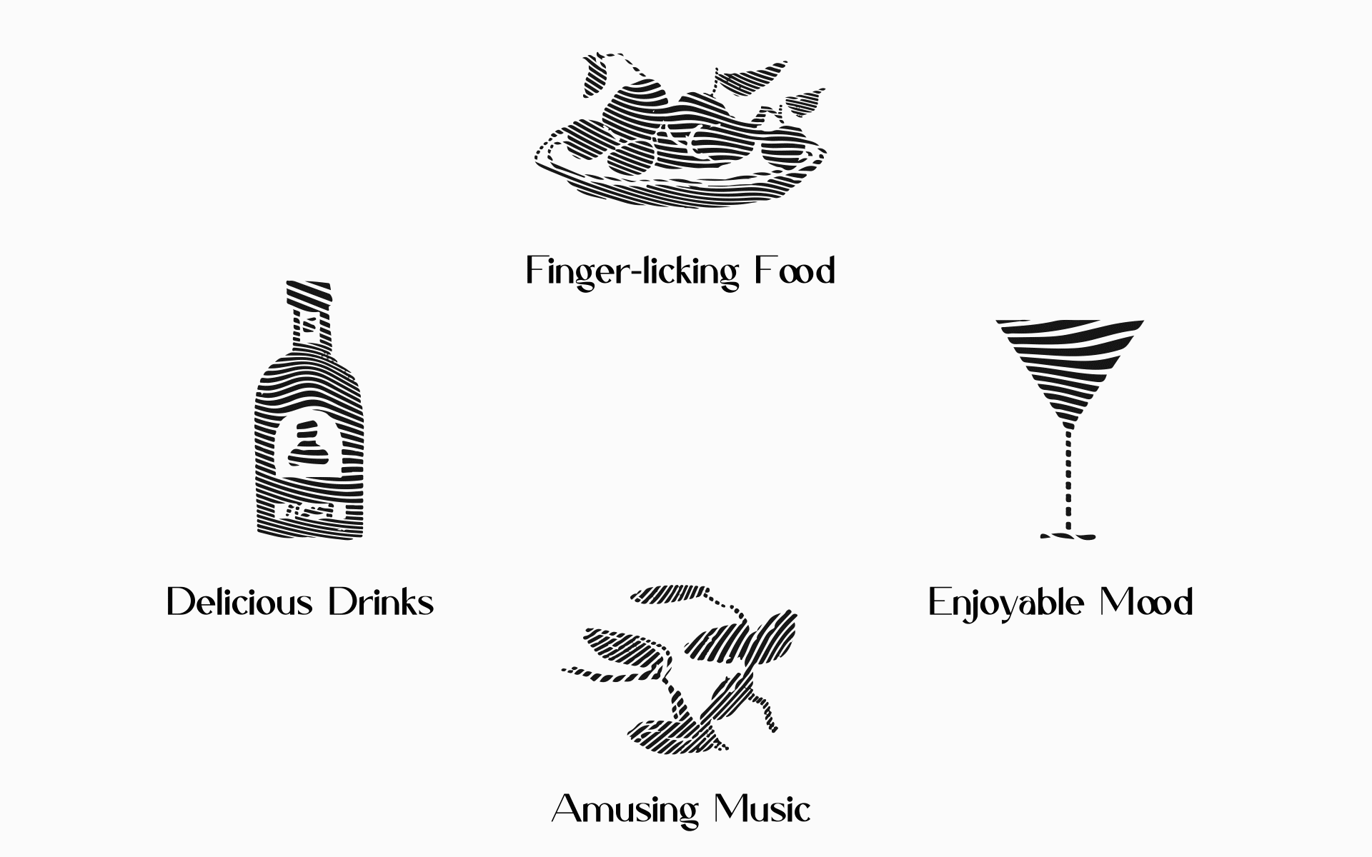
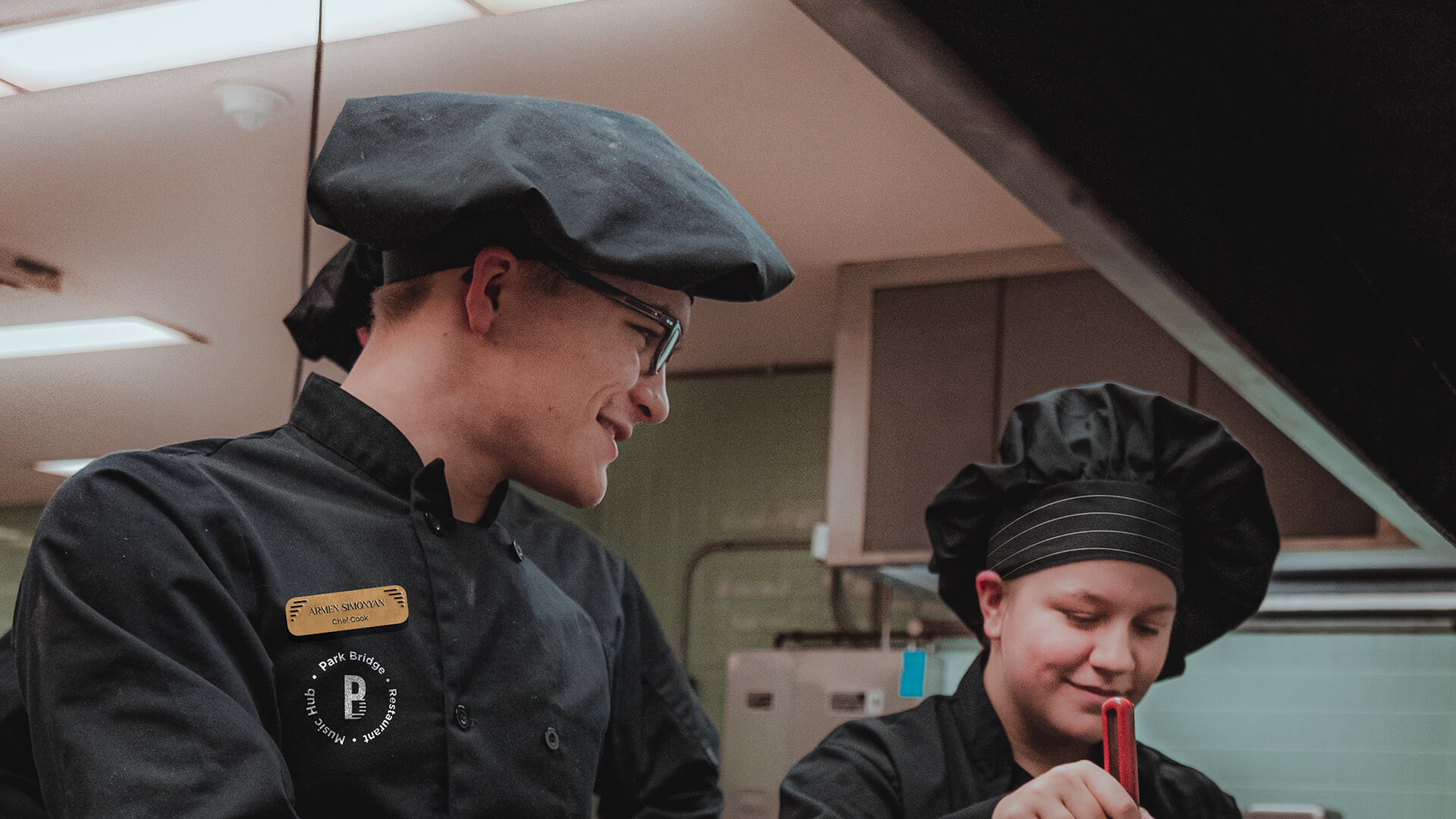
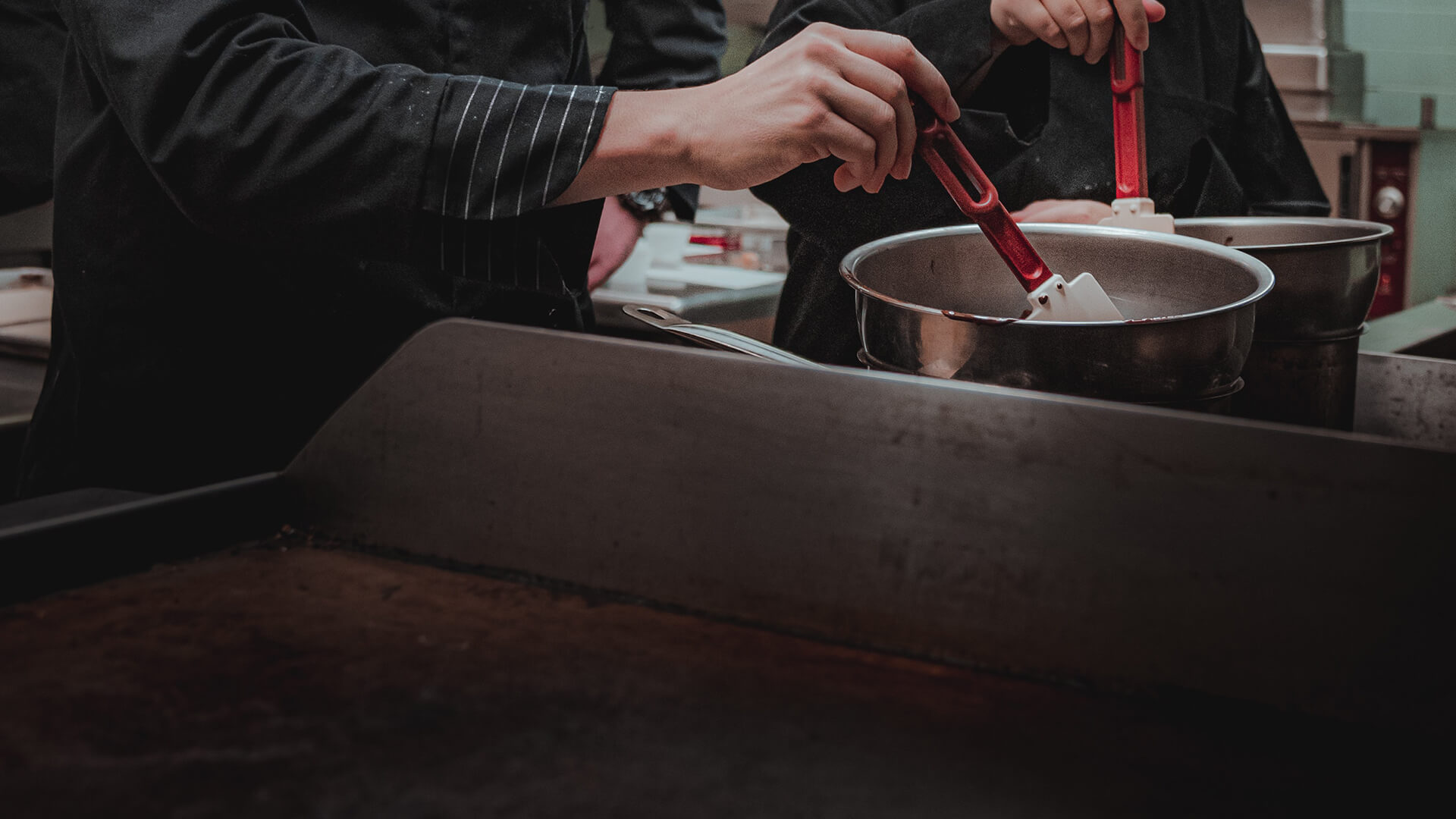
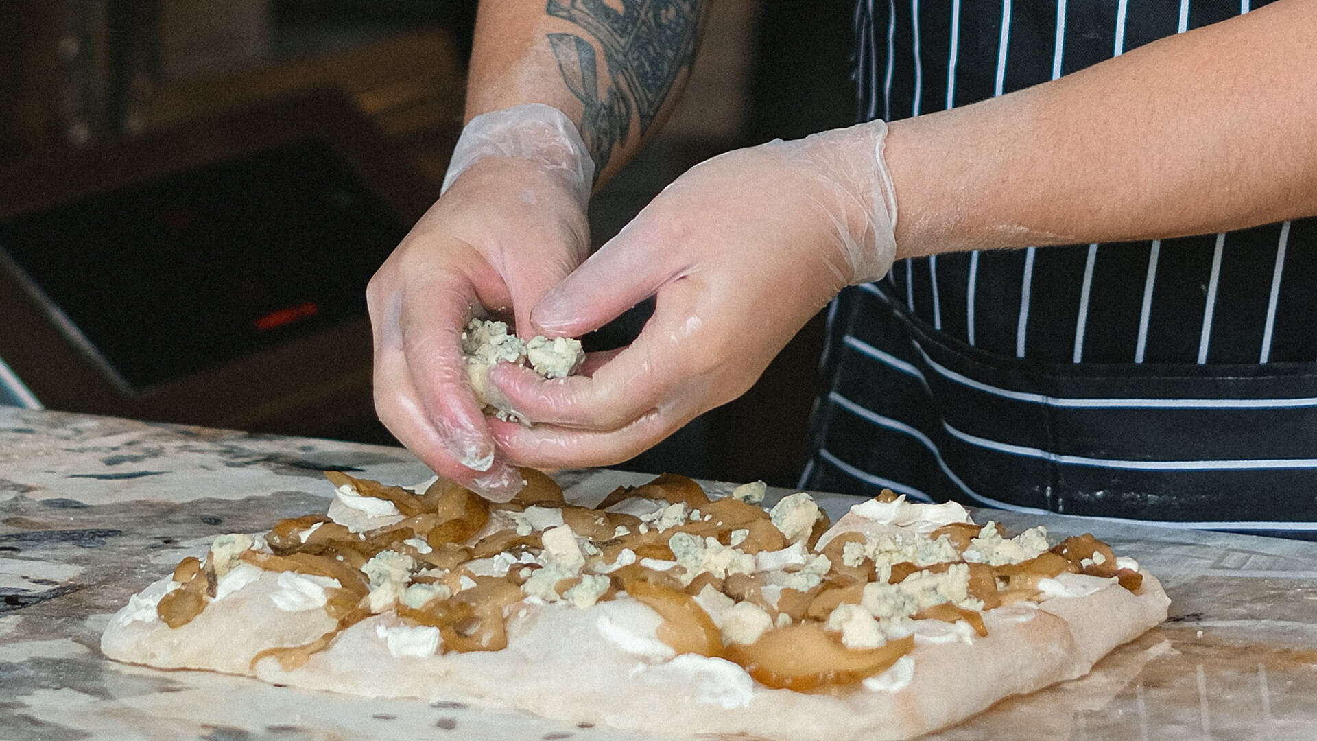
Park Bridge is a center for perfect leisure located in the woodiest place in the capital Yerevan. The complex includes various sections and combines the advantages of a restaurant and a music hall. Park Bridge is a long famous location for various events. It welcomes its guests and presents the best fusion of Armenian hospitality, international standards, and the tastiest cuisine.
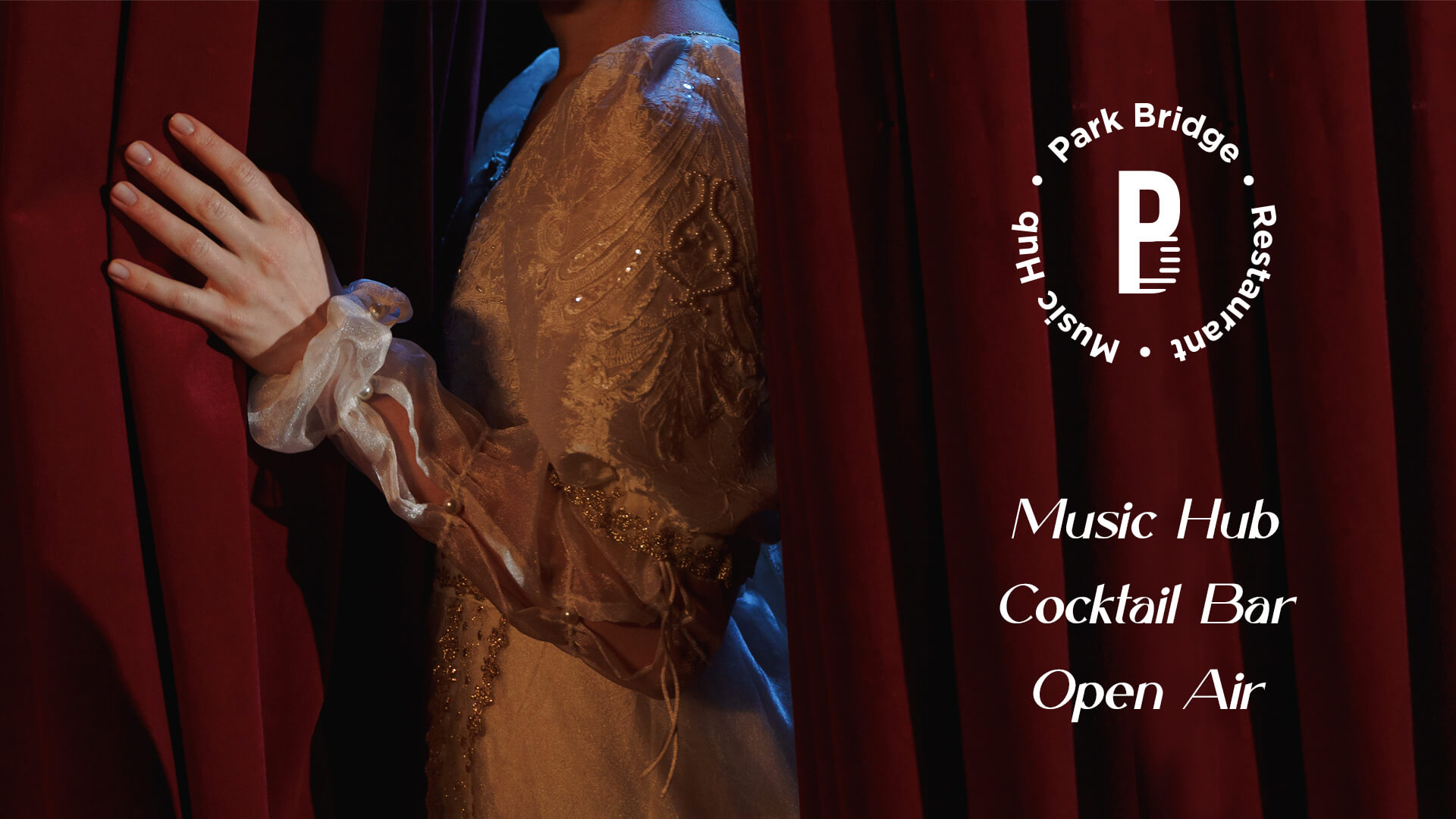
The branding of the company represents the peaceful and calm atmosphere of the venue. The bridge that is the most famous in the city is the base for the branding as the mention of the location
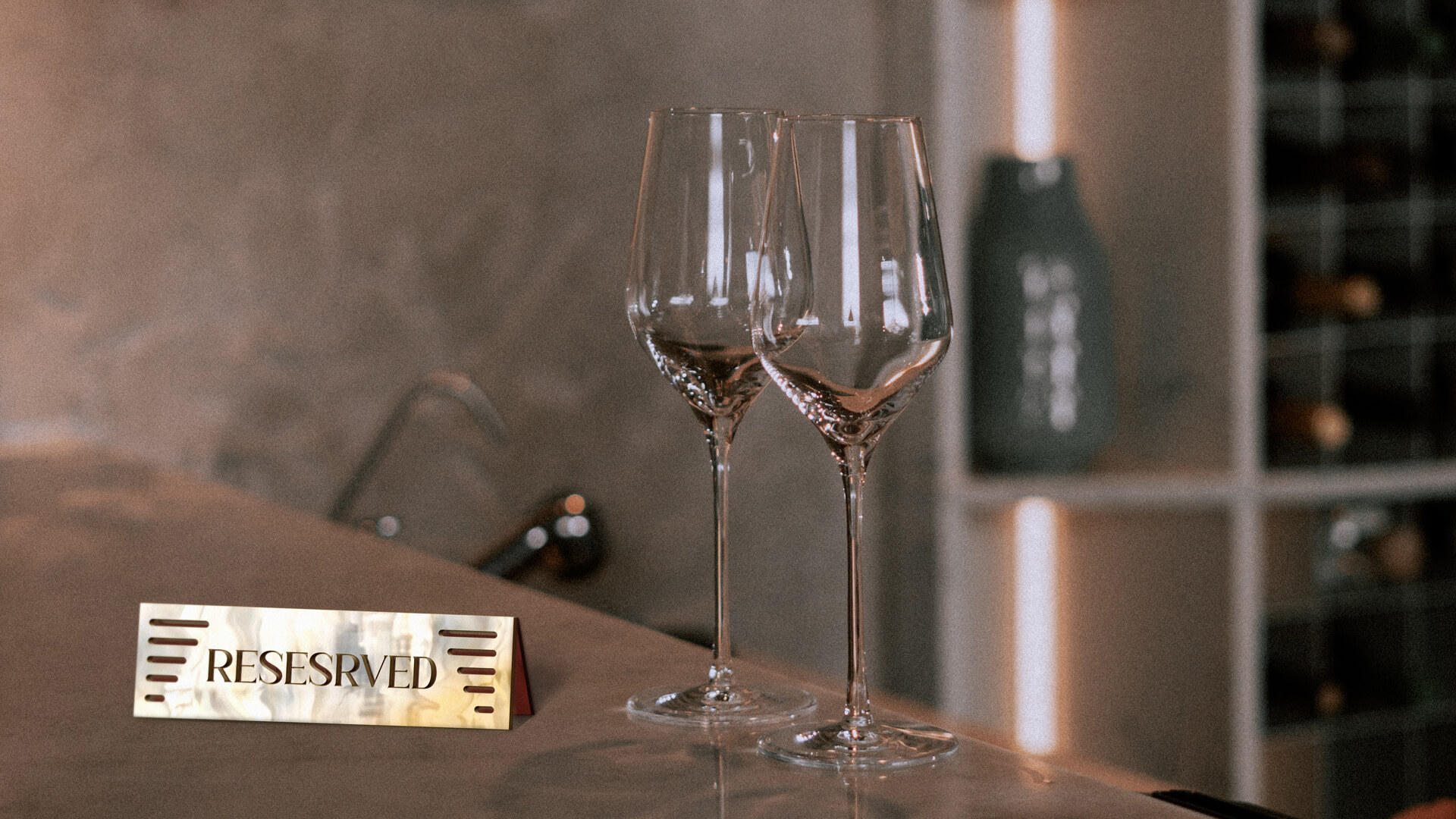
The Challenge
The branding should demonstrate the style, quality and ideology of the business, while presenting a warm and intimate atmosphere. It was also necessary to emphasize the location, to present the bridge, but above all to convey the uniqueness of the environment and approaches through the brand.
The Solution
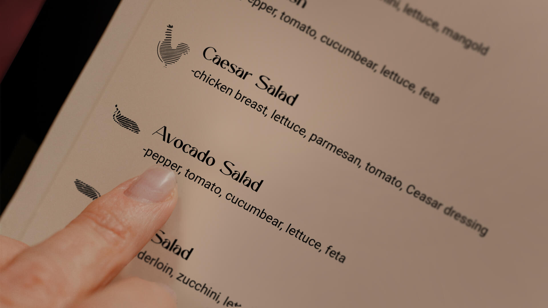
The solution to was demonstrated by the simple graphic solutions in the logo: the bridge and the lines in its image, which clearly are presented in the branding in all its manifestations, using simple lines. Meanwhile, the color palette became the source of the main messages of the brand: environment, approaches.
.jpg)
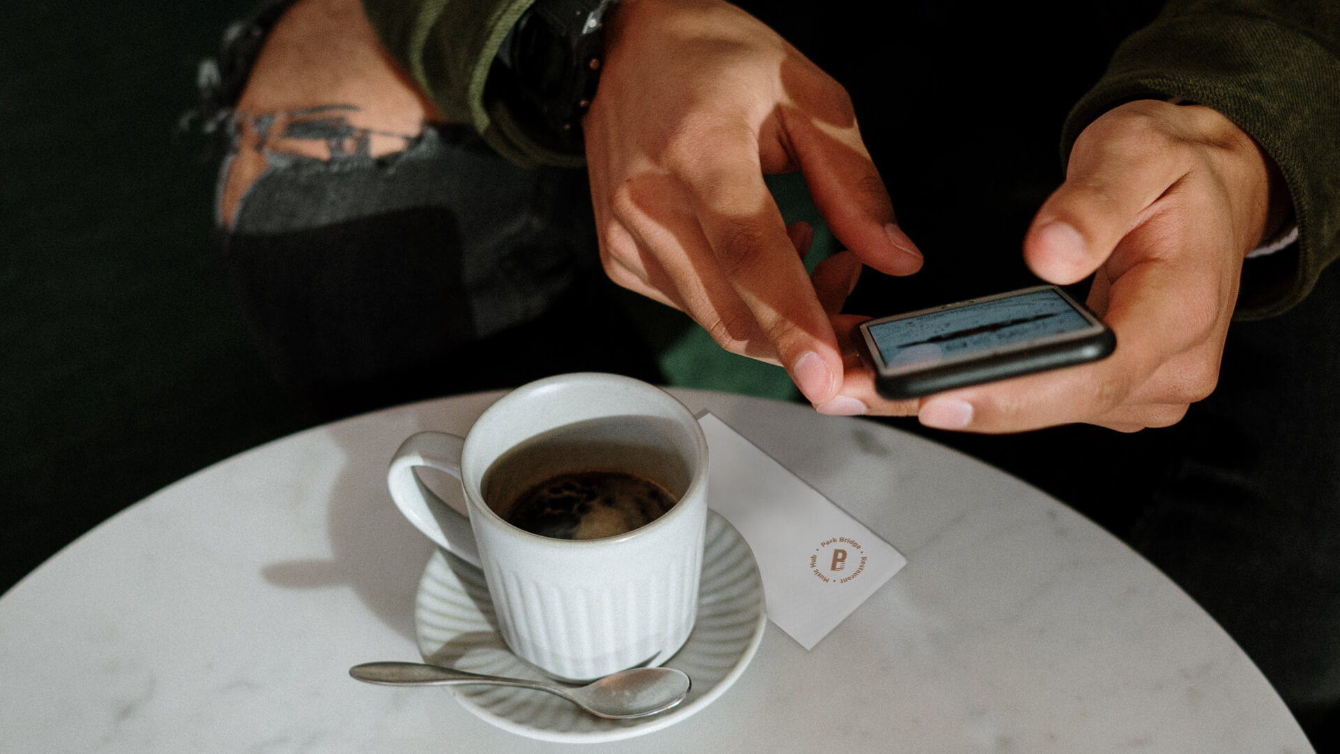
Color palette
In creating the brand, we paid special attention to the color palette, including dark, deep blue, cherry burgundy, dark blue-grey, and gold. Each of these is a symbol of style, status and quality.
The colors are harmoniously used in various stylistic solutions and make the branding complete and consistent with the brand platform, where "Park Bridge"’s approach to the service, the music played, as well as the business ideology are emphasized in the best way.
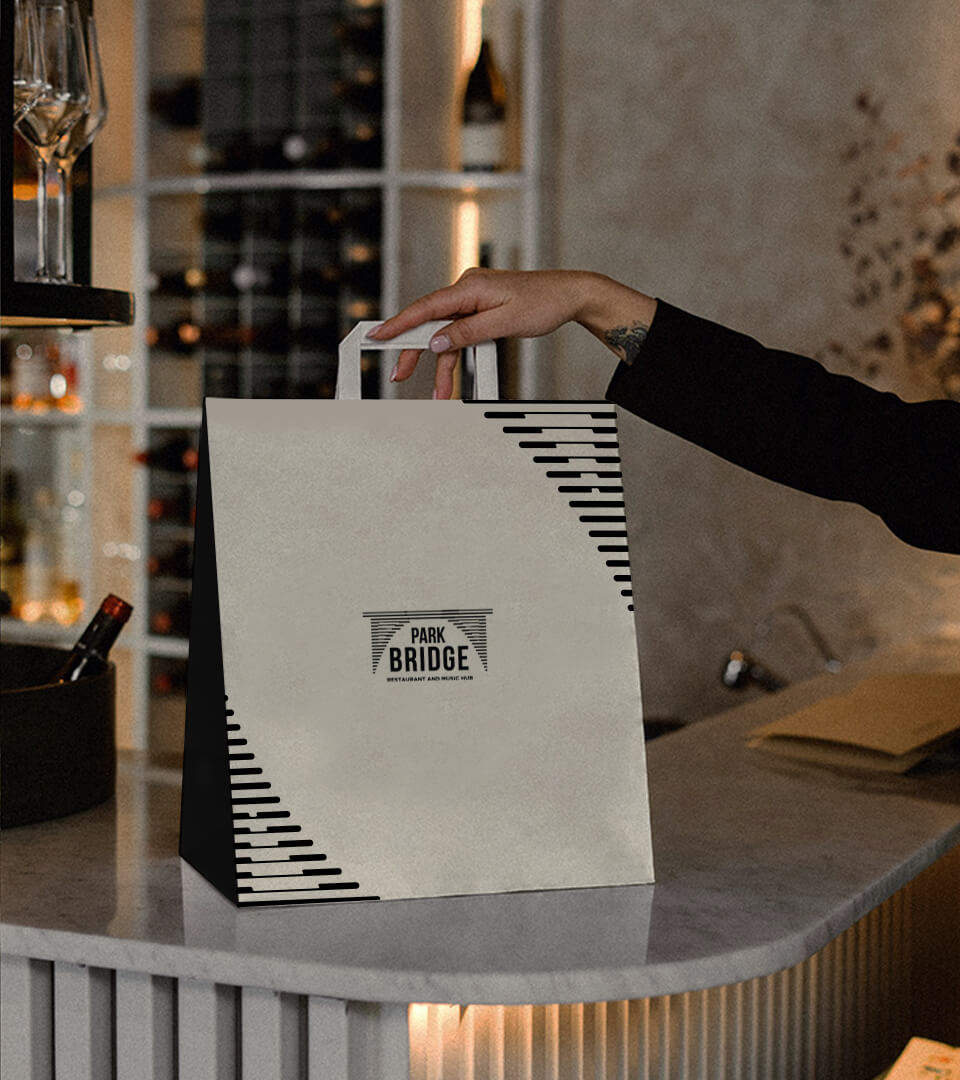
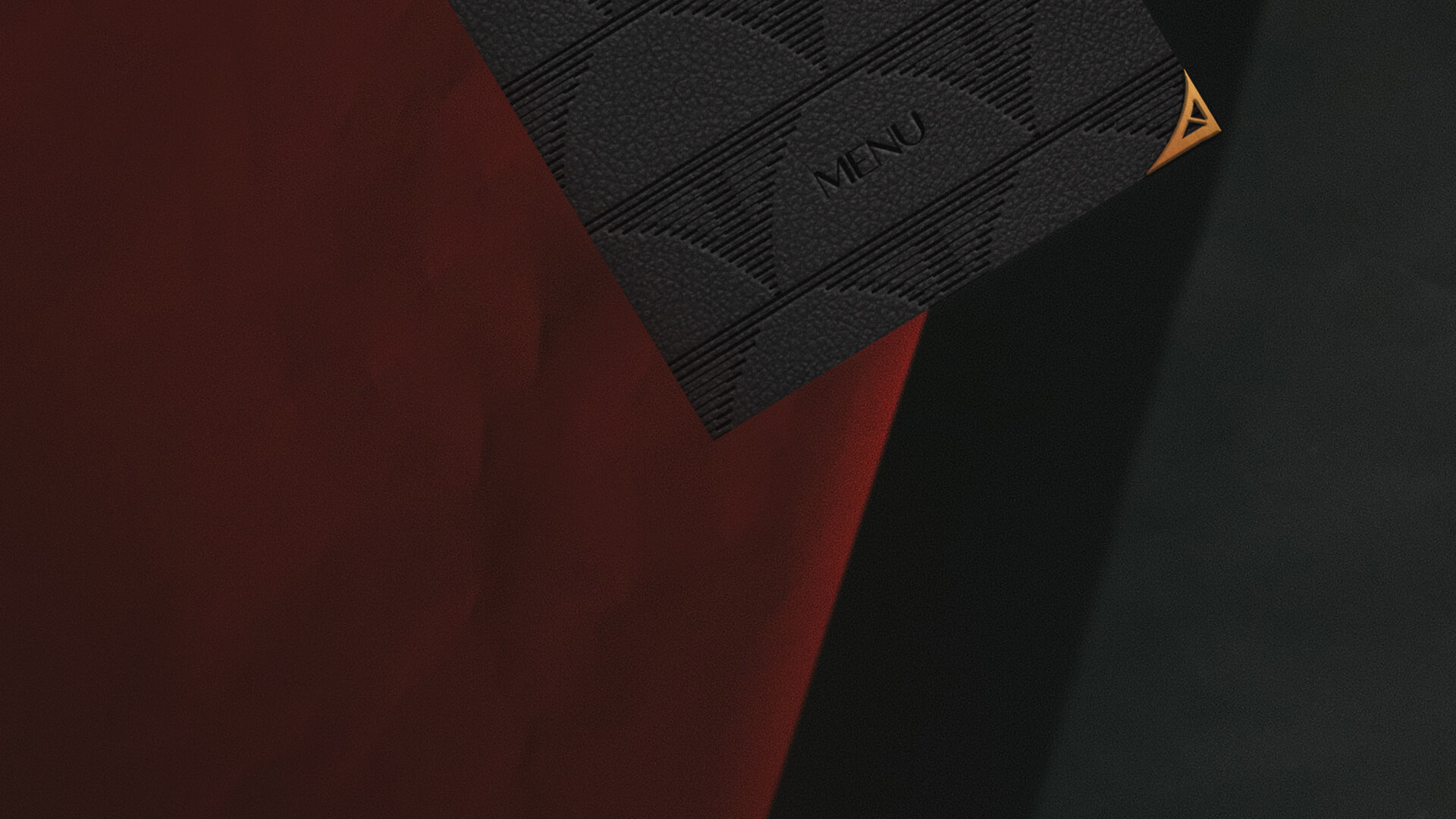
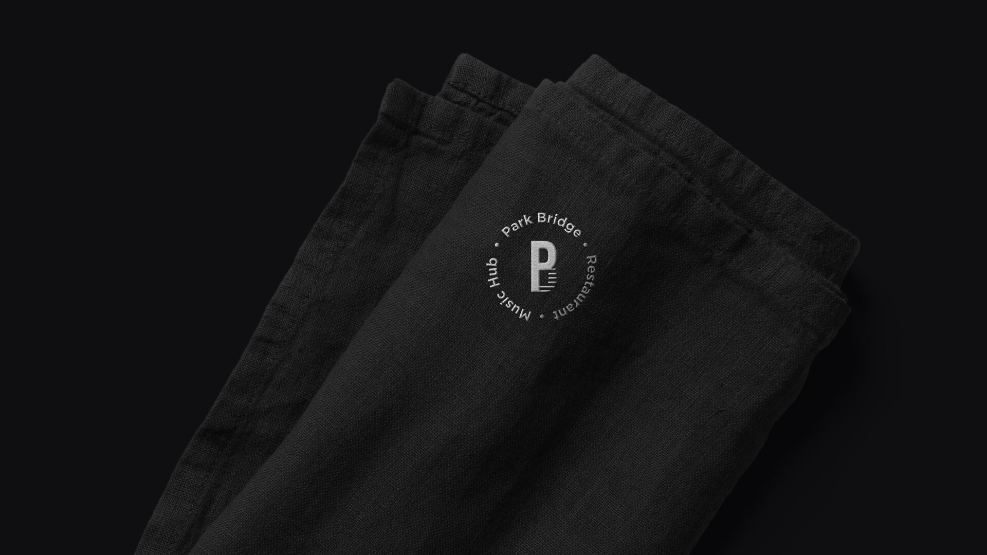
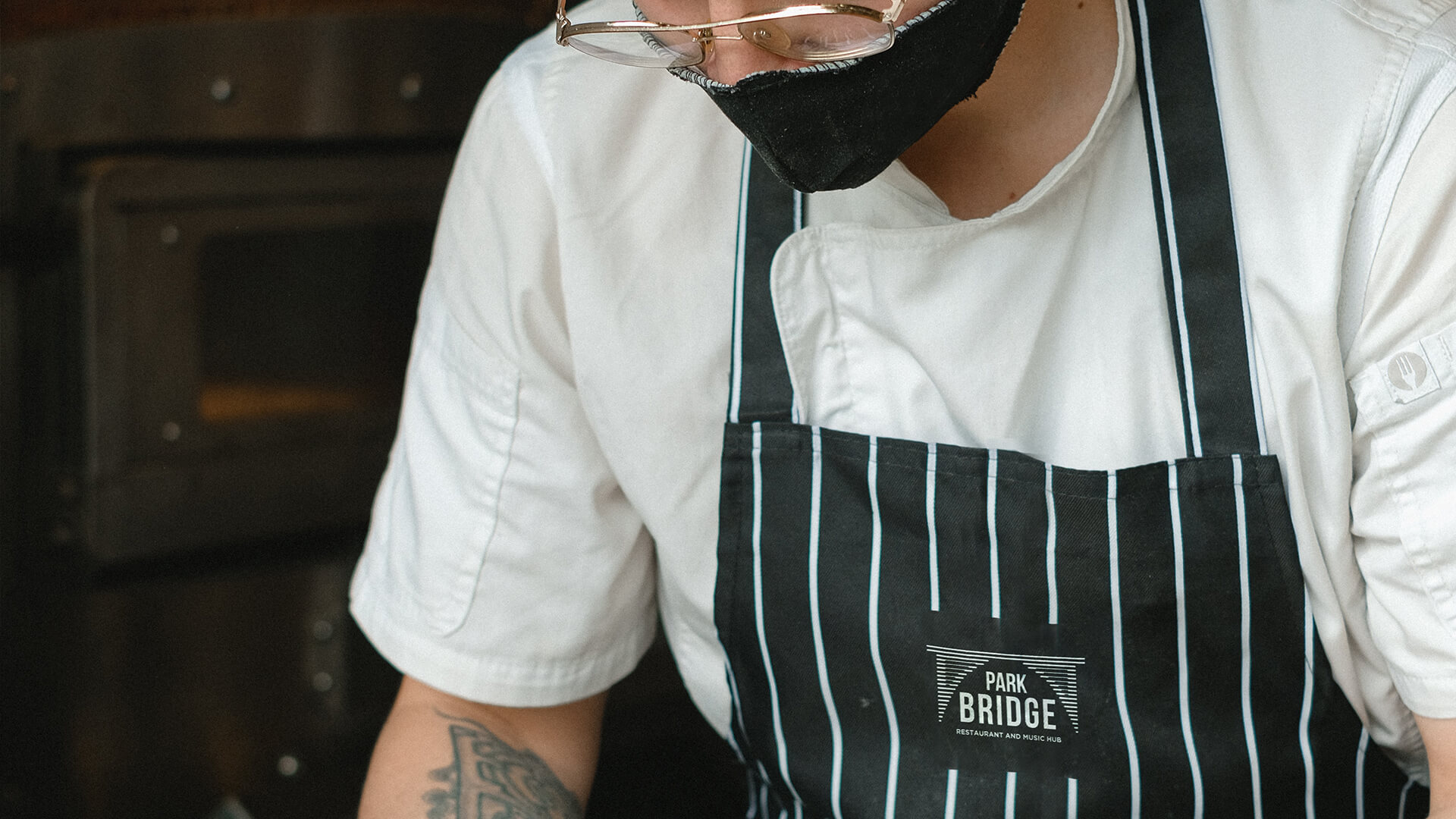
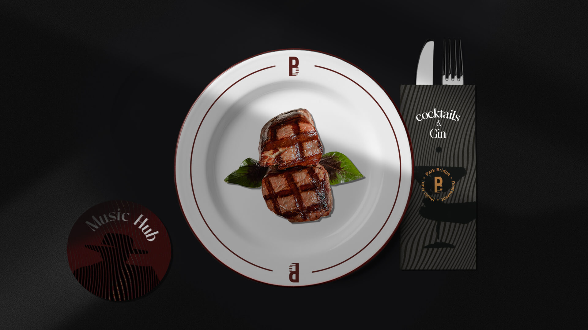
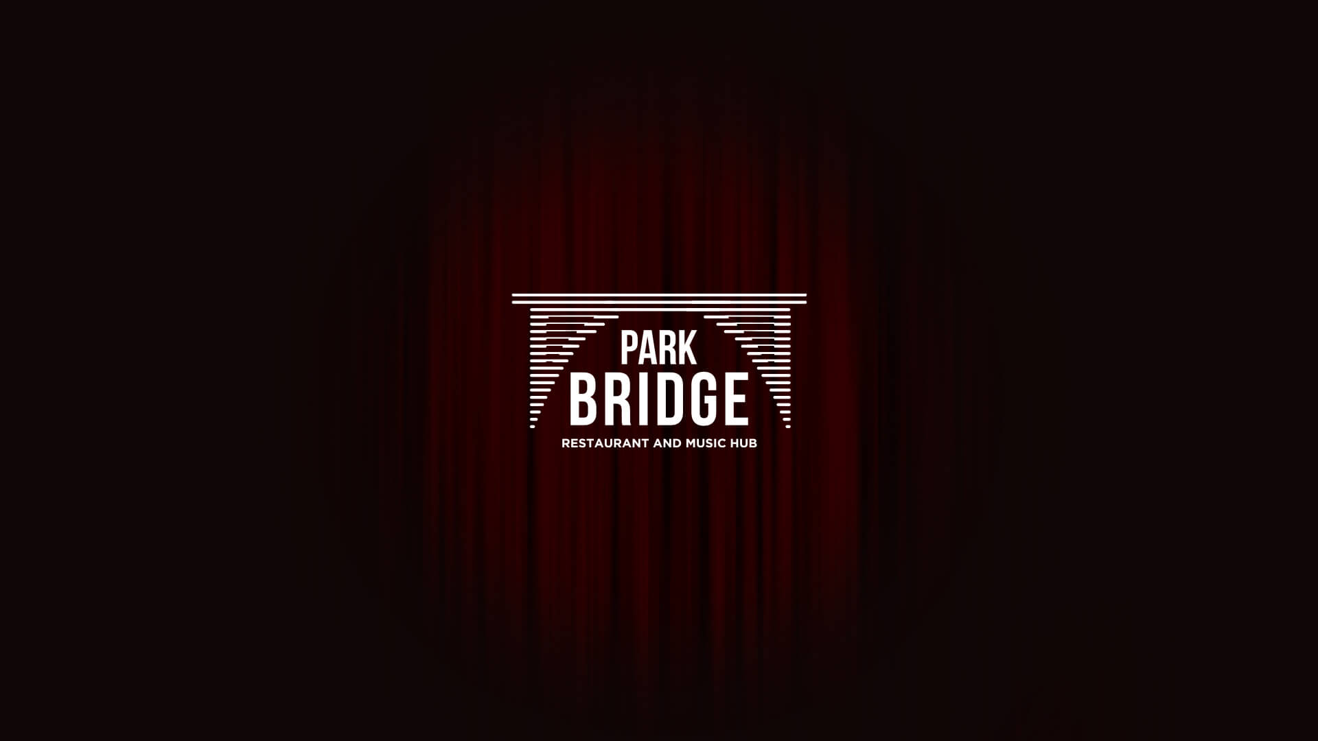
The Logo
The logo is composed of a graphic interpretation of a bridge, the name of the organization and the industry identifier. The image repeats the shape of the Kievian bridge with accentuated linear additions.
The name of the venue is written under it, meanwhile the word "Bridge" uses larger font. The stretched, solid font conveys seriousness, and the black color accentuates it even more.
The secondary colors are not represented in the main logo leave a space for using it on various surfaces and bachgrounds without any complications.
.jpg)
.gif)

.gif)
Project Team
- Creative Direction: Eduard Kankanyan
- Project Strategy: Karen Babajanyan
- Project Management: Gayane Margaryan
- Graphic Designer: Shushan Gevorgyan
- 3D and Motion Graphics: Vardan Harutyunyan
- Copywrighting: Hrachuhi Mirozyan