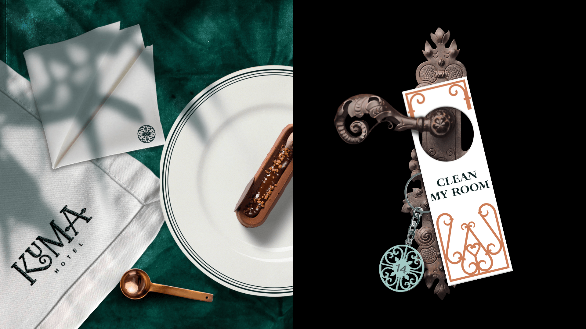
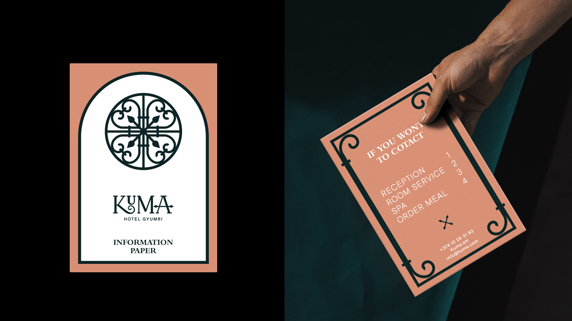
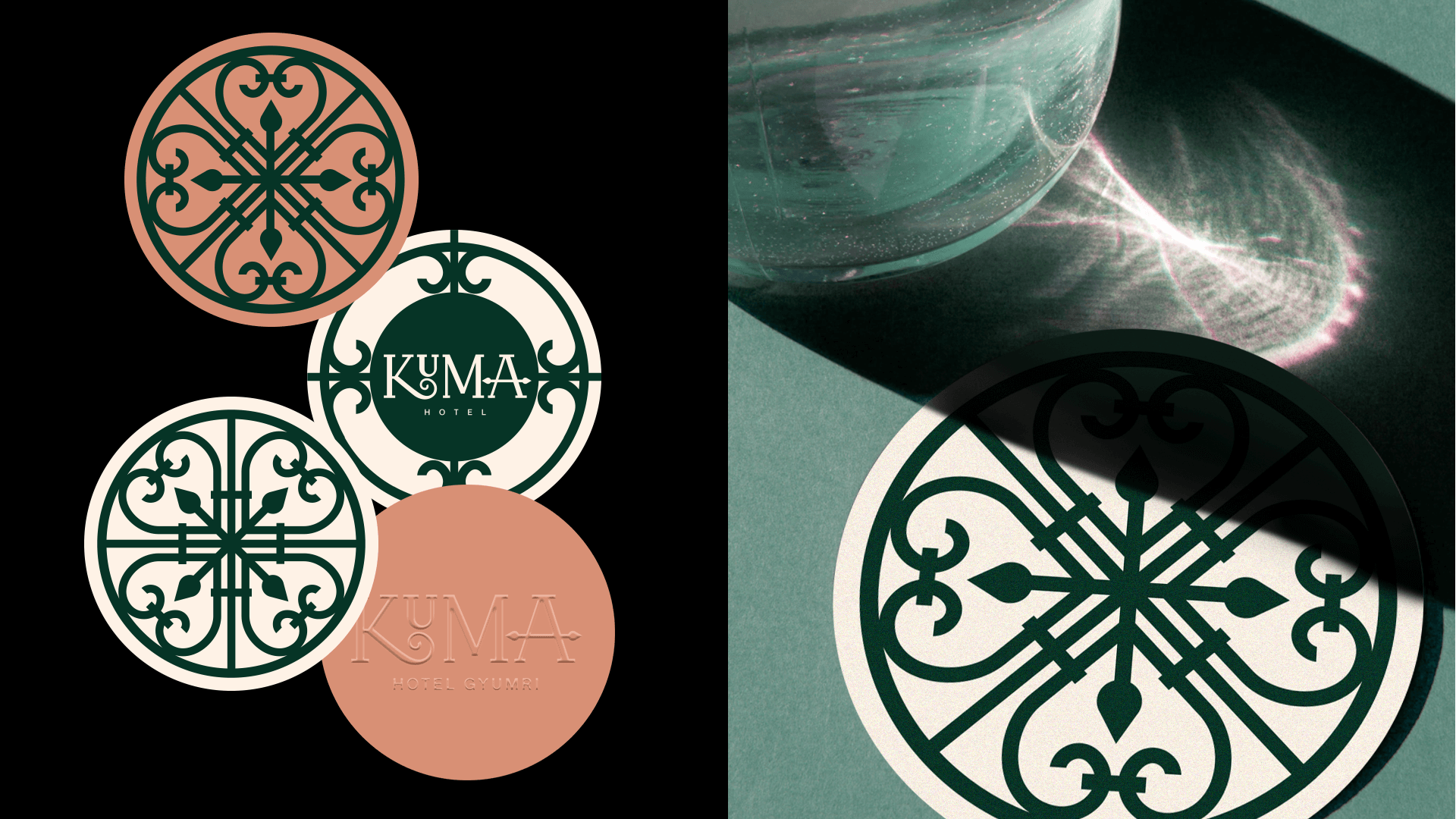
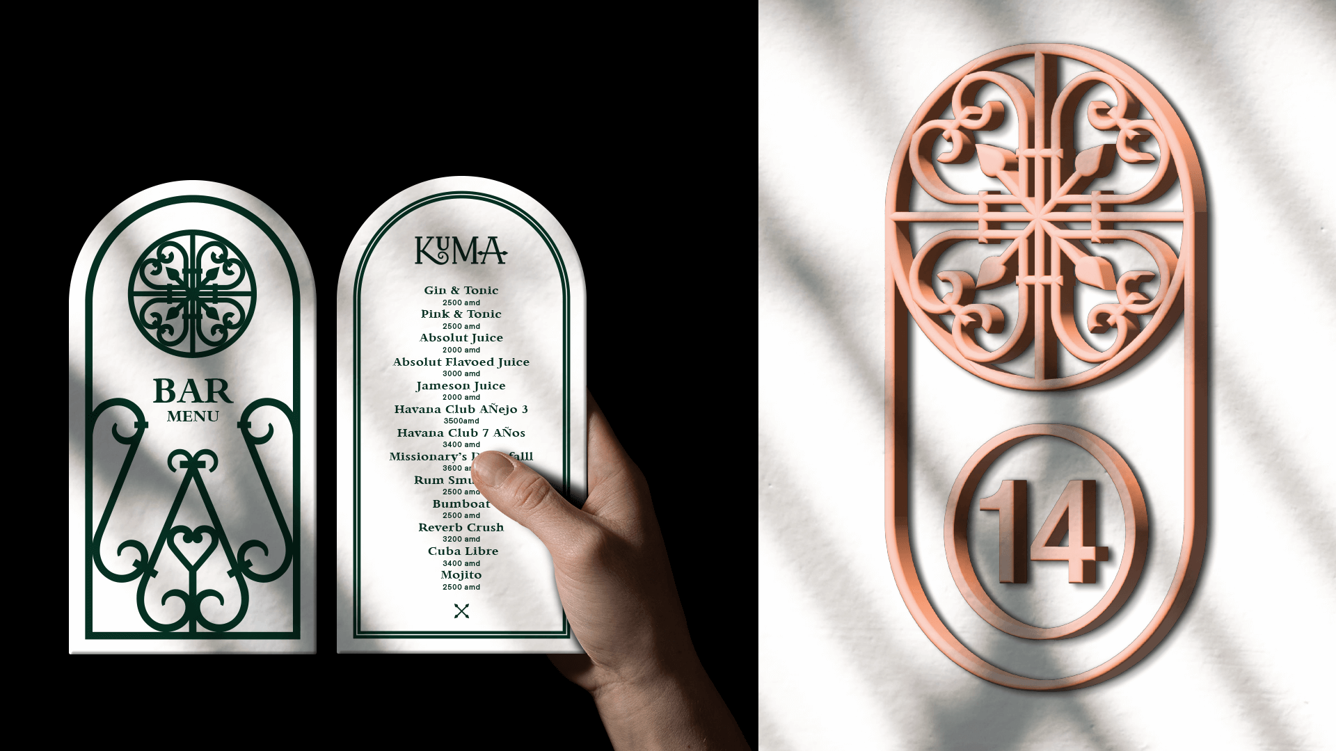

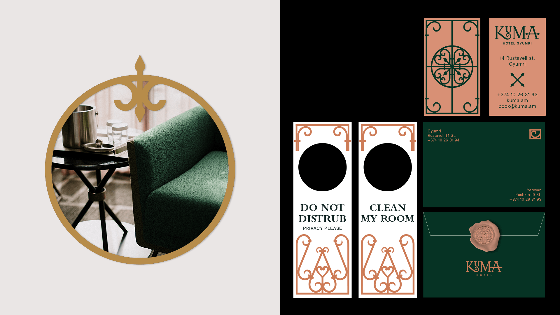
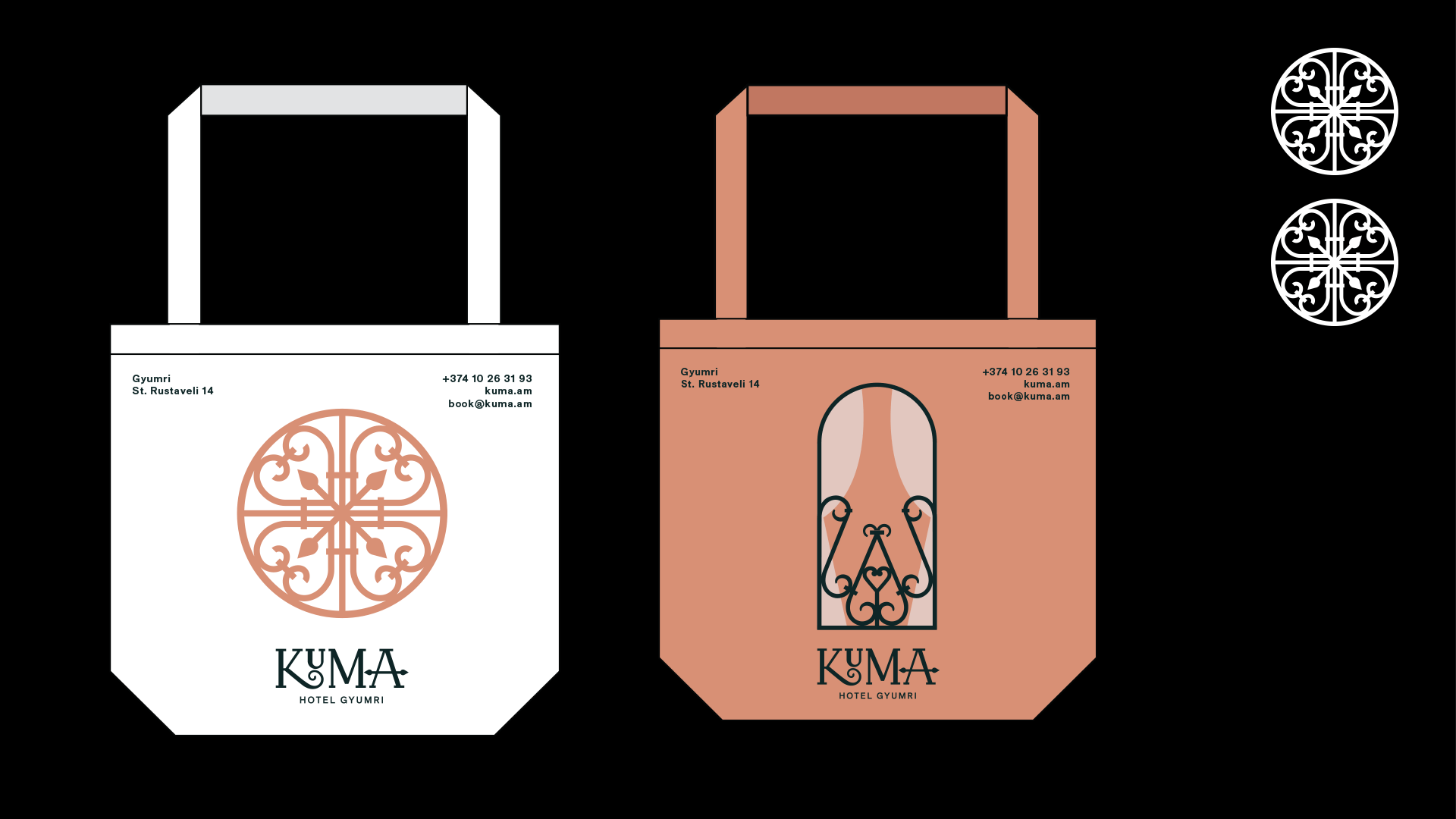
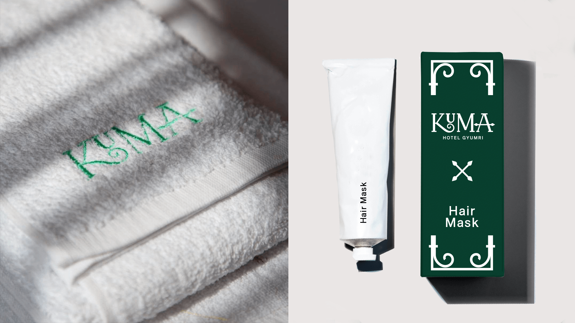
Gyumri, known as the city of master craftsmen renowned for their skillful ironwork, has inspired us in the creation of the branding for the "Kuma" hotel. The hands of these talented artisans shape iron into magnificent gates, doors, and railings, adorned with knightly insignia and a remarkable sense of aesthetics. Drawing from the refined taste of Gyumri's masters, we have incorporated their distinctive patterns into the foundation of the "Kuma" hotel's branding. The name itself, "Kuma," is a shortened version of Kumayri, the historical name of Gyumri. Emulating the style of the local craftsmen, we have transformed the name into a symbol by designing a unique font exclusively for the logo.
At the heart of the logo lies the hotel's name, accompanied by an identifier below it. To capture the essence of Gyumri and the serene ambiance of the hotel, we have carefully chosen colors that reflect the hues of the local stones: a deep, almost black green reminiscent of local black tufa and the vibrant orange reminiscent of Martian sand. Within the scope of this project, we have accomplished the comprehensive branding of "Kuma" by creating the brand identity, infusing it with visually captivating elements, and developing a solid ideological foundation for the brand.
- Creative Direction: Eduard Kankanyan
- Branding Director: Karen Babajanyan
- Project Management: Gayane Margaryan
- Graphic Designer: Garik Ghazaryan
- Motion Designer: Vardan Harutyunyan
- Copywrighting: Hrachuhi Mirozyan