Gurmenia Shopping Experiences
Born from the combination of the words "gourmand" and "Armenia", the name Gurmenia most accurately describes the approach to business of this food supermarket-- gastromarket. Armenians with special shopping preferences are welcomed with warm smiles, high quality service, and always fresh, delicious food. This smile has been boosted by Gurmenia's
revamped branding, which is designed to convey the supermarket's expansive selection while leaving shoppers with a positive aftertaste evoking shopping. As in Gurmenia, in the field of FMCG, logotype, color style, and widely used symbols have formally become a new word in branding for supermarkets in Armenia and rightfully become golden standards for supermarket branding.
Logo Options
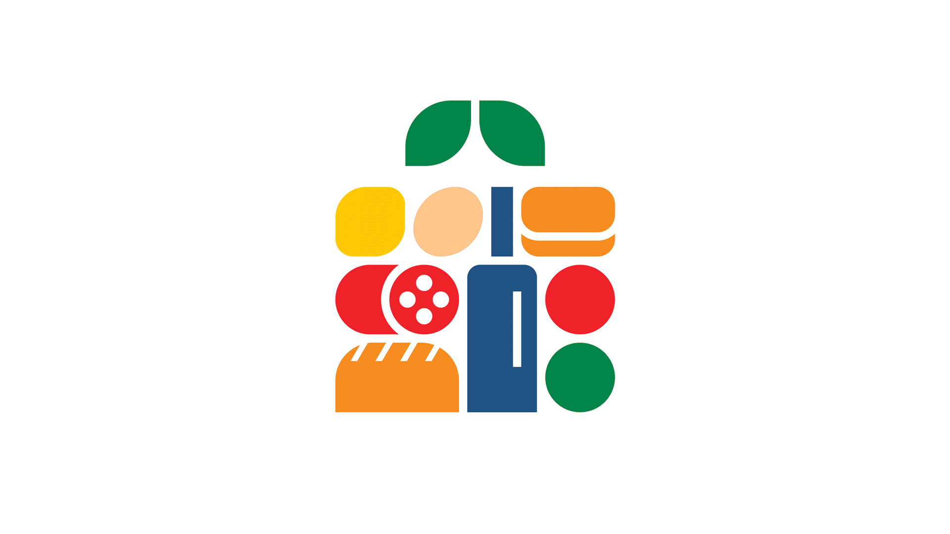
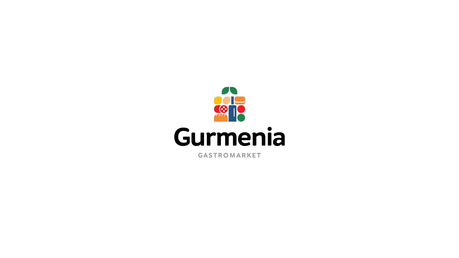
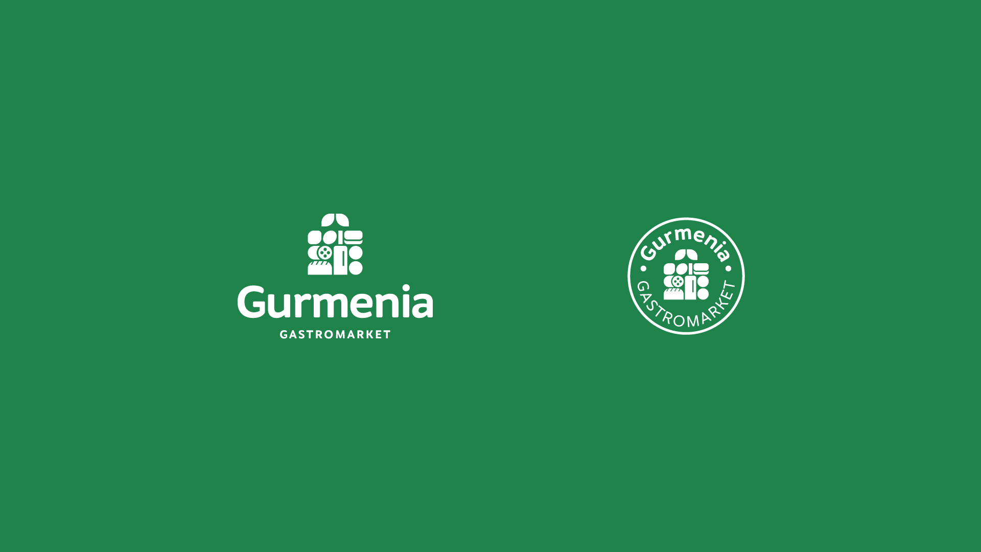
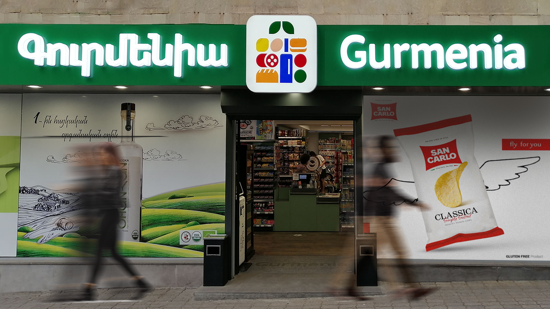
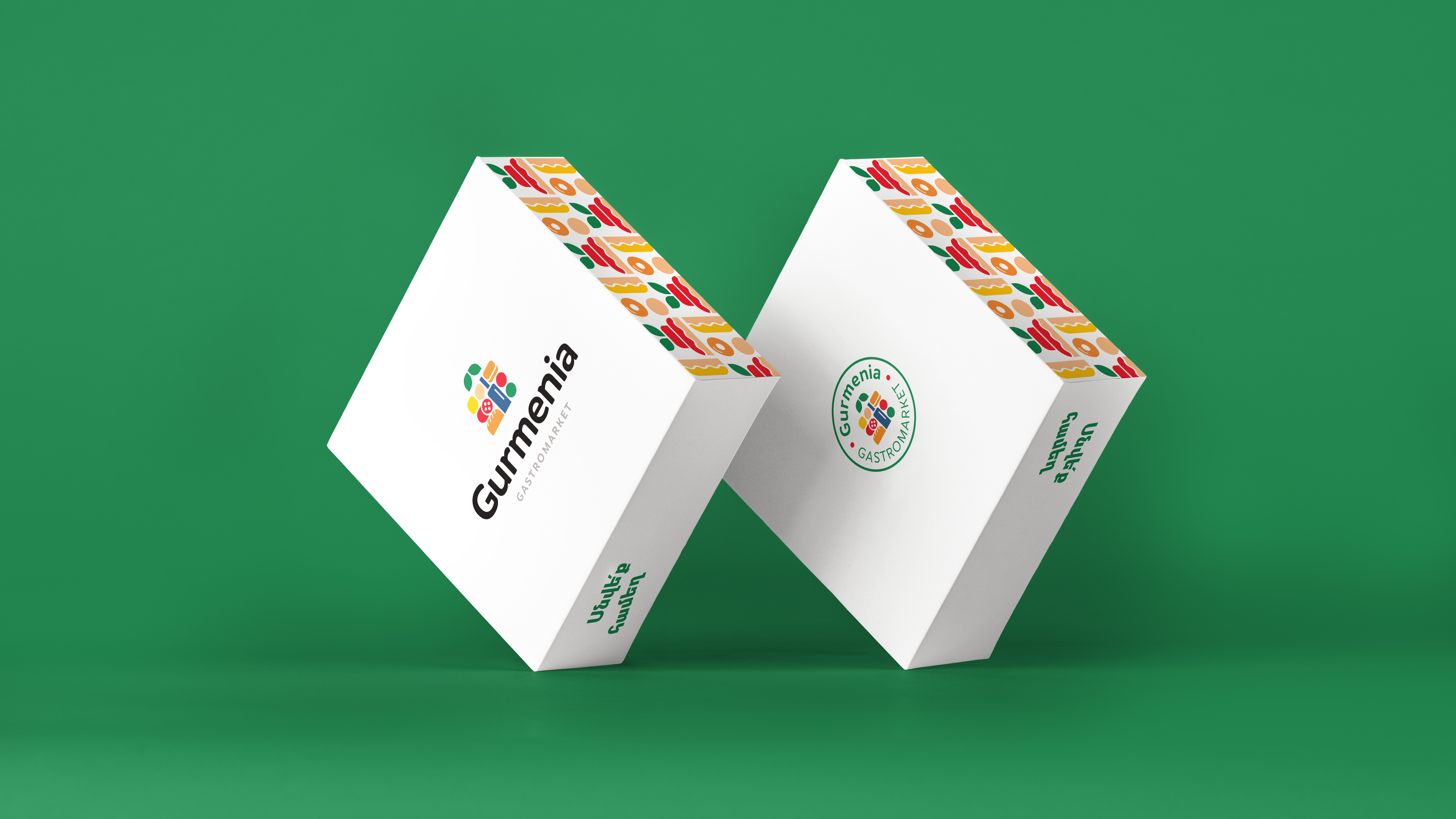
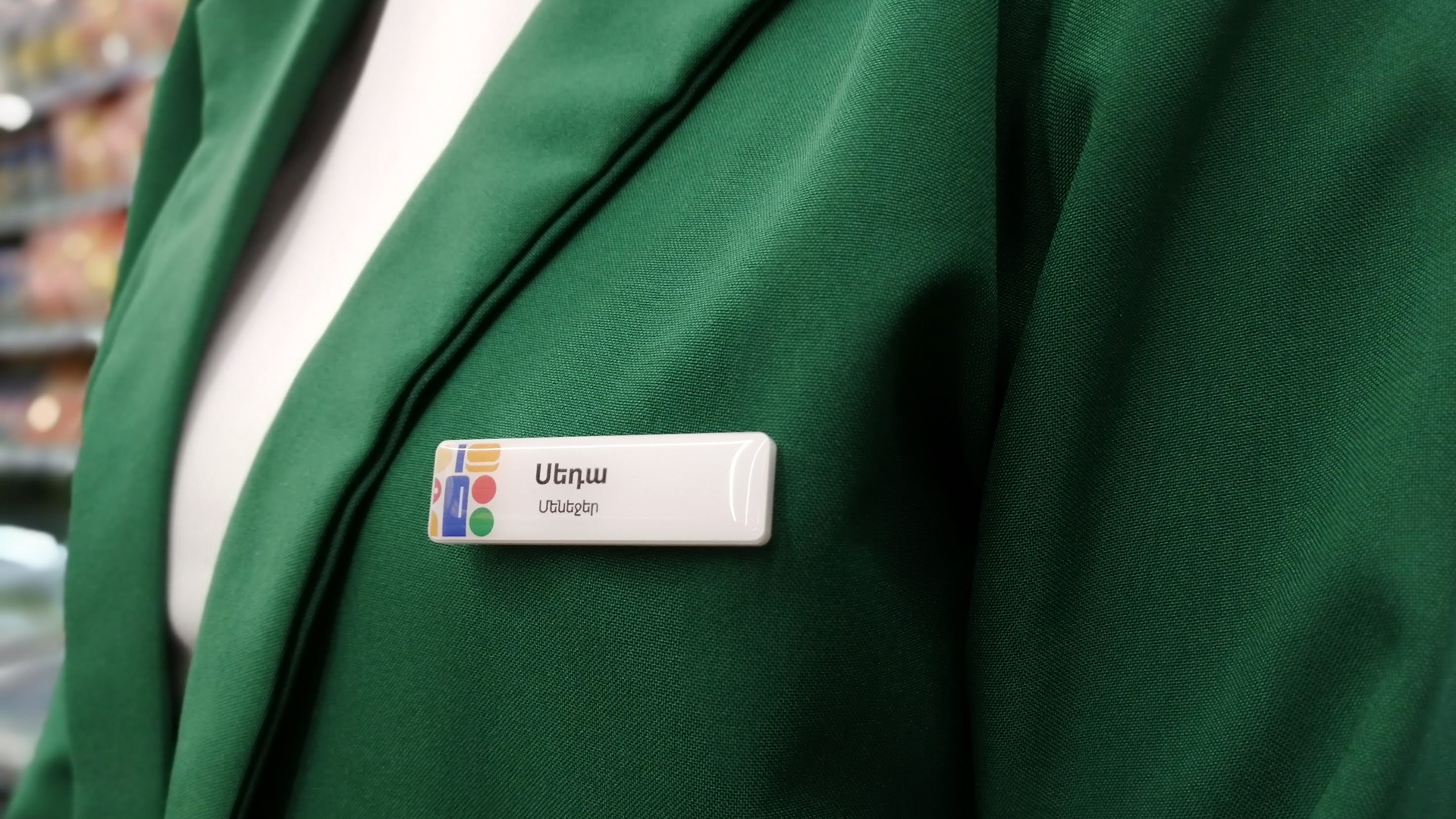
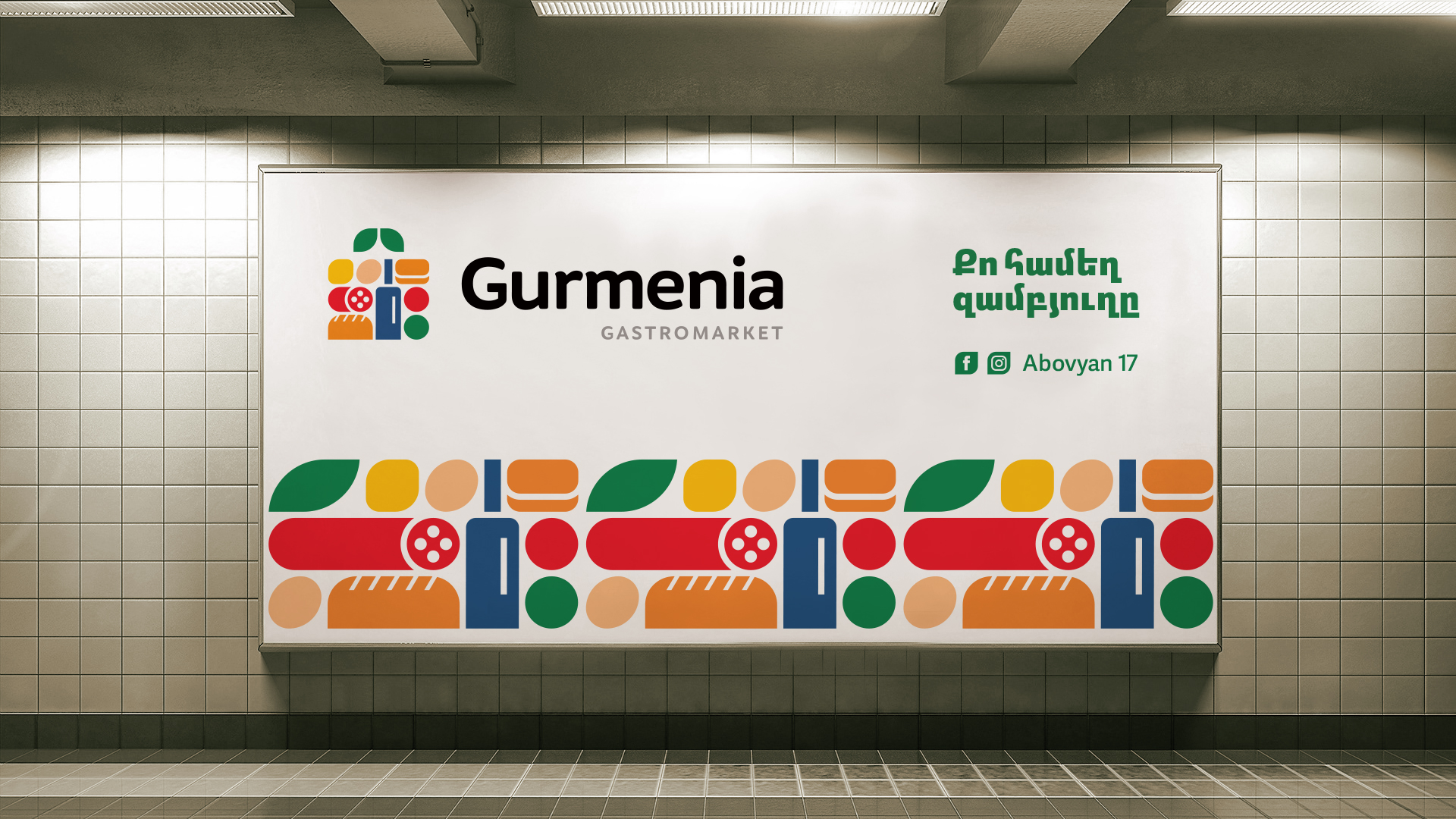
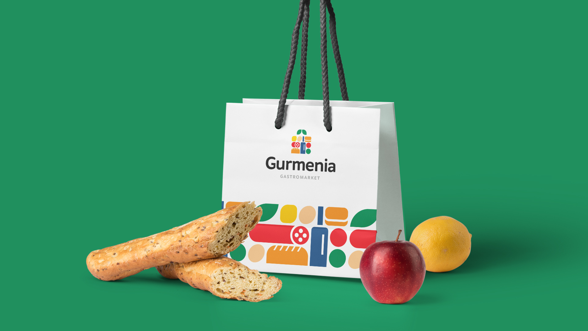
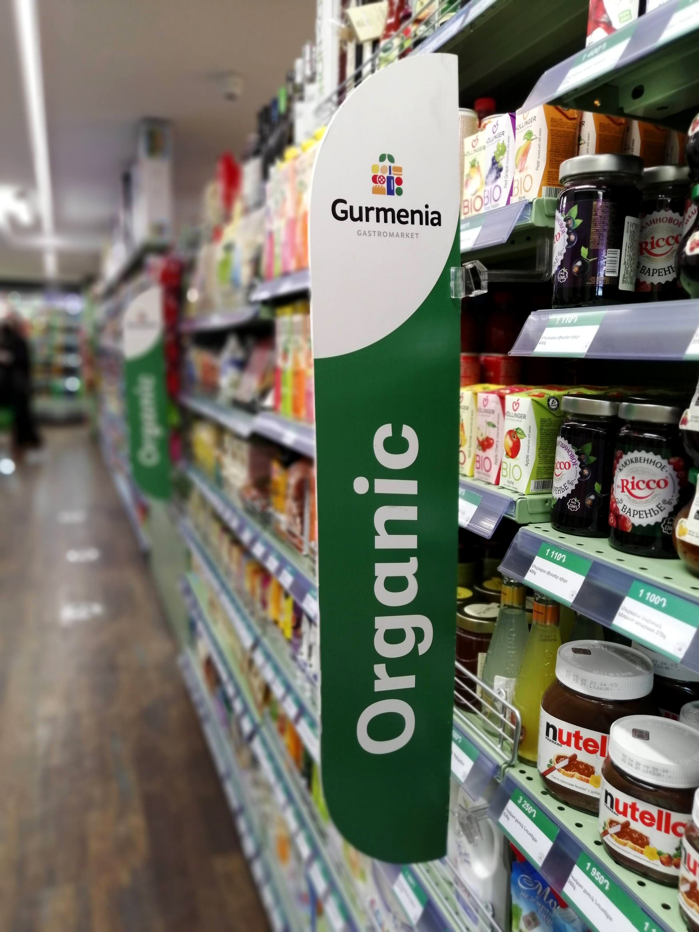
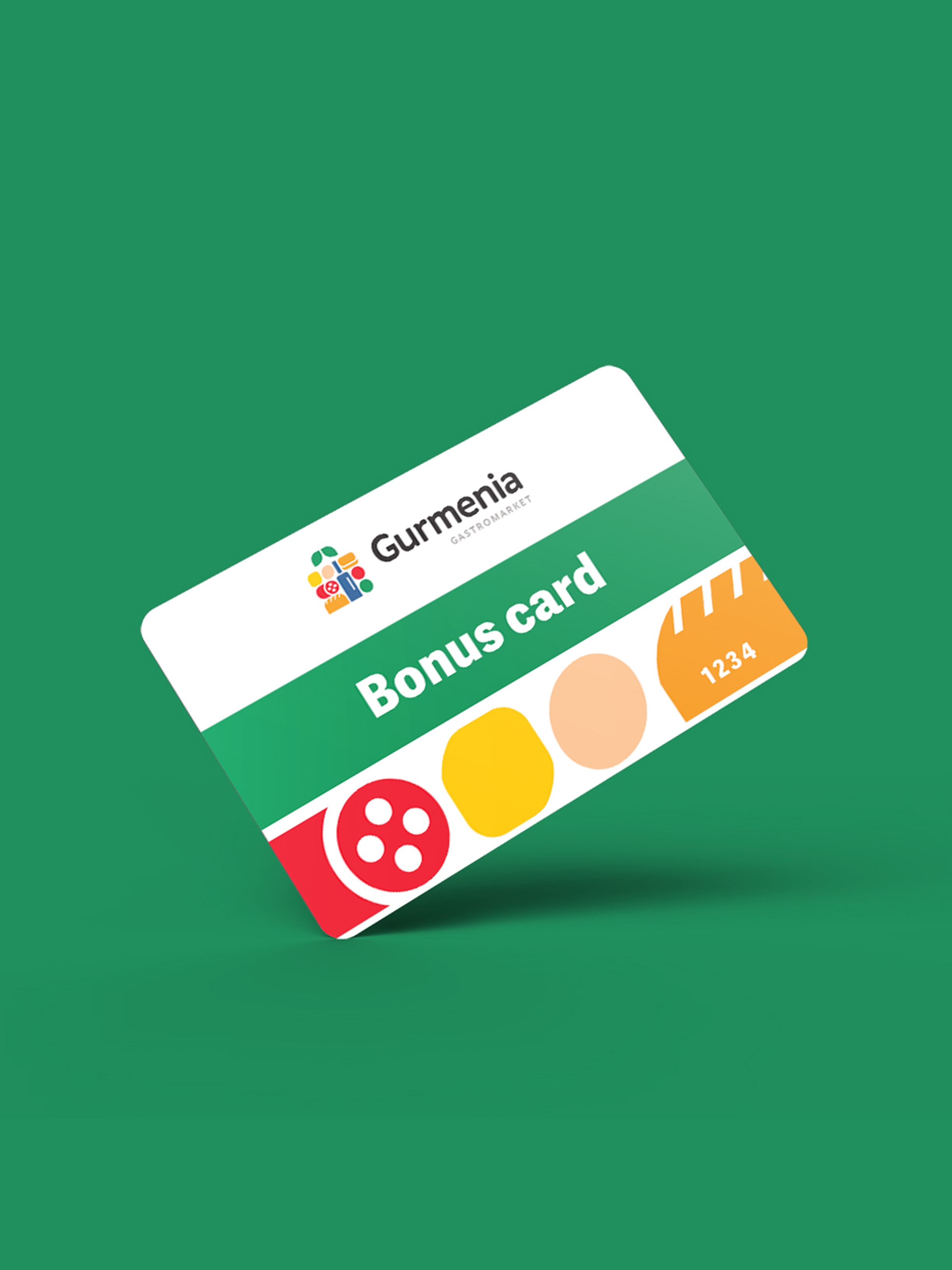
The logo consists of a symbol, a wordmark, and an identifier. The symbol is a graphic interpretation of the images of the most commonly purchased food products in supermarkets. These images are in the corresponding colors, which together form an image of a full basket. In the primary version of the logo, the symbol is located at the top, the name is in the middle row, and the identifier is at the bottom.
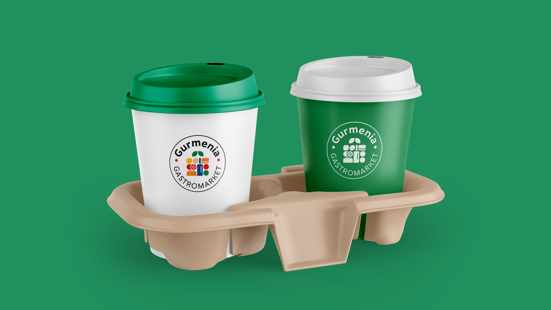
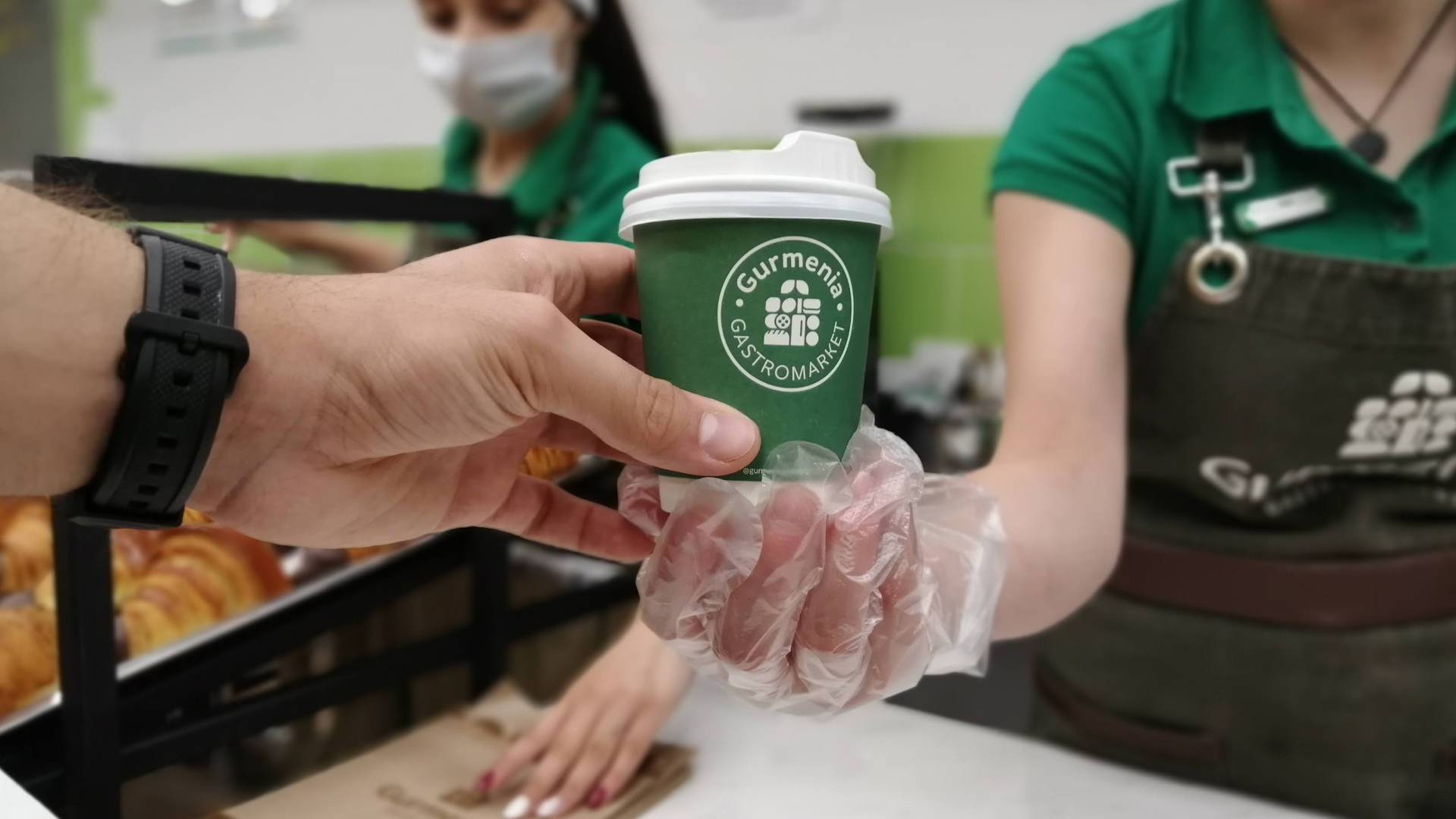
In the other version of the logo application, the symbol, name and identifier are enclosed in a circle, together forming a "mark of quality" - a seal. Here, also, the symbol is in the central part of the logo, the name is above it, and the identifier is in the lower part. These two versions of the logo have different application situations and were created to react to various visual topics of the gastromarket, which they do wonderfully.
Culture and Style
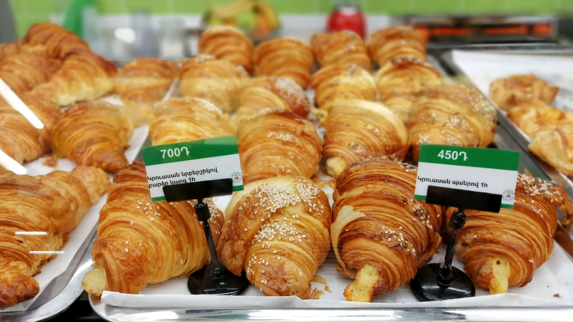
Gastromarket culture is new, but quickly adopted by consumers. Here, it is difficult to underestimate the importance of branding that meets the needs of all businesses. Its distinctive style and identity have become part of the gastromarket culture and accurately represent its features.
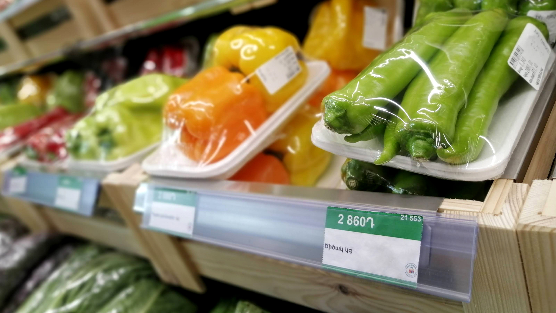
Color Style
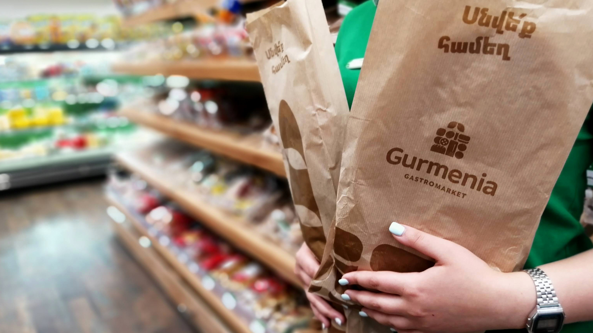
Gurmenia's color style is a variety of colors, there is no a dominant one. Graphics for the logo symbol are presented in bright red, vivid yellow, soft navy, deep green, carrot, wheat and light brown tones. It may seem that the combination of such bright colors
can create dissonance and image overload, but against the background of pure white, they are combined harmoniously and tunefully. This is the case where the departure from minimalism has formed the solution that truly represents this brand.
Stylized Symbols
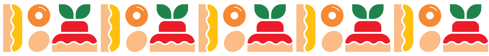
We used a variety of symbols to convey the abundance of assortment on the shelves of the gastromarket, which has made it easier to present it. Basically, the logo symbol was created by combining all of them.
However, the symbols are also available in a separate, decomposed version as stylized solutions to represent the range available in the gastromarket. The symbols translate many words into ideas understood to everyone.
- Creative Direction: Eduard Kankanyan
- Branding Director: Karen Babajanyan
- Project Management: Mariam Hayrapetyan
- Graphic Designers: Anush Alexsanyan, Anush Alexsanyan
- Portfolio Designer: Shushan Gevorgyan
- Copywrighting: Hrachuhi Mirozyan