- Country: Armenia
- Year: 2021
- Industry: Food & Hospitality
- Service: Brand Concept, Logo, Visual identity, Packaging
Comfortable Elegance
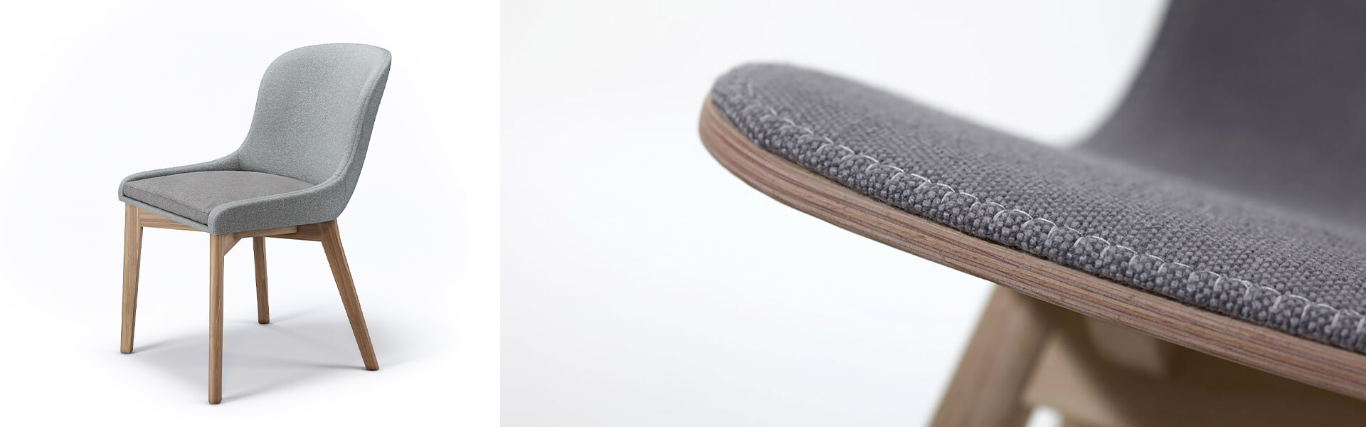
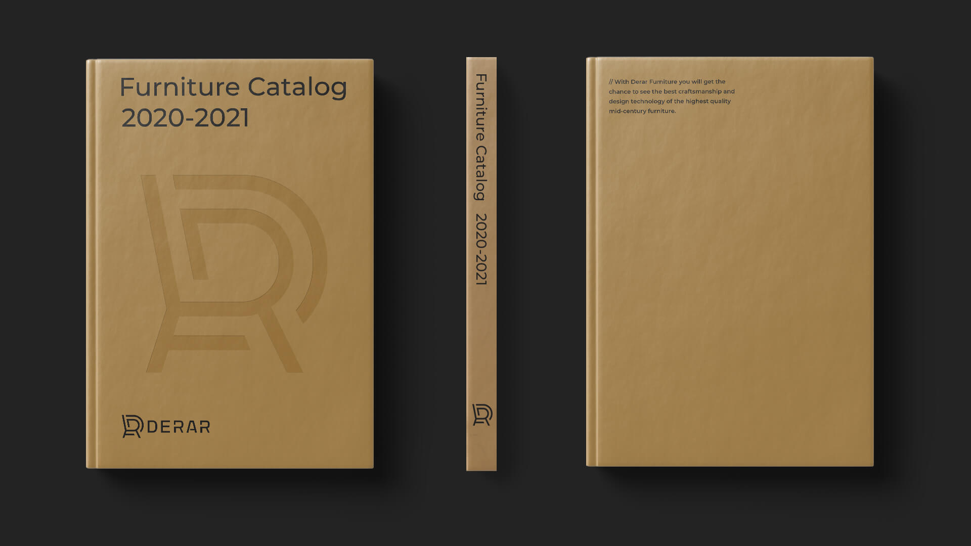
Derar is a company that produces comfortable and elegant furniture. This company's mission is to create an environment filled with aesthetically pleasing and different styles of furniture that perfectly suits gourmet customers' tastes. Within the framework of this branding project, we developed brand identity, brand style, logotype, and implemented complete brand development to showcase the company's customer-oriented approach, style, and elegance.
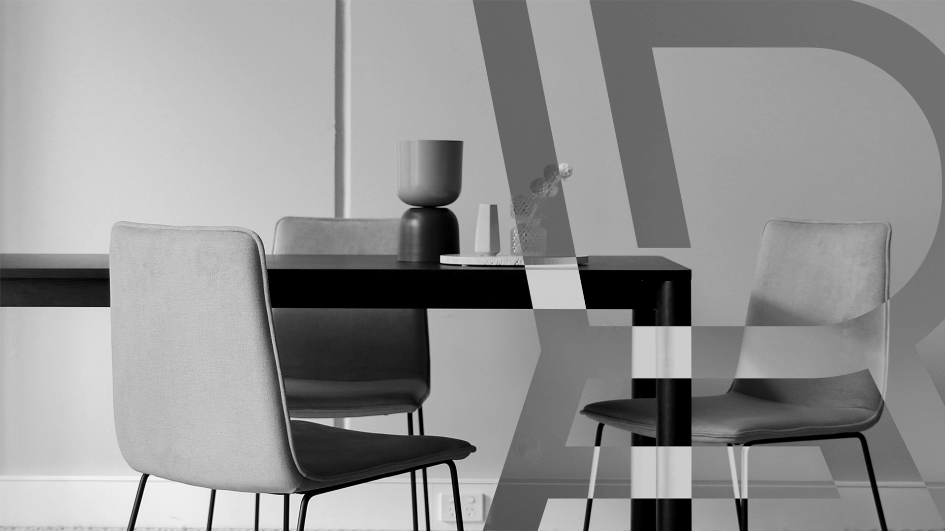
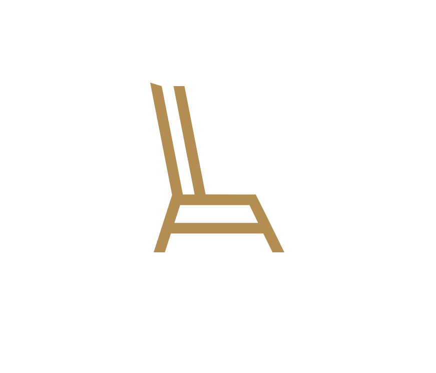
Stylized Symbols
The brand style is based on stylized images of various pieces of furniture, presented with an elegance and sense of style specific to the brand.
Such use of brand elements completes the brand identity and conveys the message of sophistication through visual imagery.

The Colors
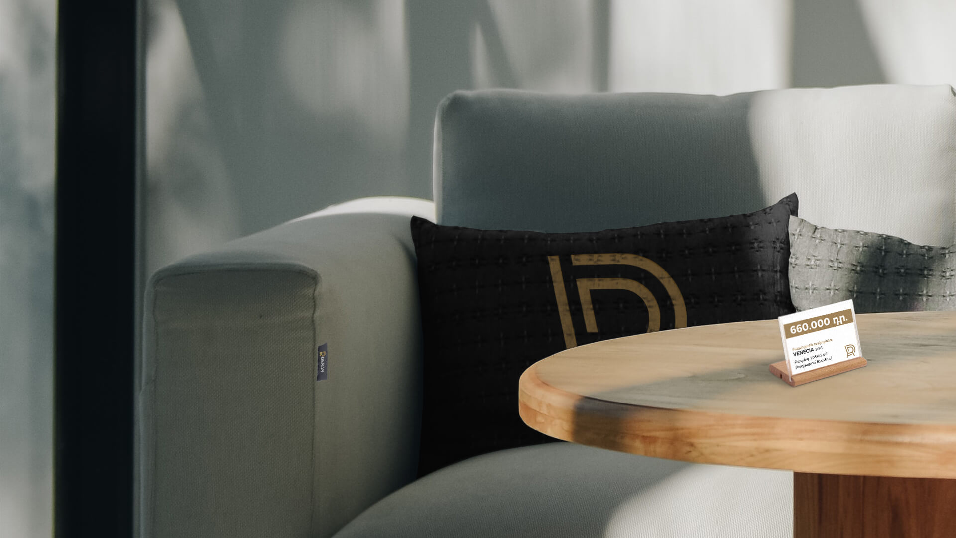
The core of Derar's brand colors is gilded copper, which replicates the metal color often found in the company's furniture. This choice of color is also due to the stylish and status of the company's furniture.
Cold, cement gray complements the metallic color in the color gamut. The combination of these contrasting colors emphasizes the modern and trendy nature of the presented product. Pure white is used as a secondary color, completing the palette.

Style and Aesthetics
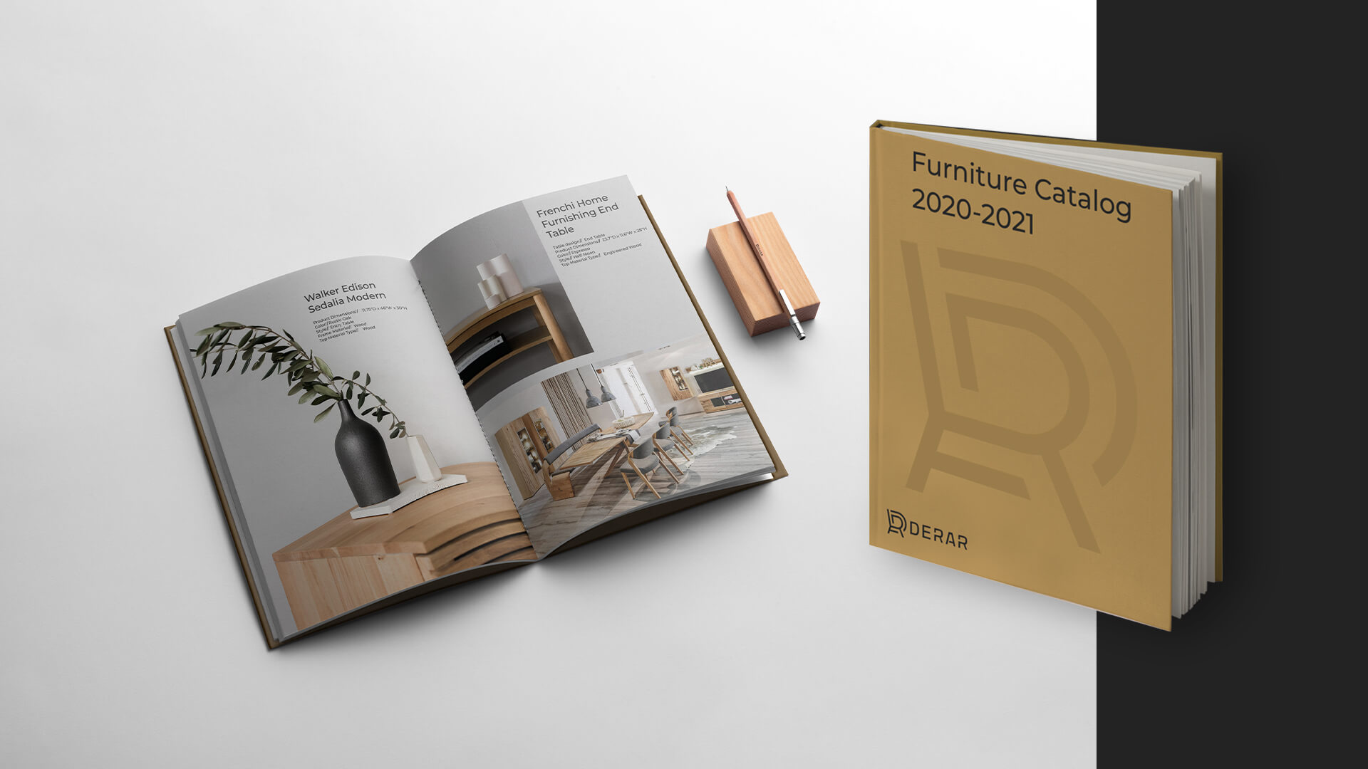
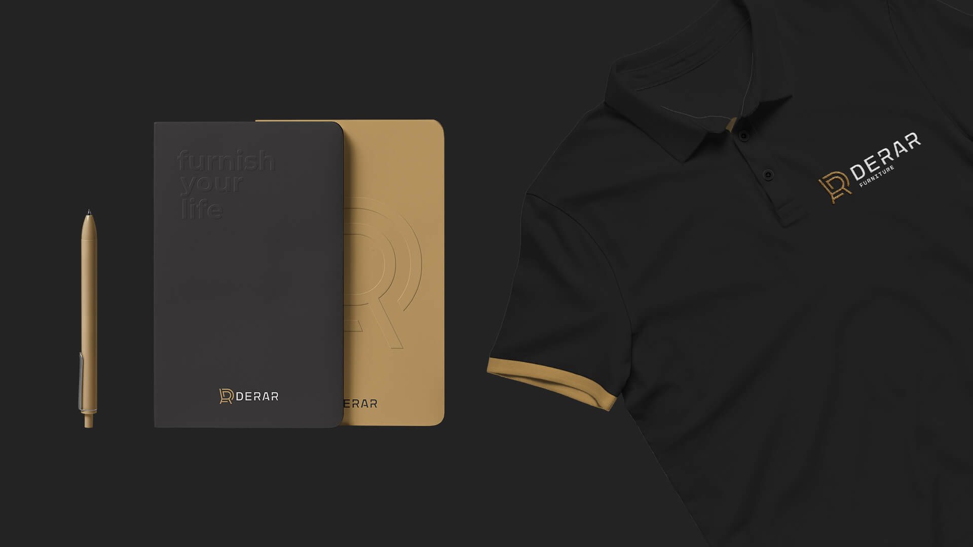
Elegance is evident in every element of Derar's brand style. To emphasize this, in addition to the specially designed font used in the logo, we also use a round, stylish font for advertising and other informational materials.
Advertising materials prepared according to the brand platform recommendations developed by us not only convey the company's brand message, but also counsel style and taste in creating elegant and comfortable environments.
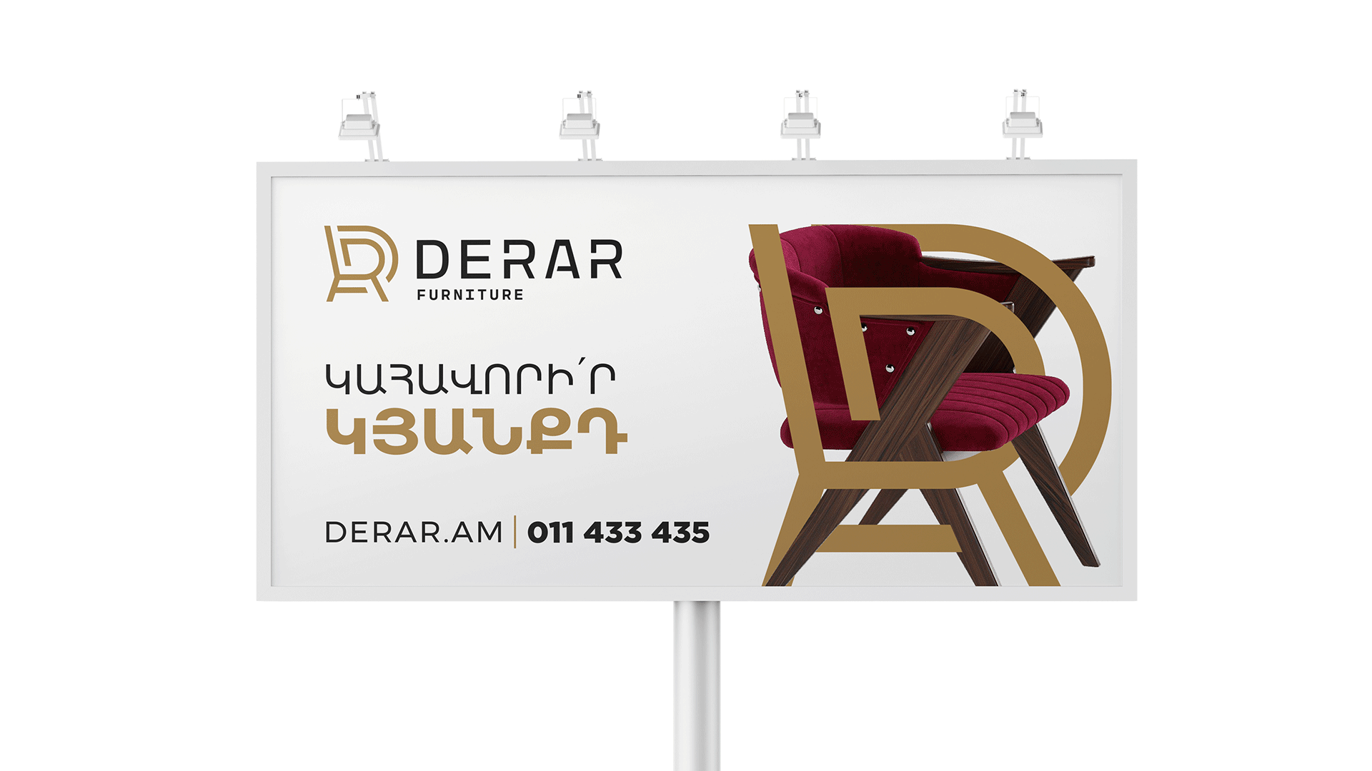
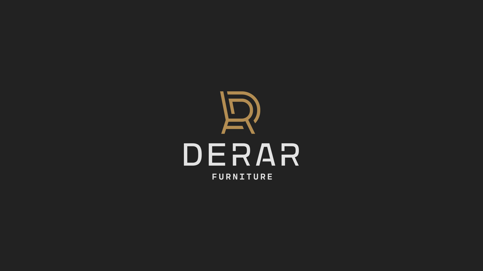
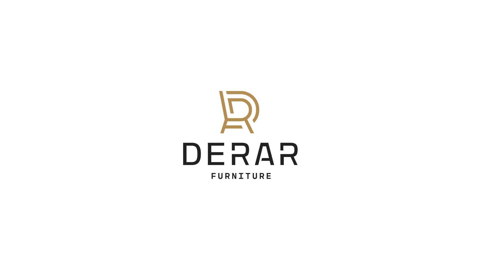
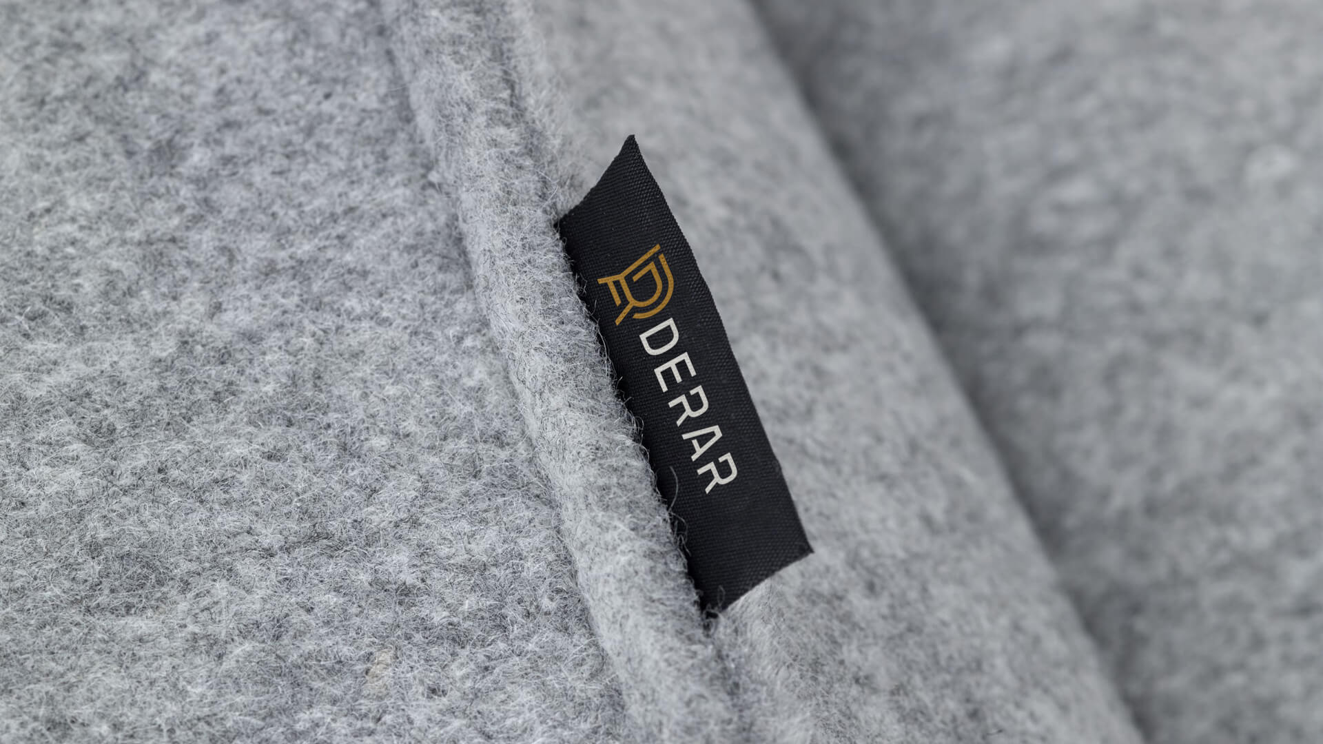
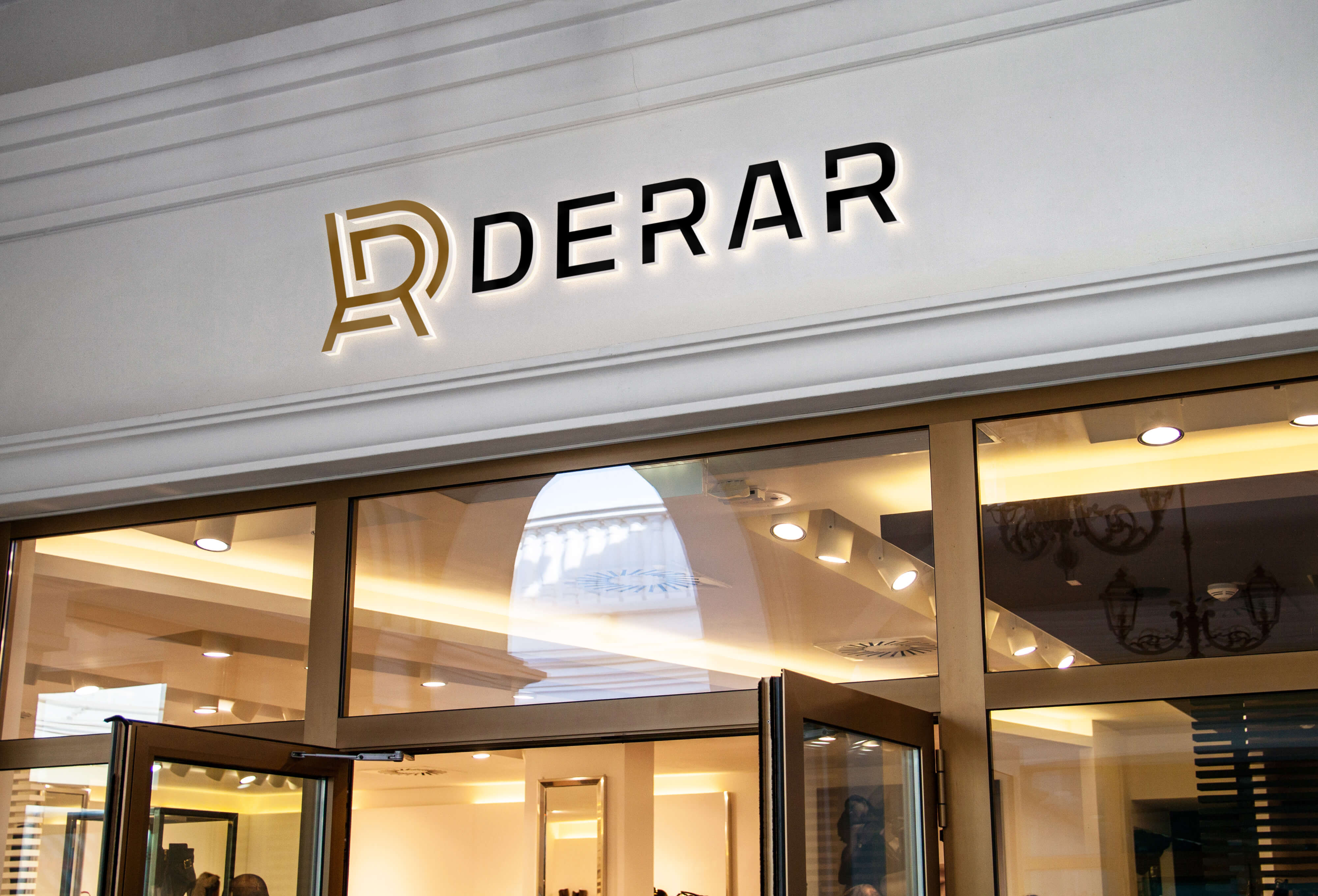
The Logotype
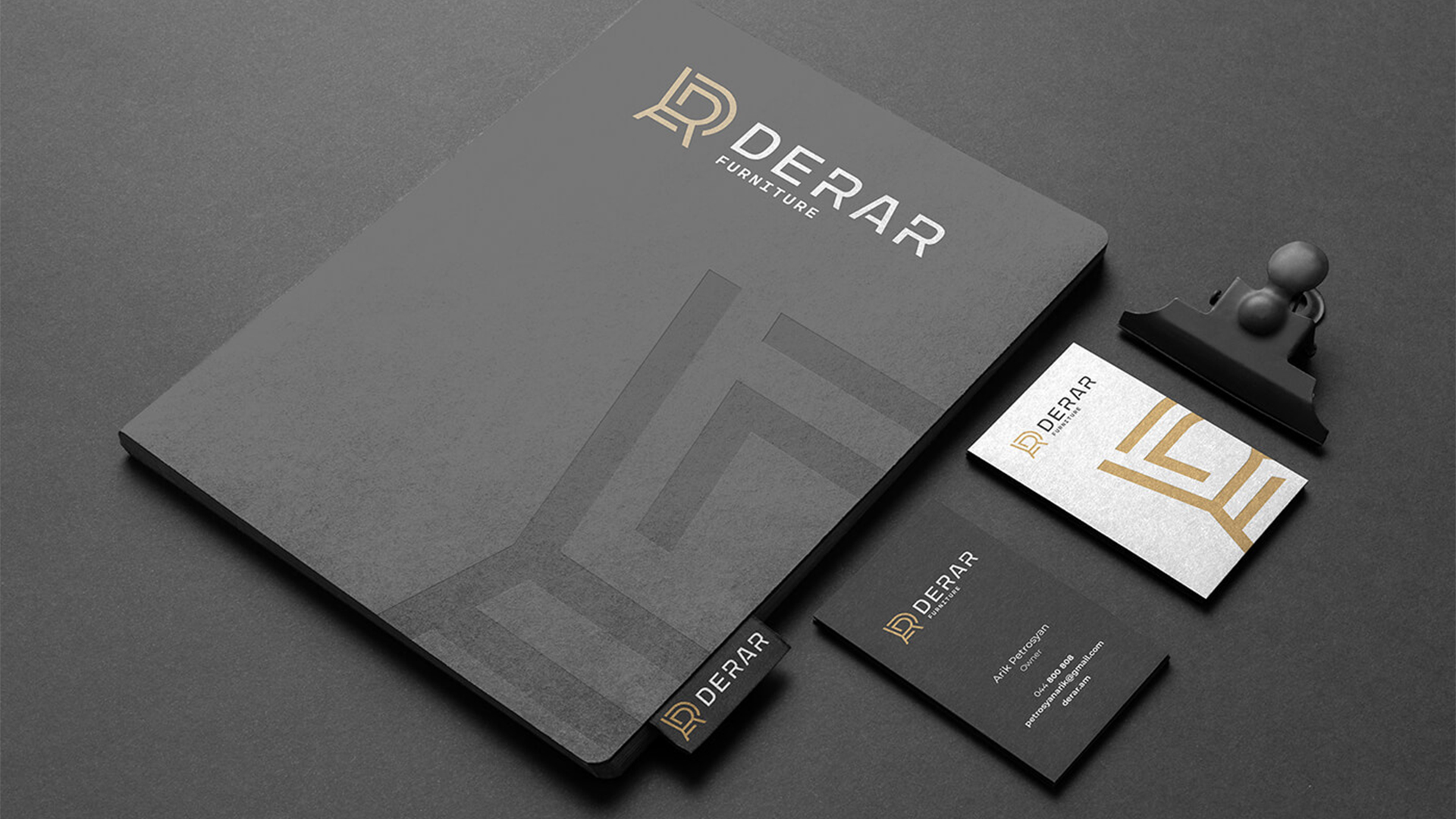
The logo consists of a symbol, the wordmark and identifier of the organization. The symbol is a combination of graphic images of a chair, an armchair, and the top of a bed. This represents the versatility of the company's furniture offerings. The symbol is depicted in the key color of the brand.
The wordmark and identifier are shown in black, and in some applications, on a white. To depict them, a special font was developed, which duplicates the curves and straight lines of the logo symbol, further emphasizing the originality of the furniture. In the lower part of the wordmark, in a smaller font, is the identifier, which completes the logo.
- Creative Direction: Eduard Kankanyan
- Branding Director: Karen Babajanyan
- Project Management: Gayane Margaryan
- Graphic Designers: Sen Olqinyan, Anush Balasanyan
- Copywrighting: Hrachuhi Mirozyan