
Direction towards education via Compass
The need for a compass is especially important these days when it has become so difficult to choose among so many options. Education is the most complex product that can be branded, taking into account the traditions of representing educational institutions, also in terms of branding.
However, the situation has changed as a result of the application of modern approaches, where even in visual communication, valuing a person and the education becomes a characteristic of identity. These are the considerations that we put at the core of the Compass branding, convinced that the compass always points in the right direction.

The Challenge
When creating the branding for Compass, the main challenge was to create visual communication that would be reasonable both for parents and children.
It was necessary to emphasize the uniqueness of this educational institution, also to highlight the name, personality of kids studying here and importance of education in this institution.

The Solution
The solution was found in the name itself. The compass, composed of stylized human figures, bright, but muted colors represent the essence of the educational institution.
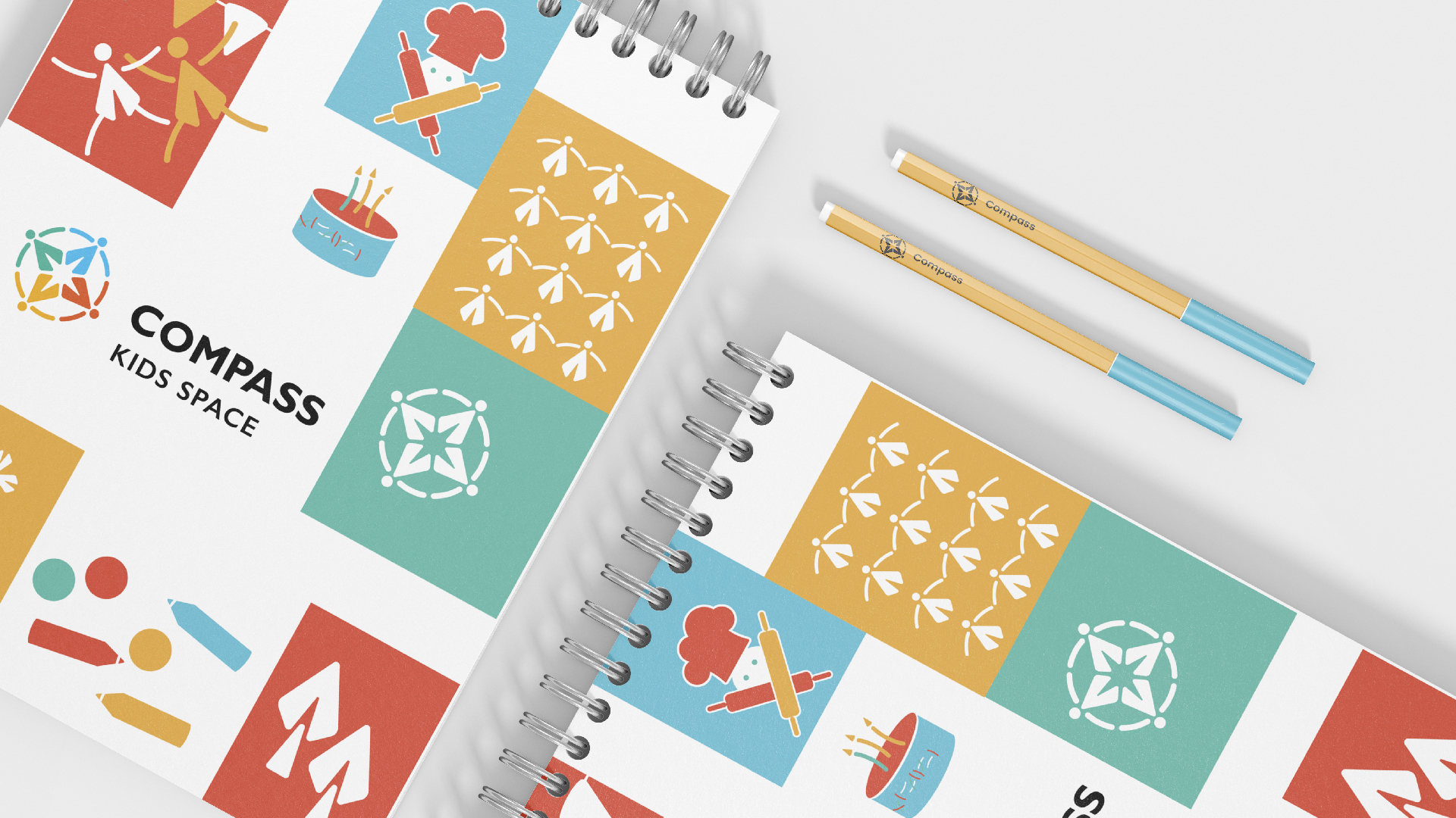
And to demonstrate the versatility of this educational institution, we created different stylized characters that are part of the brand identity and best describe Compass.

The Logotype
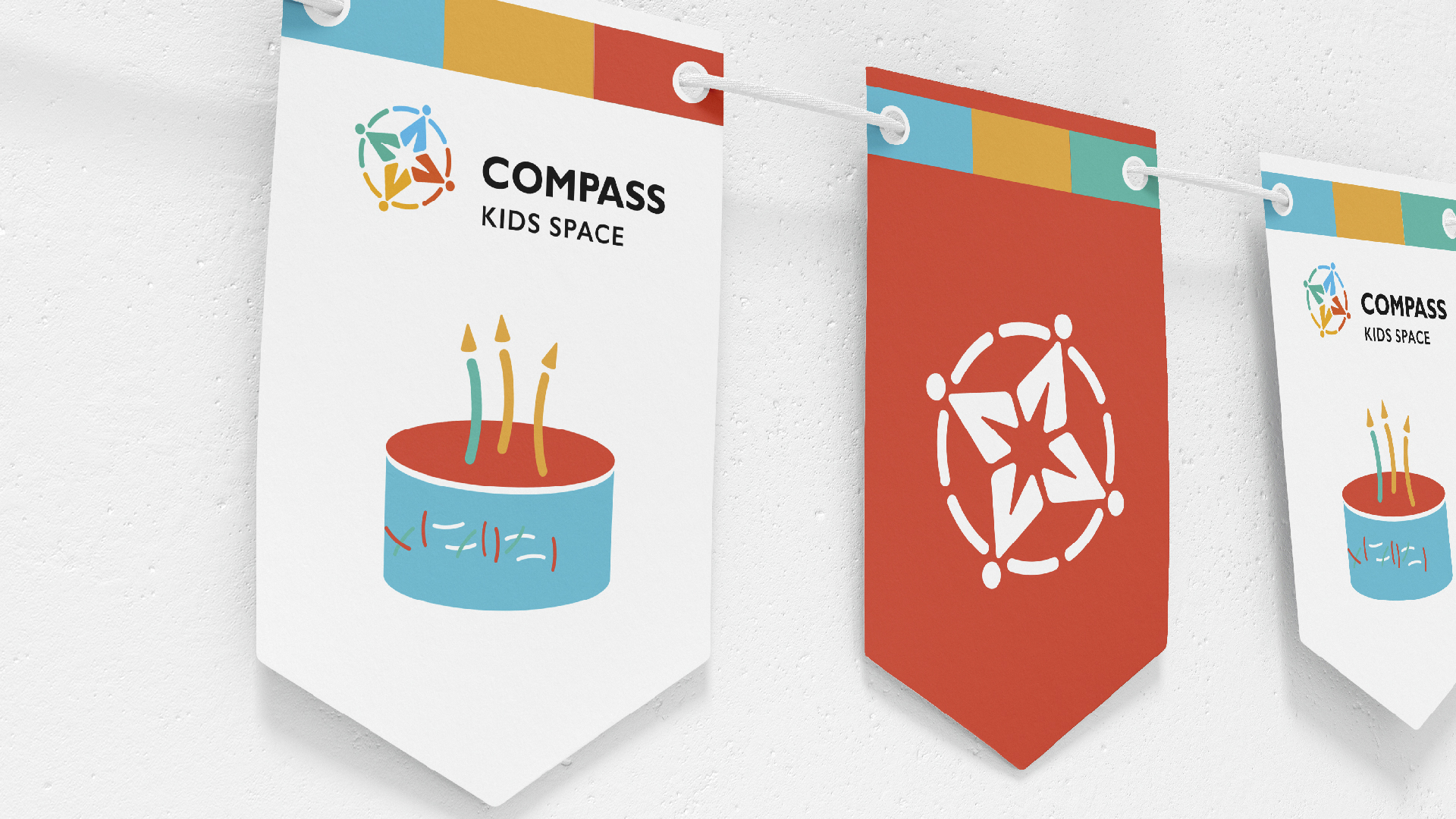
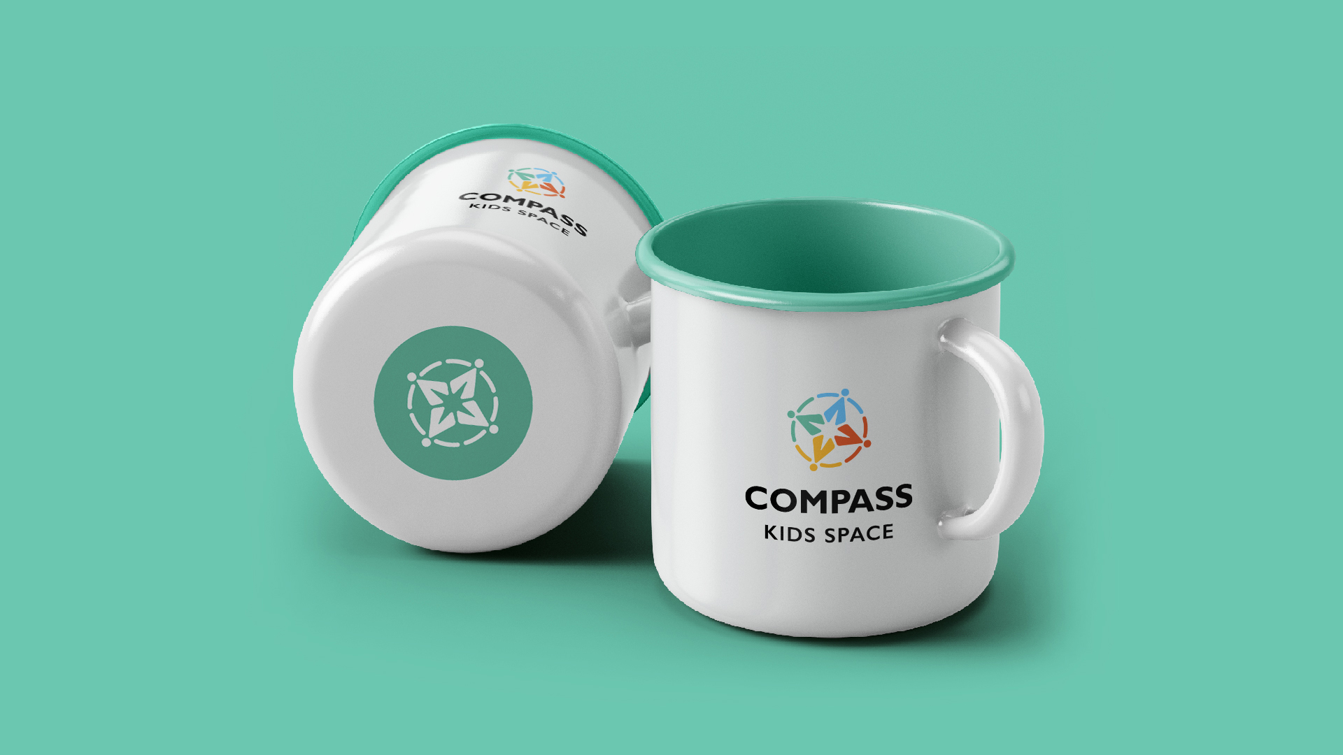
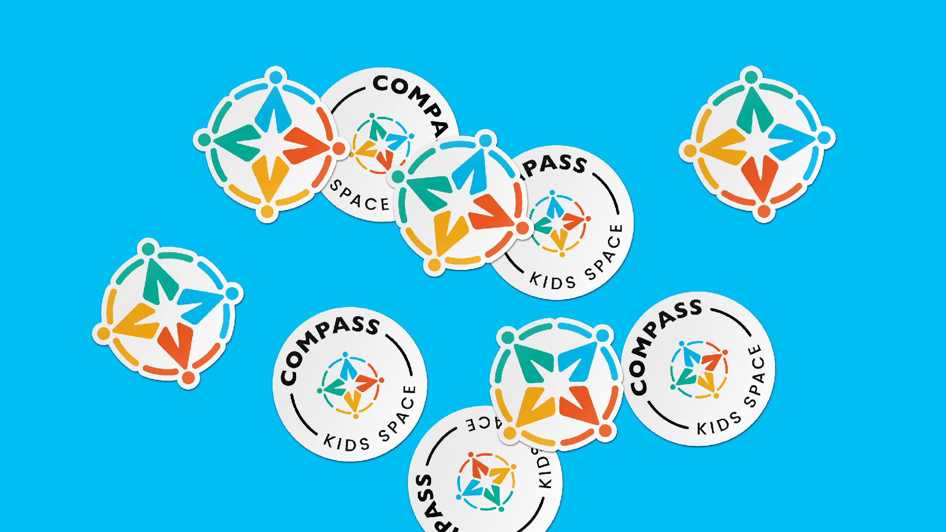
The logo is composed of four stylized characters which form compass together. The characters are represented in the color palette of the brand. They are connected with each other by a line, which is the figurative hands, that symbolizes unity and the idea of an educational group.
In the lower part of the compass, the name is written in capital letters, and the identificator is presented in the lowest line.
The characters represented in the logo are part of the brand identity and are presented in a variety of ways in the complete branding.


The Colors
The palette is a combination of muted versions of bright colors. Turquoise, carrot, yellow and blue represent activity, education, dynamism. The primary color,
however, is carrot, which acts as a locomotive throughout the branding. For the brand, the classical monochrome, in black or white versions are also applicable.


- Creative Direction: Eduard Kankanyan
- Branding Director: Karen Babajanyan
- Project Management: Gayane Margaryan
- Graphic Designer: Arlin Vartanian
- Copywrighting: Hrachuhi Mirozyan