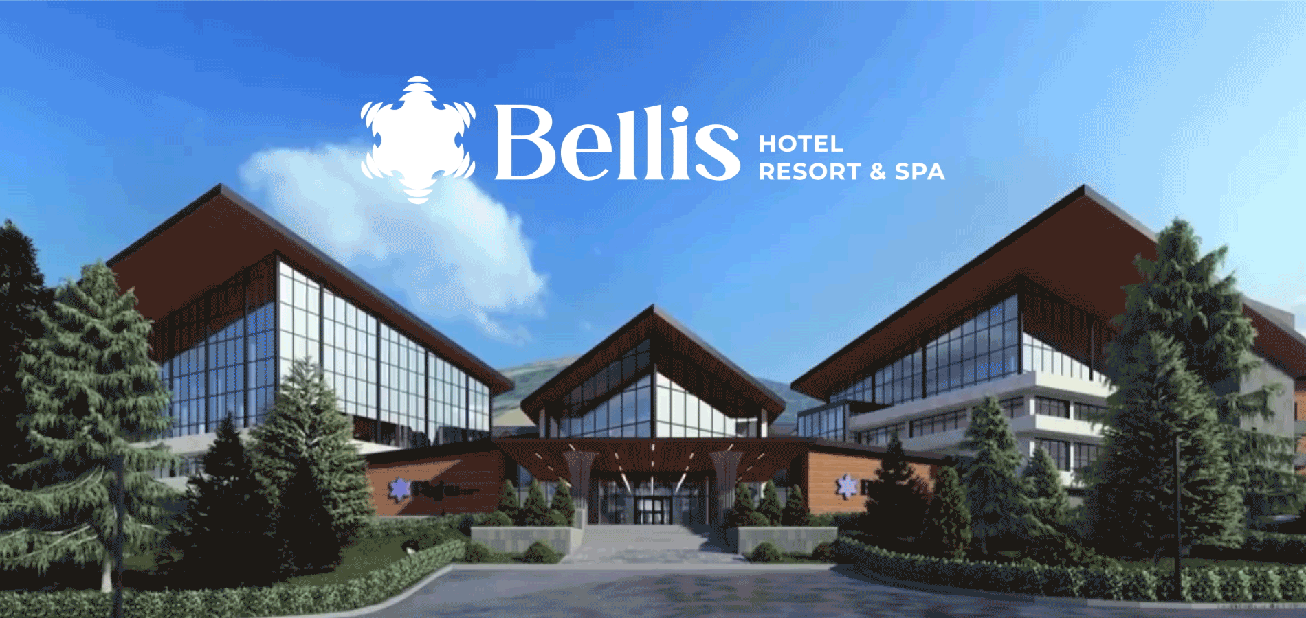
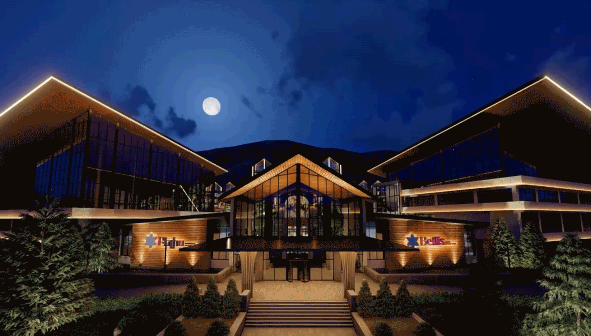
Chamomile, comfort and picturesque landscapes of Jermuk
Jermuk is the only place in the world where a daisy is made of stone and lives on water, like a water lily. Here, in Jermuk's artificial lake, there is a stone daisy, the water of which flows in, forming an inward flowing waterfall. Chamomile has become an integral part of the fantastic nature of Jermuk, the beauty that is the source of inspiration for the branding of the "Bellis"
hotel complex.
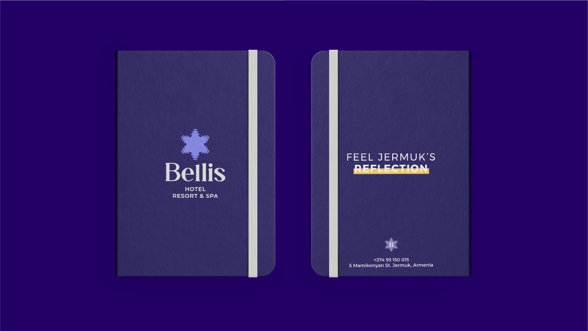
Through this branding project, we conveyed notonly the beauty of the mysterious stone daisy of Jermuk, but also the feeling of comfort everyone has when entering Bellis. Beauty and delicacy are prominent here, in every detail: a sense of harmony in every corner, and of course, the reflection of nature, branded in every item. Bellis branding is a celebration of nature and harmony.

The Inspiration
The inspiration for the Bellis hotel complex is the stone daisy built in Jermuk's artificial lake. This engineering feat, which resembles a waterfall gushing inward from the depths of the lake, also causes indescribable admiration, being an exceptional architectural structure right on the lake.
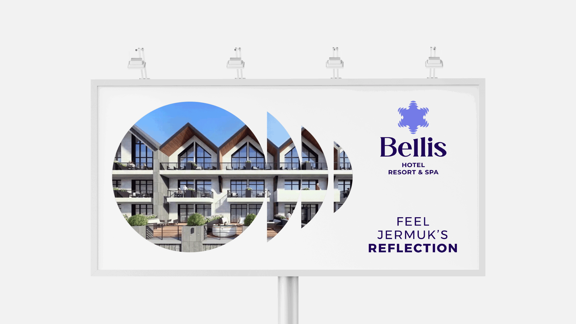
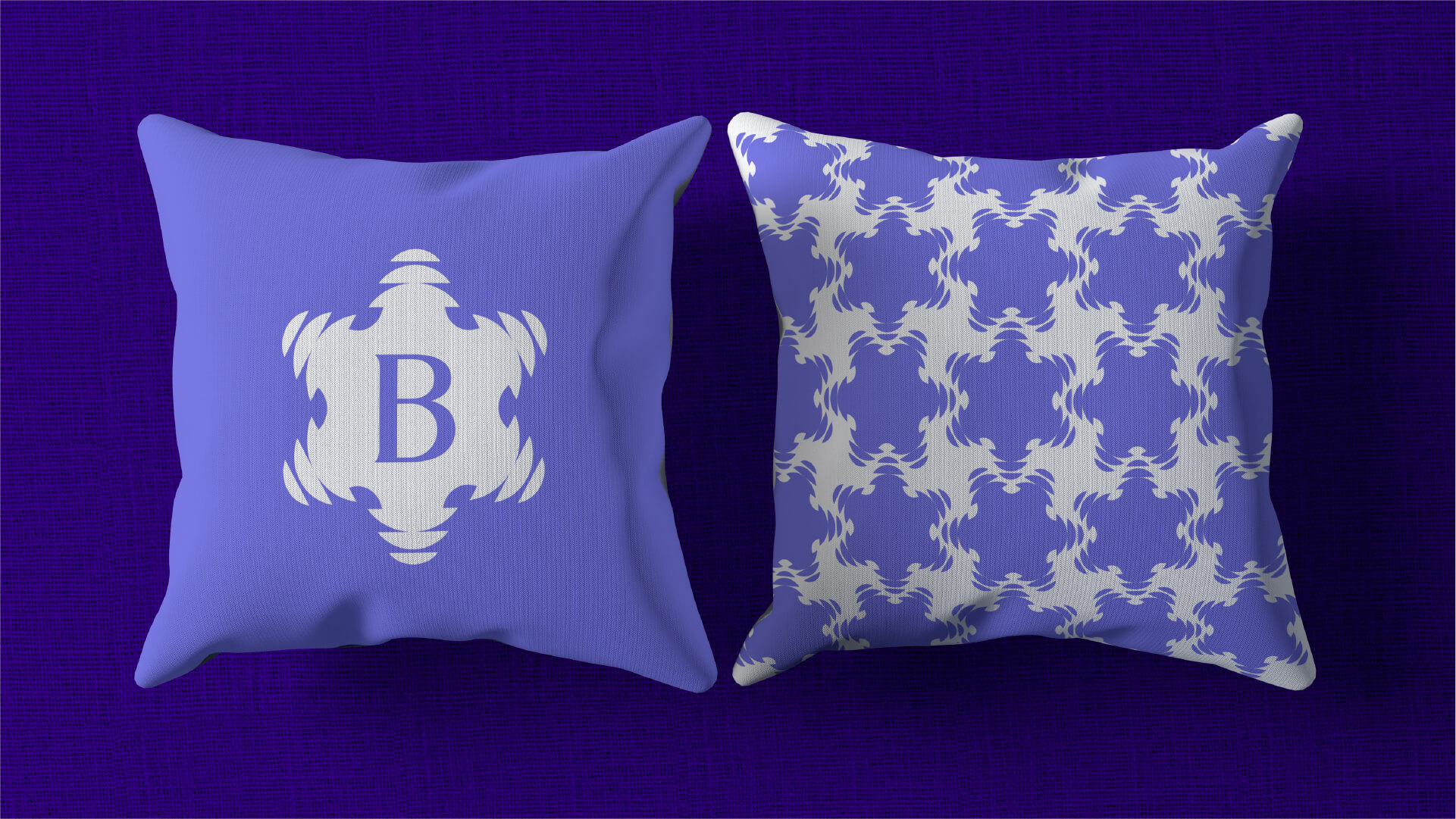
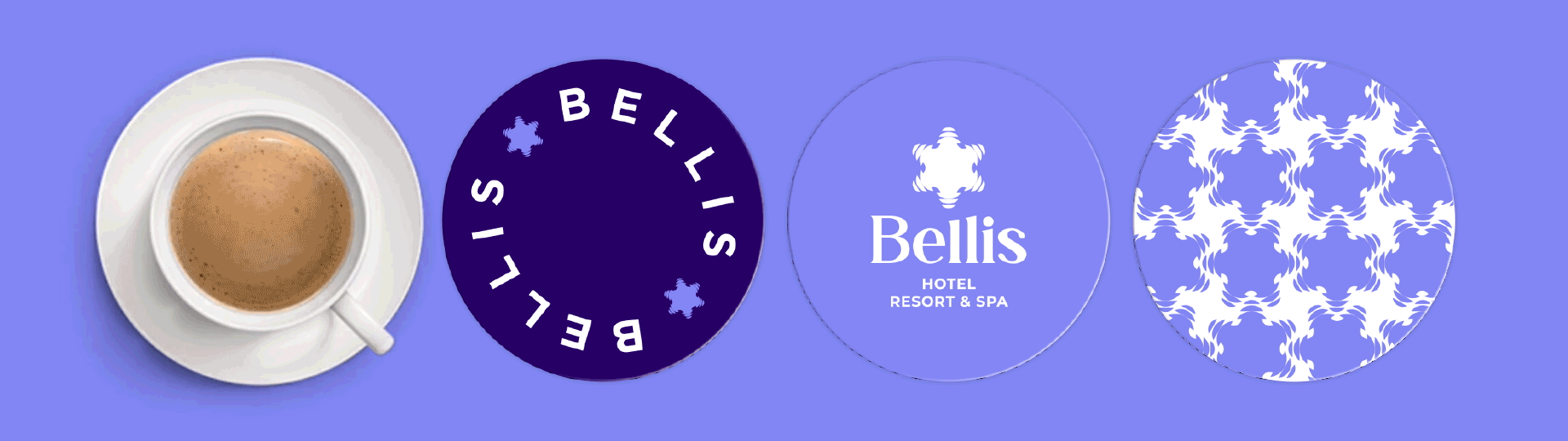
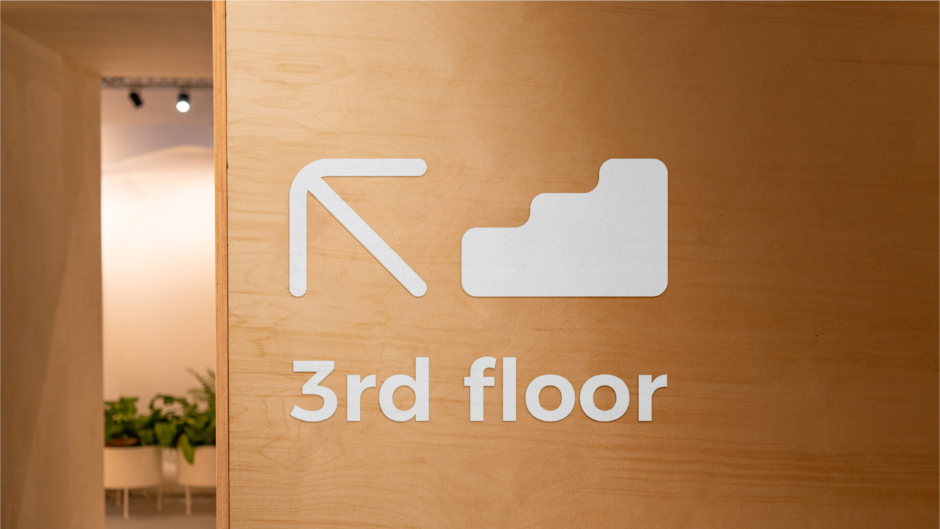
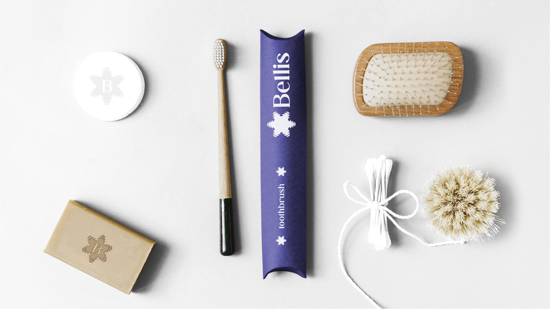
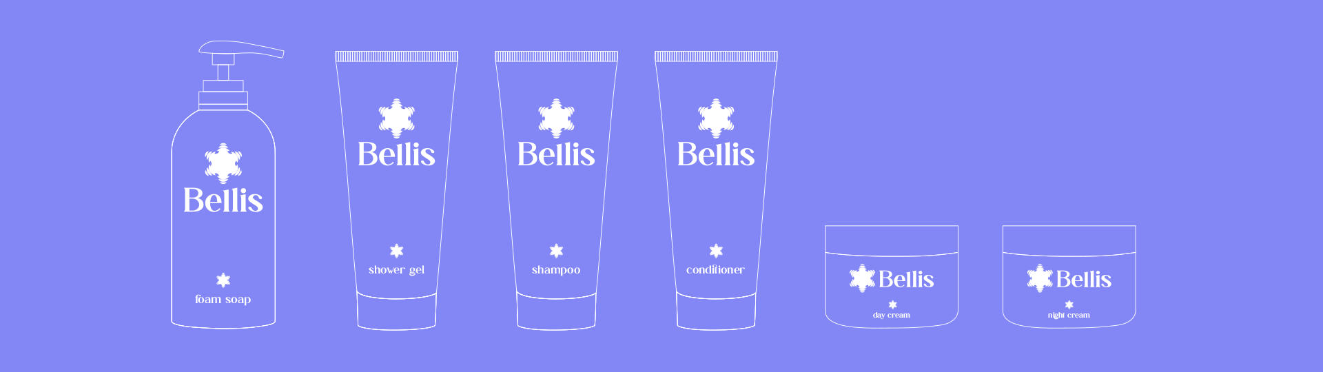
Chamomile has found its manifestation in every element of Bellis branding. Chamomile and the graphical interpretation of propagating water waves, as a brand element, they are applied to hotel accessories, kitchen utensils, printing materials, either as a whole or as a separate element.
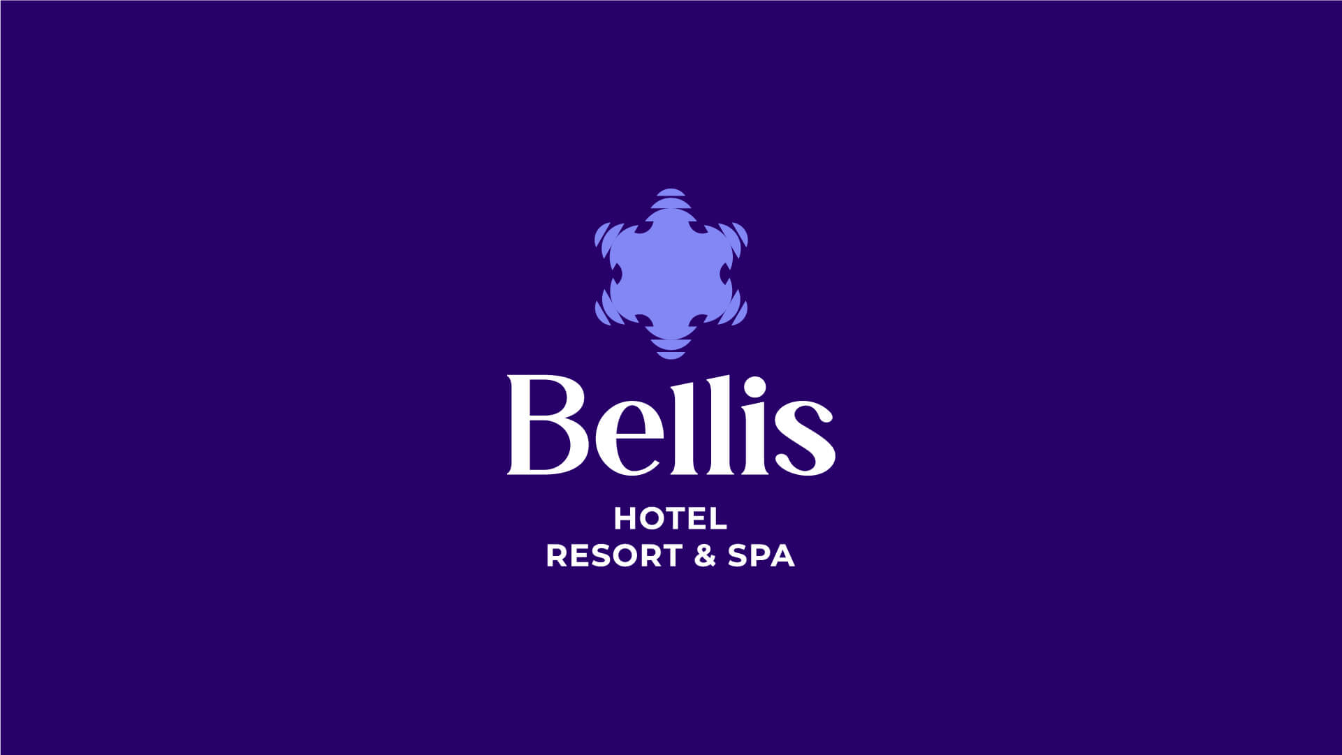
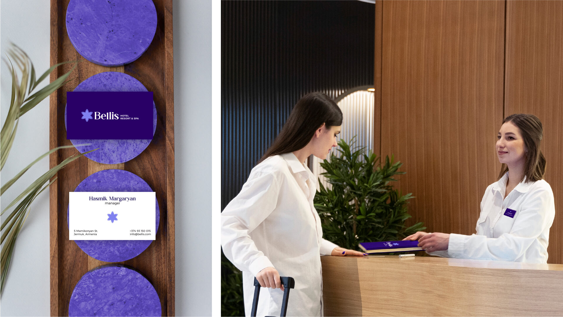
The Logotype
The logotype consists of a symbol, a wordmark and an identifier. At the base of the symbol is the daisy and the image of the flower representing the depth of the artificial lake of Jermuk. The design solutions of the chamomile flower are combined with petals imitating
the waves of the lake.
The elongated, solid font emphasizes the hotel's high quality. Using a simpler font in the lower part of the logo, the finished logo emphasizes the field of activity. The logo has both vertical and horizontal versions.
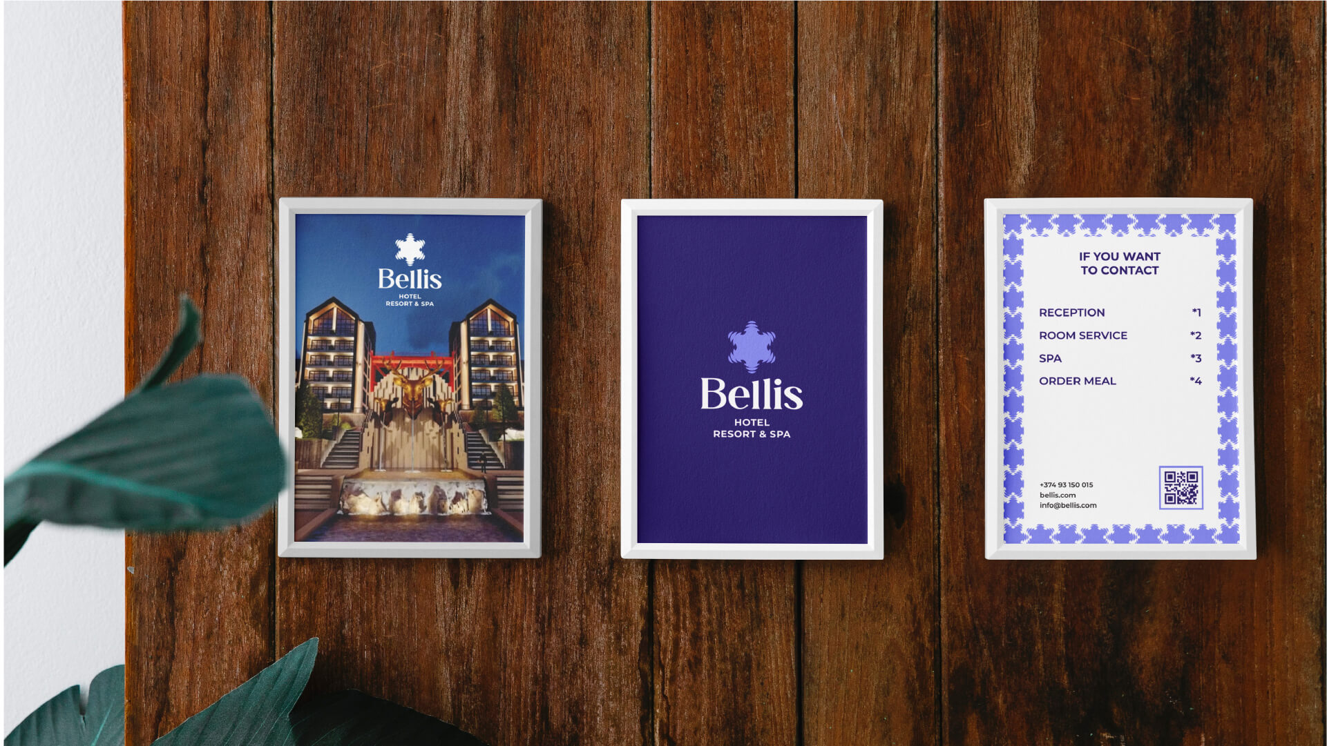
The Colors
The brand's primary colors are two shades of purple. The deep, royal purple symbolizes the luxury of the hotel complex. The lilac emphasizes the openness of
subtlety of "Bellis".
Pure white completes the palette, combining perfectly with key colors. They are used both as a background color and as a color for the full version of the logo.


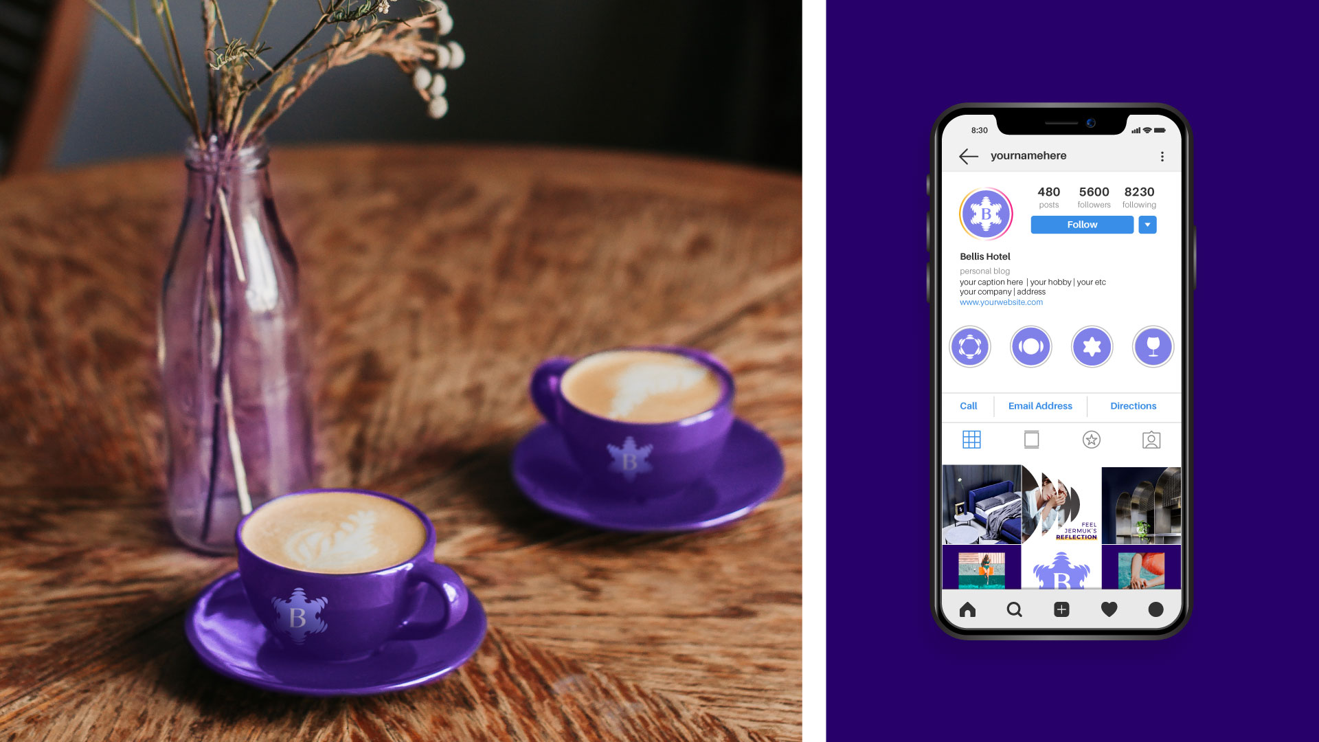
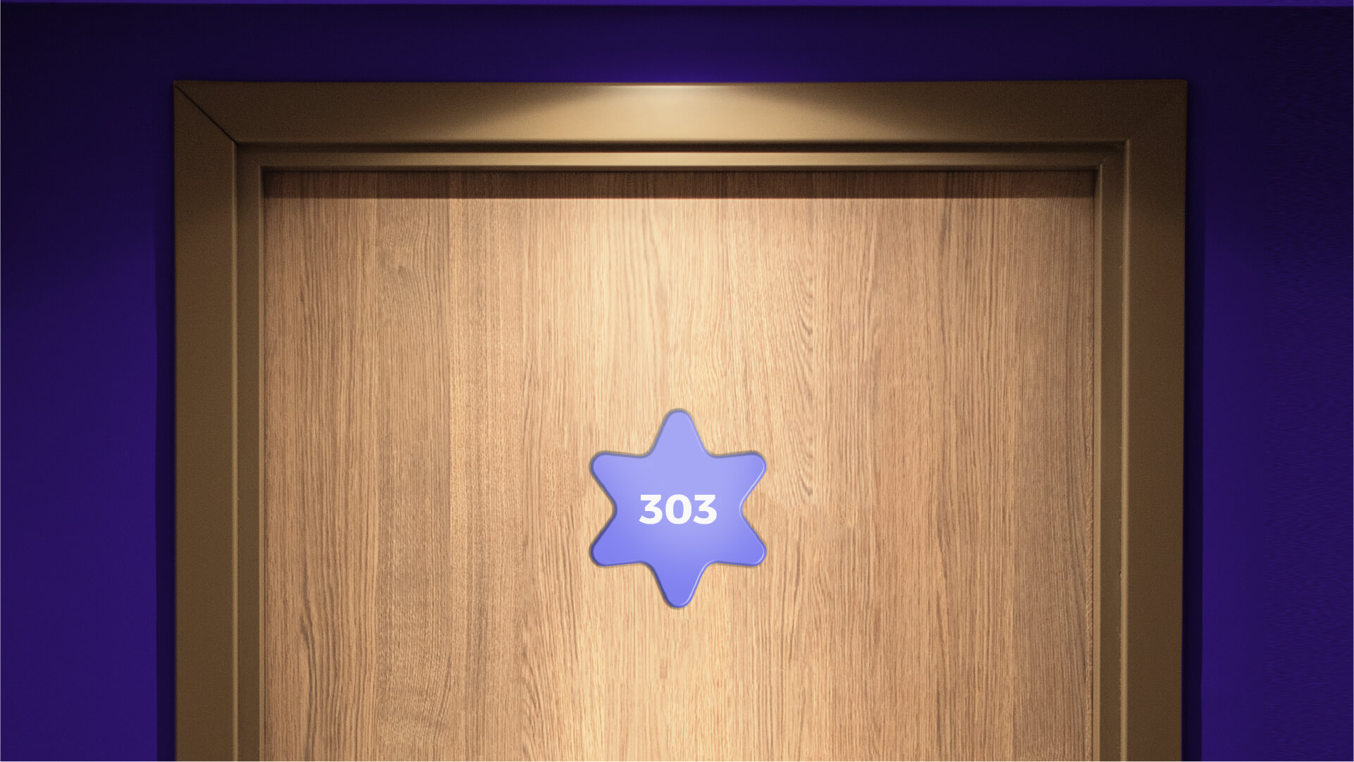

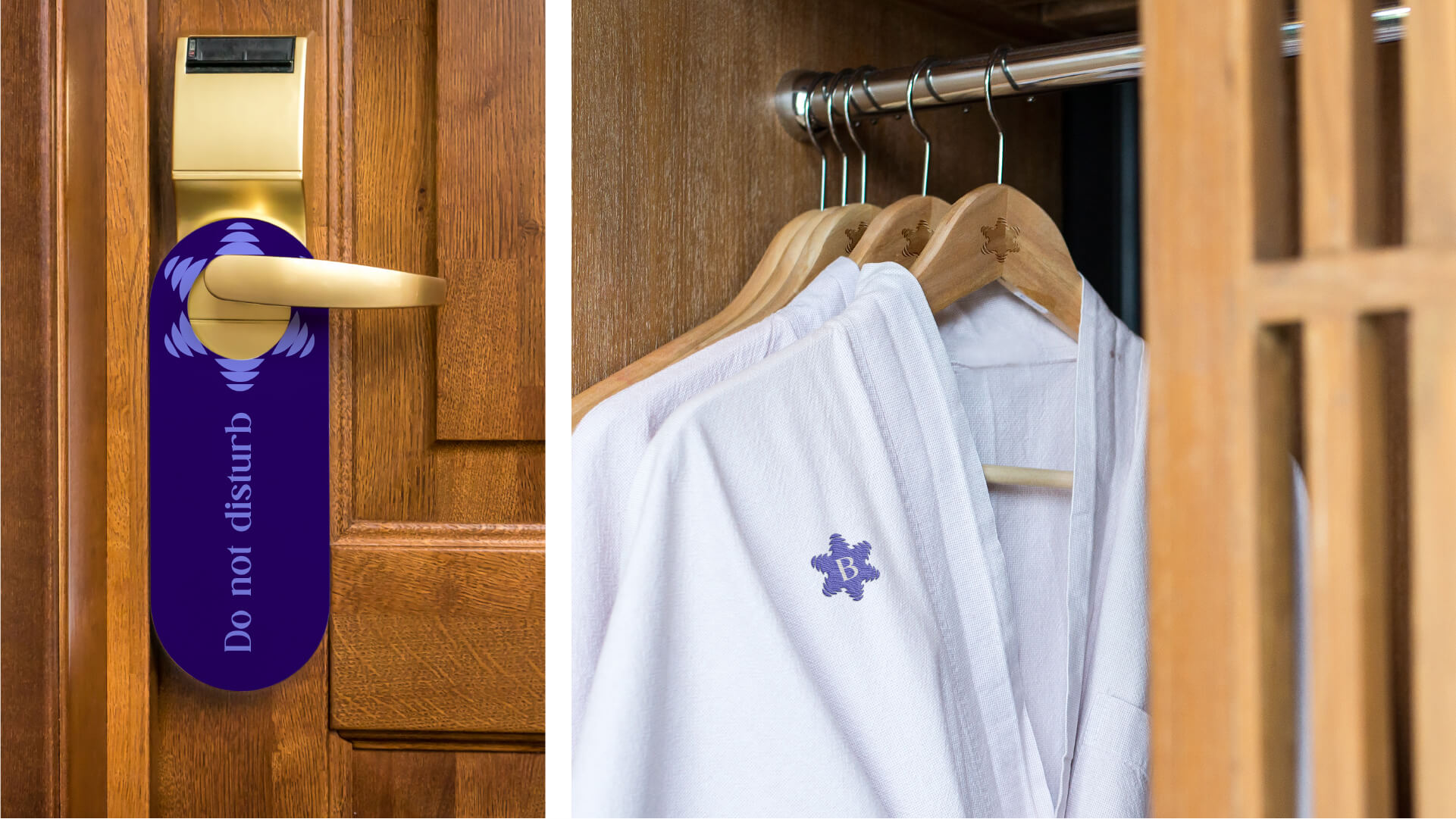
Stylized Symbols
Stylized symbols have been created to represent the various hotel accessories and the different directions of the complex's activities. They are based on the combination of the daisy used in the logo and the
graphic image of water waves. Those images are manifested in different symbols in such a way that the complete style was preserved and a complete brand was created.

- Creative Direction: Eduard Kankanyan
- Branding Director: Karen Babajanyan
- Project Management: Gayane Margaryan
- Graphic Designer: Shushan Gevorgyan
- Motion and Graphic Designer: Lilit Avetisyan
- Copywrighting: Hrachuhi Mirozyan