
Armenia's Music Waves
For more than 15 years, the Armenian State Symphony Orchestra has been bringing the Armenian approach to classical music to the world's most prestigious stages, receiving excited ovations from music critics and audiences. Although the orchestra mainly performs classical repertoire, they have a unique, innovative approach even to classical music. We knew that this talented orchestra is spreading a piece of
Armenia in the form of musical waves with any of its concerts, whether in Armenia or especially abroad.
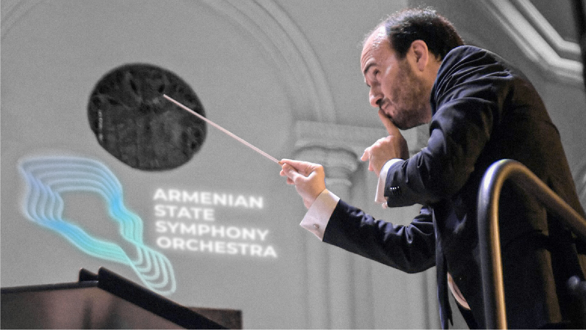
It was the sound waves that became the basis of the brand identity. Using sound waves imitating the map of Armenia as a logo, we convey the main message of the Armenian State Symphony Orchestra. This symphonic music comes from Armenia, which, along with being classical, is light and innovative, with differing approaches and presentation.

The Challenge
The key challenge of the branding project was to portray the world-renowned orchestra as precisely as possible through visual communication. It was necessary to create such a visual style, logo and branding, which would at first glance present the exclusivity of the orchestra, its country of origin
and what values and ideas it brings to the world. The color palette was quite difficult to select.
In addition to presenting the real lightness of the orchestra, which presents classical and traditionally considered not "light" music, it was necessary to provide similar stylistic solutions to the orchestra's non-standard initiatives.


The Solution
The solution was born from a combination of ideas. Inspired by the endlessly spreading waves of music, we depicted a stylized map of Armenia in the form of spreading waves. The waves were stylized into notes' lines. which provided verbiage for the visualization of ideas in various images.

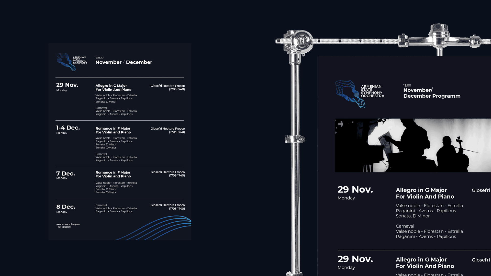
Symbols
Symbols created for different applications have a special place in the brand style. As with the logo and other elements of the overall brand style, the symbols combine notation lines, sound waves, and color
gradients. Symbols and other elements used in branding complete the brand style and also provide an opportunity to take a creative approach when producing different branded materials.


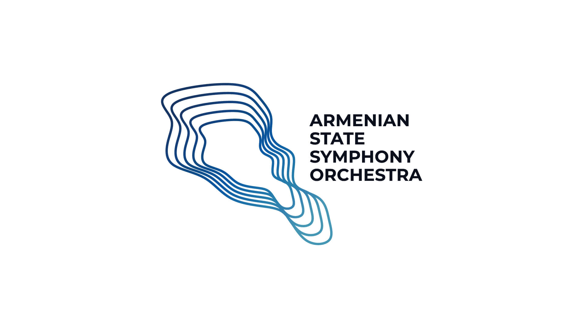
The Logotype
The logotype is a stylized image of the Armenian landmass represented by contours resembling sound waves. In the logo, the symbol is located on the left side. On the right is the full name of the orchestra,
written in a special font and using only capital letters. This approach emphasizes the classical essence of the orchestra, while at the same time maintaining its modernity through the accurate choice of color palette. Branding does not provide a vertical version of the logo.
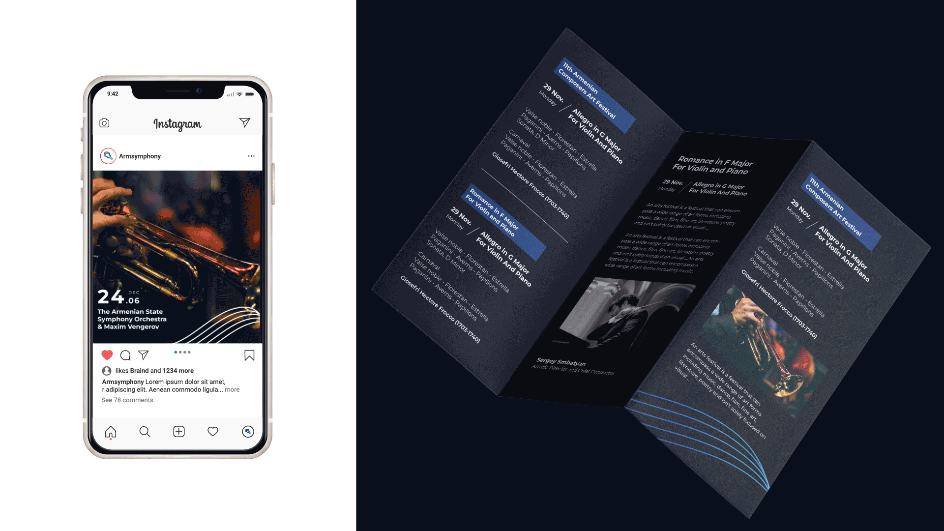
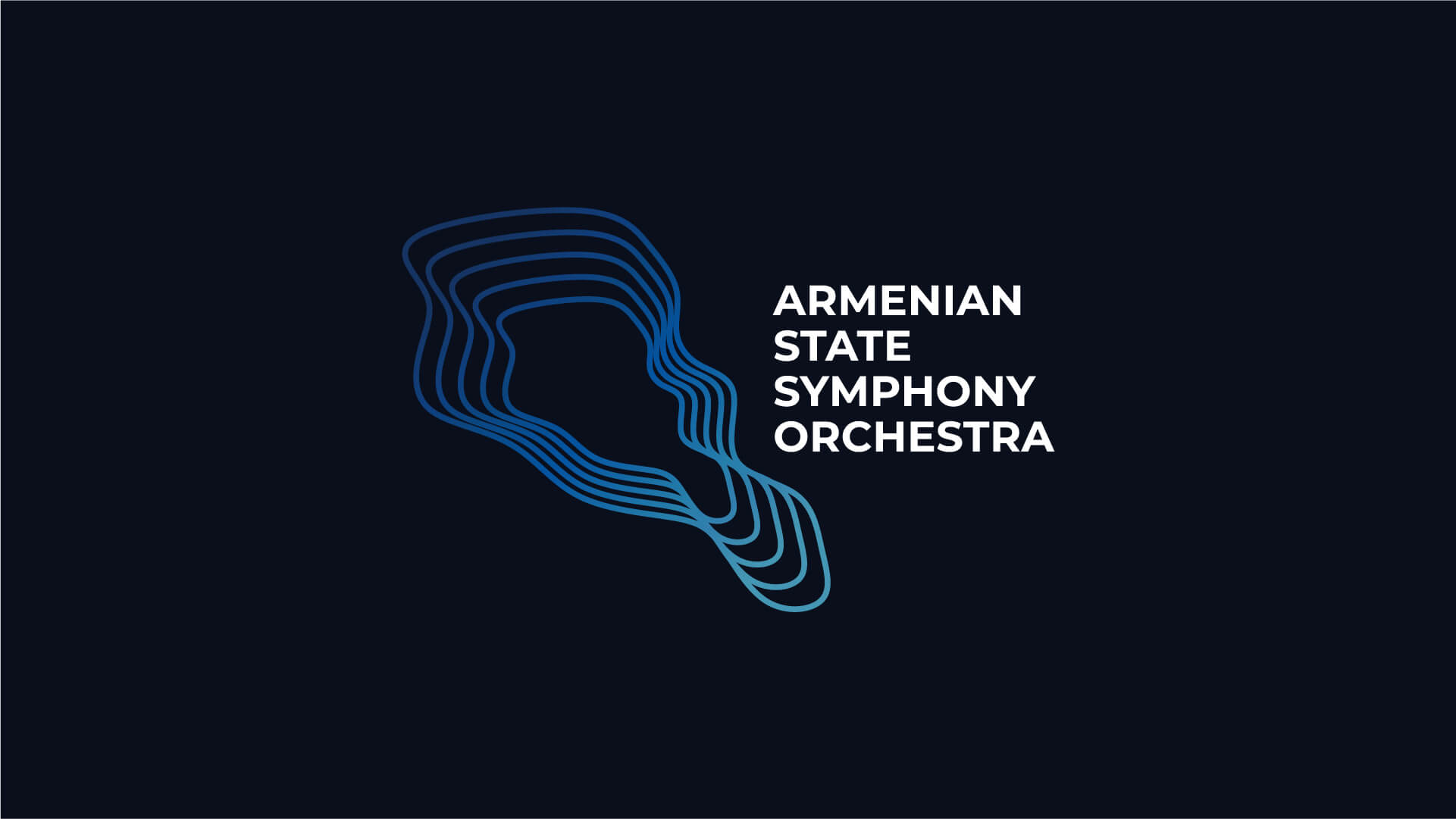
Colors
The basis of the color palette is different shades of blue, which are represented by smooth transitions from dark to light. The gradient allowed us to build a complete
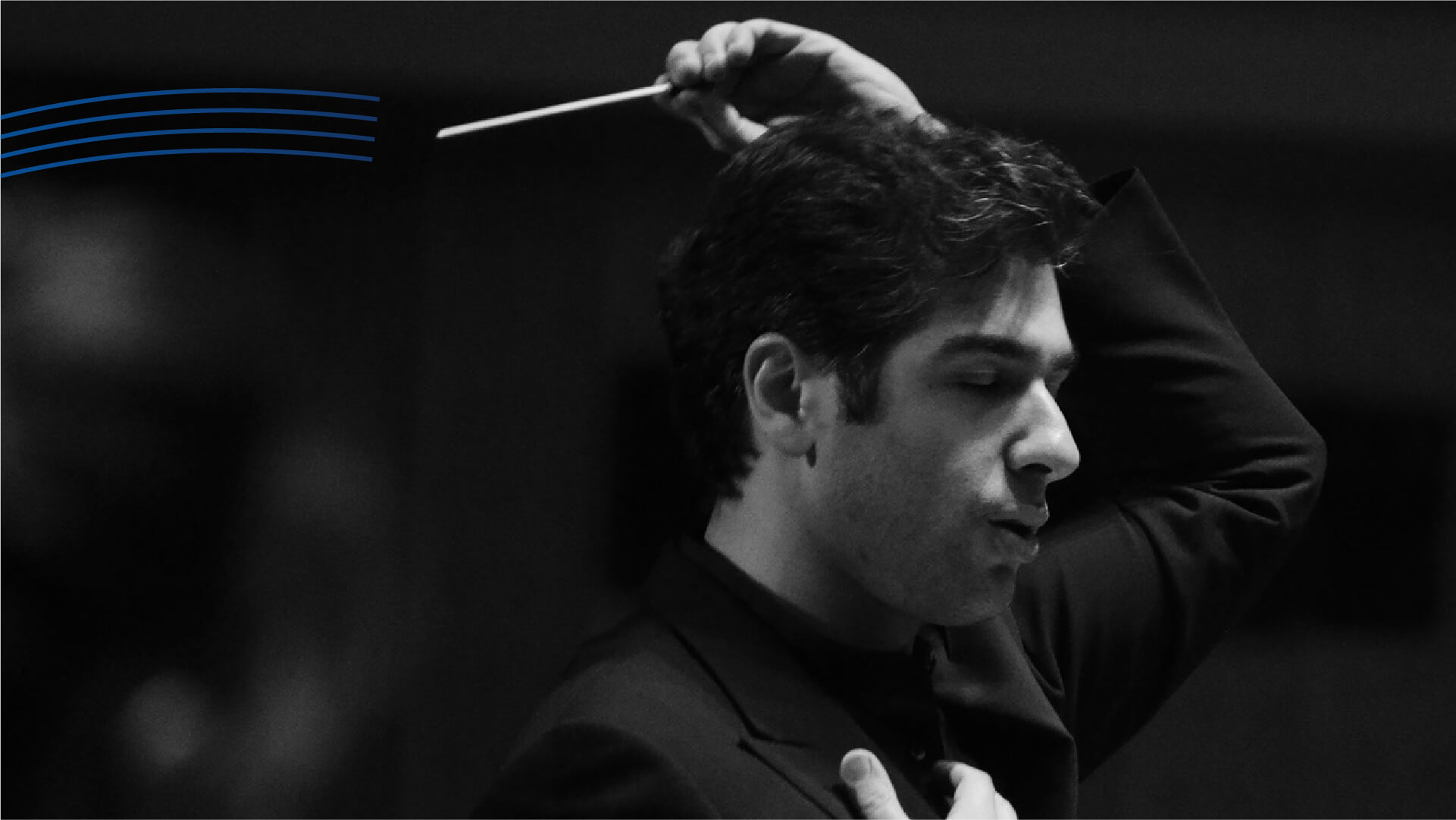
color style around one key color, avoiding primitivism. Black and white are used as colors that expand the palette. This style is also preferred in photographs.

- Creative Direction: Eduard Kankanyan
- Branding Director: Karen Babajanyan
- Project Management: Masha Hayrapetyan
- Graphic Designer: Lusine Yeghunyan
- Portfolio Designer: Lilit Avetisyan
- Motion Designer: Lilit Avetisyan
- Copywrighting: Hrachuhi Mirozyan