Combining all aspects of analytical thought
Think-tanks are often behind scientific, economic and political activities. They solve many problems, helping humanity to find answers to complex questions. APRI is a think tank that deeply studies the issues affecting the Armenian world, from the triggers for the formation of a networked and political nation to the study of the potential of realizing the scientific thought of Armenians living all around the world for the sake of a common homeland. APRI's research and proposals open new horizons for putting Armenian thought into action and benefiting all Armenians.


The Challenge
The key issue was the selection of the best idea, which, along with restrained, classical approaches, would symbolize such a broad concept as the Armenian world.
No less important challenge was to present a fully applicable, easy-to-grasp branding which would allow presenting various content: texts, images, graphics, photos, etc.


The Solution
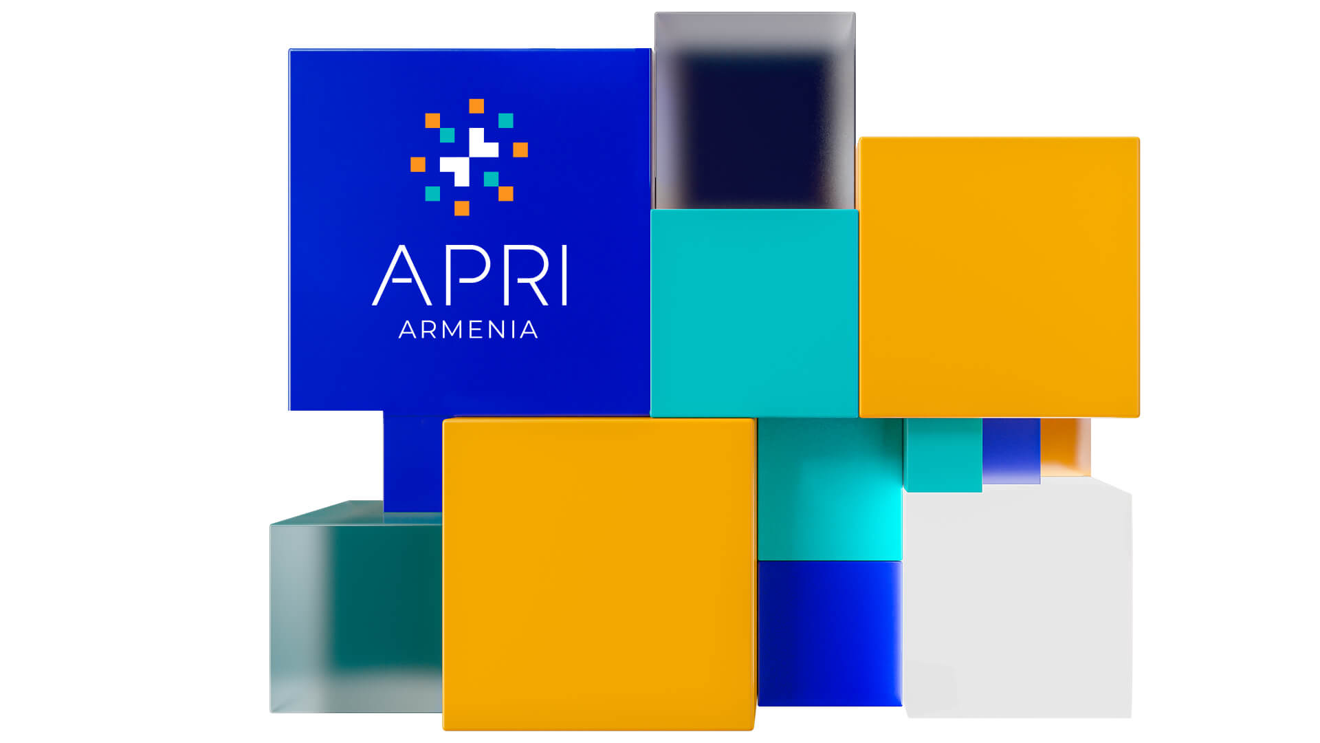
The combination of multi-colored squares, which symbolizes the similarity and unity of different parts, was chosen as an ideological base. And their unity in the center, which forms a double-sided arrow,
demonstrates the goal of all parties involved-- orientation and union around one common idea. The various uses of squares forming different geometrical images also resolves the challenge of the applicability of the brand symbol.

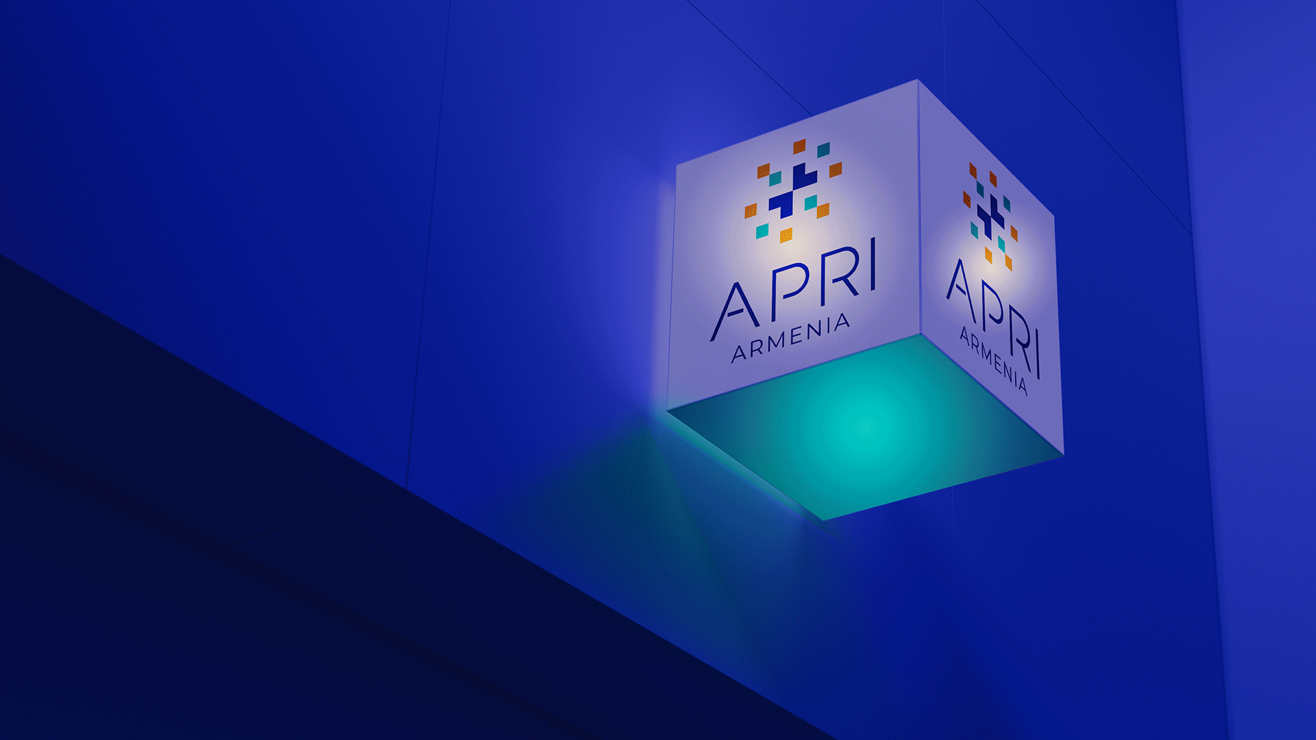
The Logotype
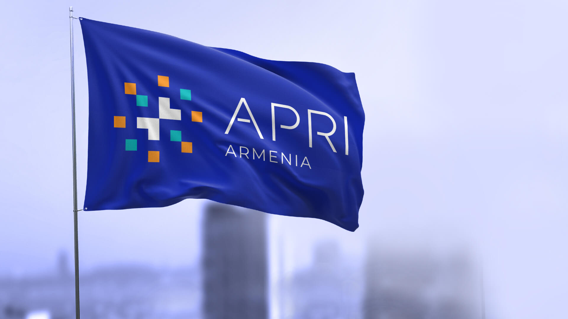
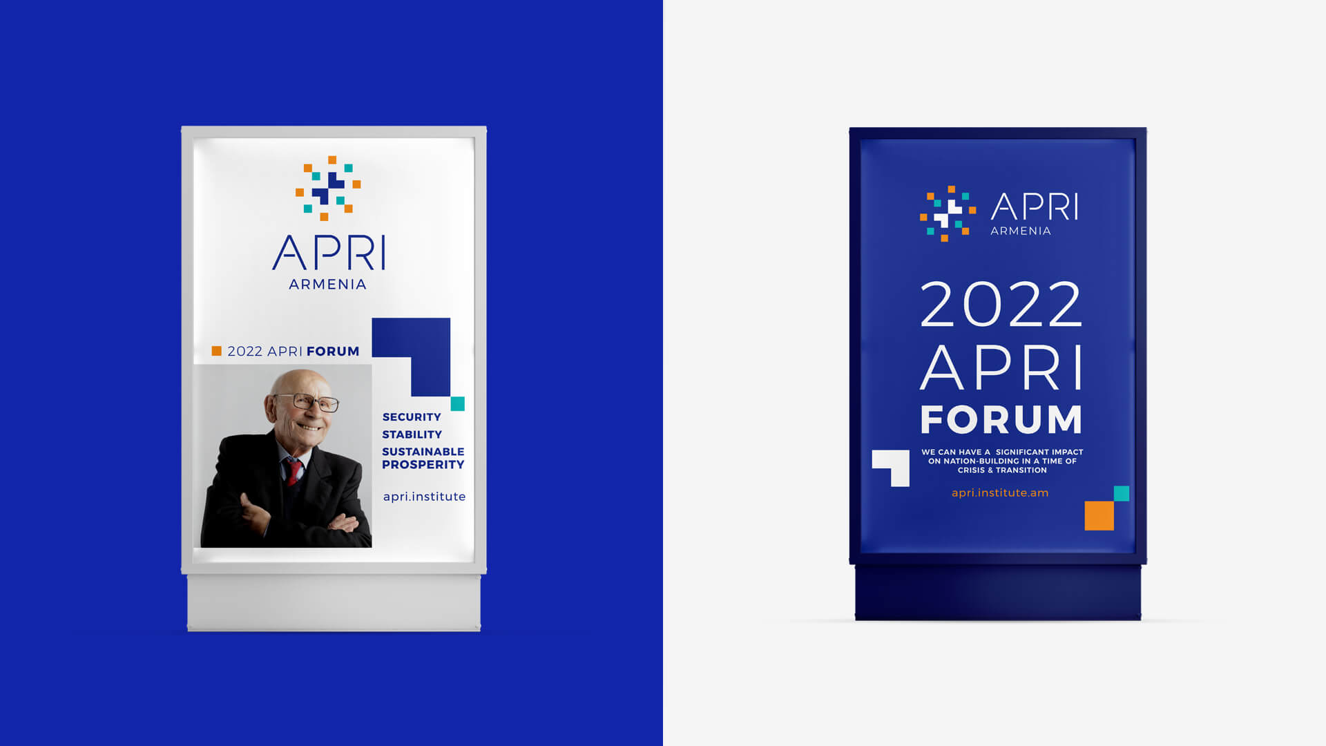
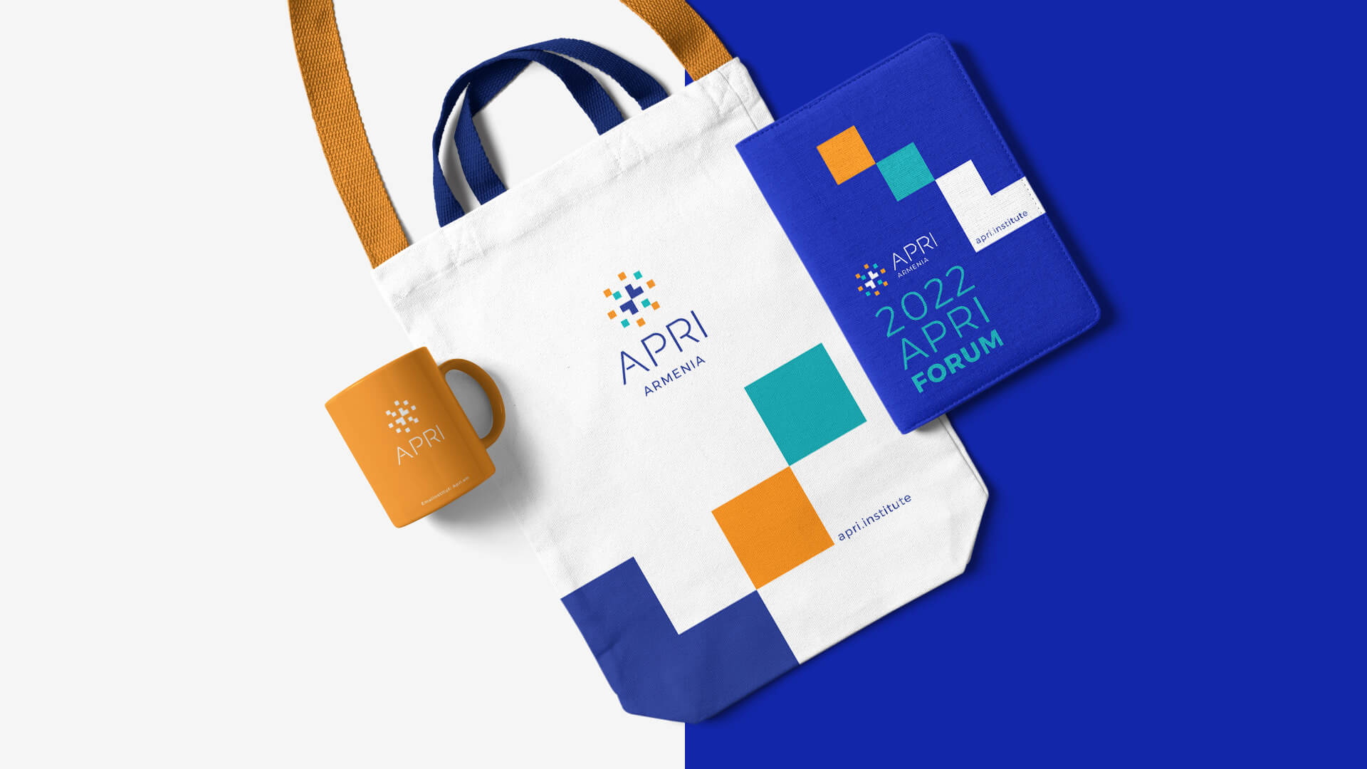
The logotype consists of the abbreviation of the title of the organization, the identifier presented in its lower part and the symbol. The latter represents a symmetrical combination of multi-colored squares, united in the center and forming a two-sided arrow. The symbol emphasizes the idea of the center. And the multi-colored squares symbolize the Armenian thought spread all over the world, scientists, influential individuals and opportunities, which unite around one common idea-- the Armenian world.


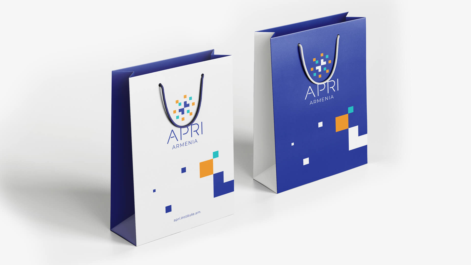
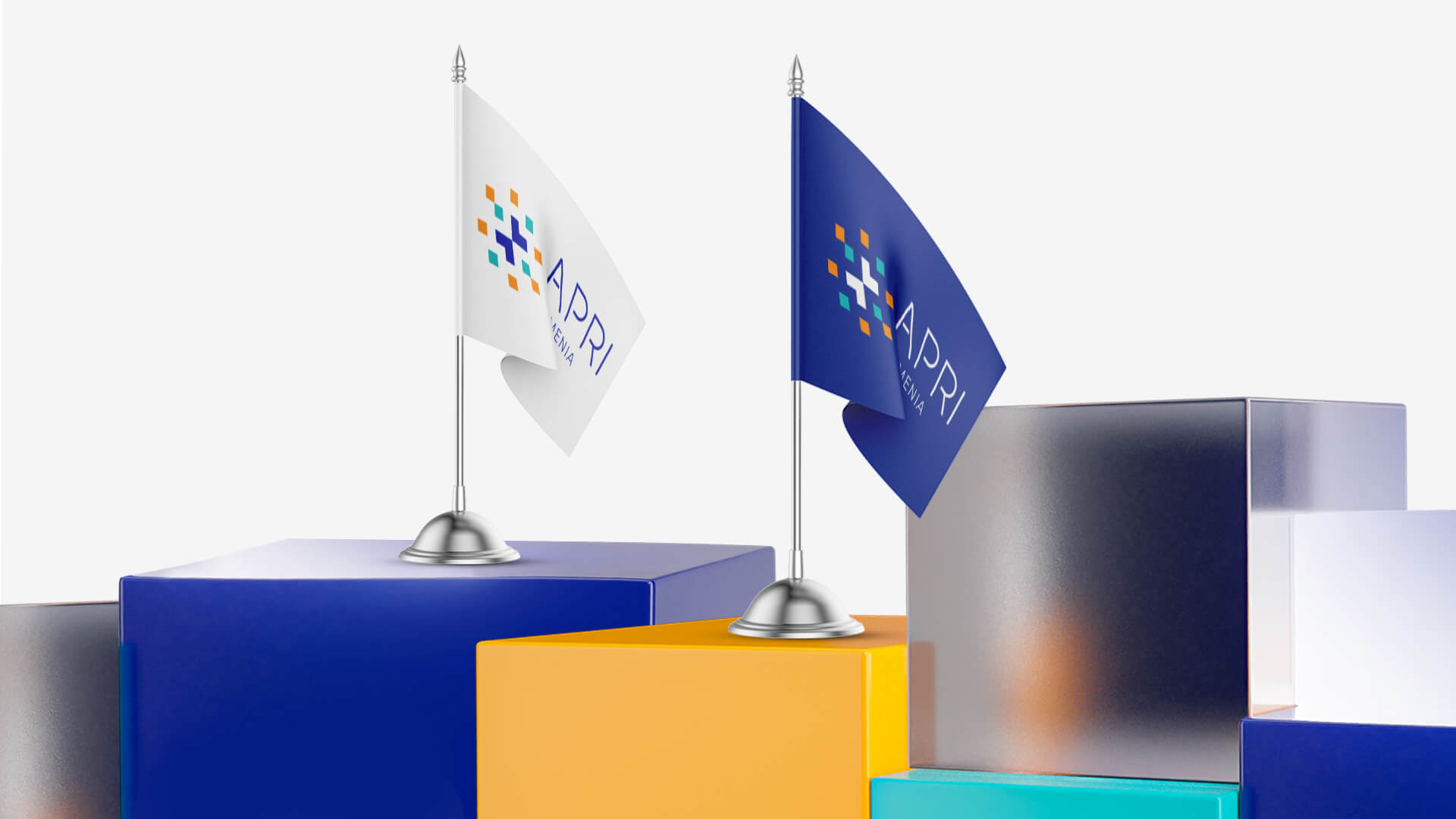

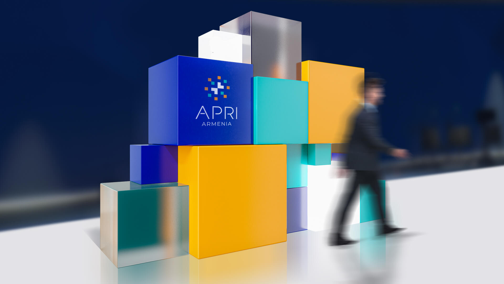
The Colors
The palette is restrained and attractive. The main color is inky blue, which is combined with white, turquoise and bright orange. Secondary colors bring freshness to
the classical palette, emphasize innovation and the dynamics of thought. The choice of color palette is also based on the possibilities of their application in various graphics.

- Creative Direction: Eduard Kankanyan
- Branding Director: Karen Babajanyan
- Project Management: Gayane Margaryan
- Graphic Designer: Anush Ghandilyan
- Motion Designer: Vardan Harutyunyan
- Copywrighting: Hrachuhi Mirozyan