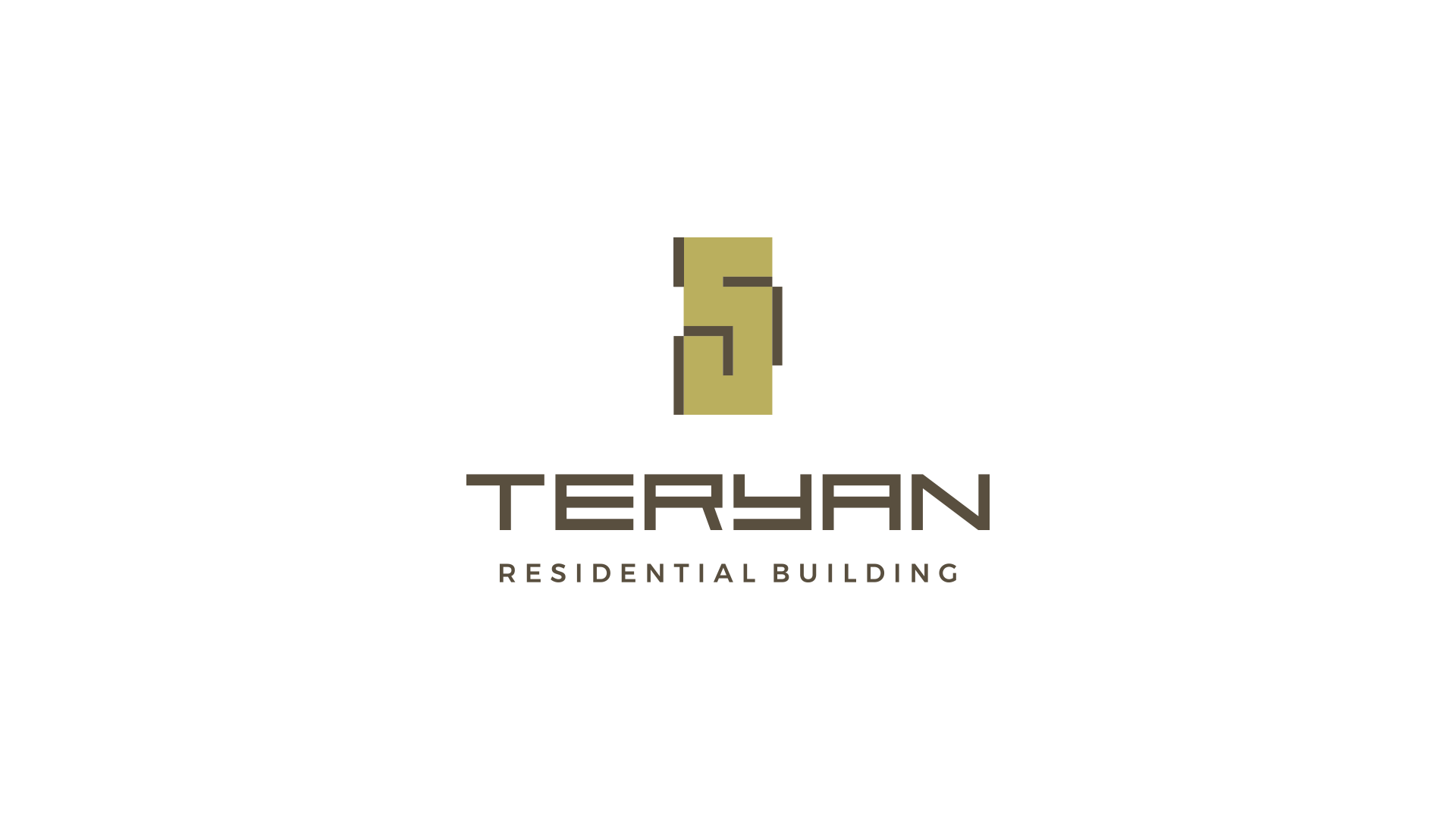
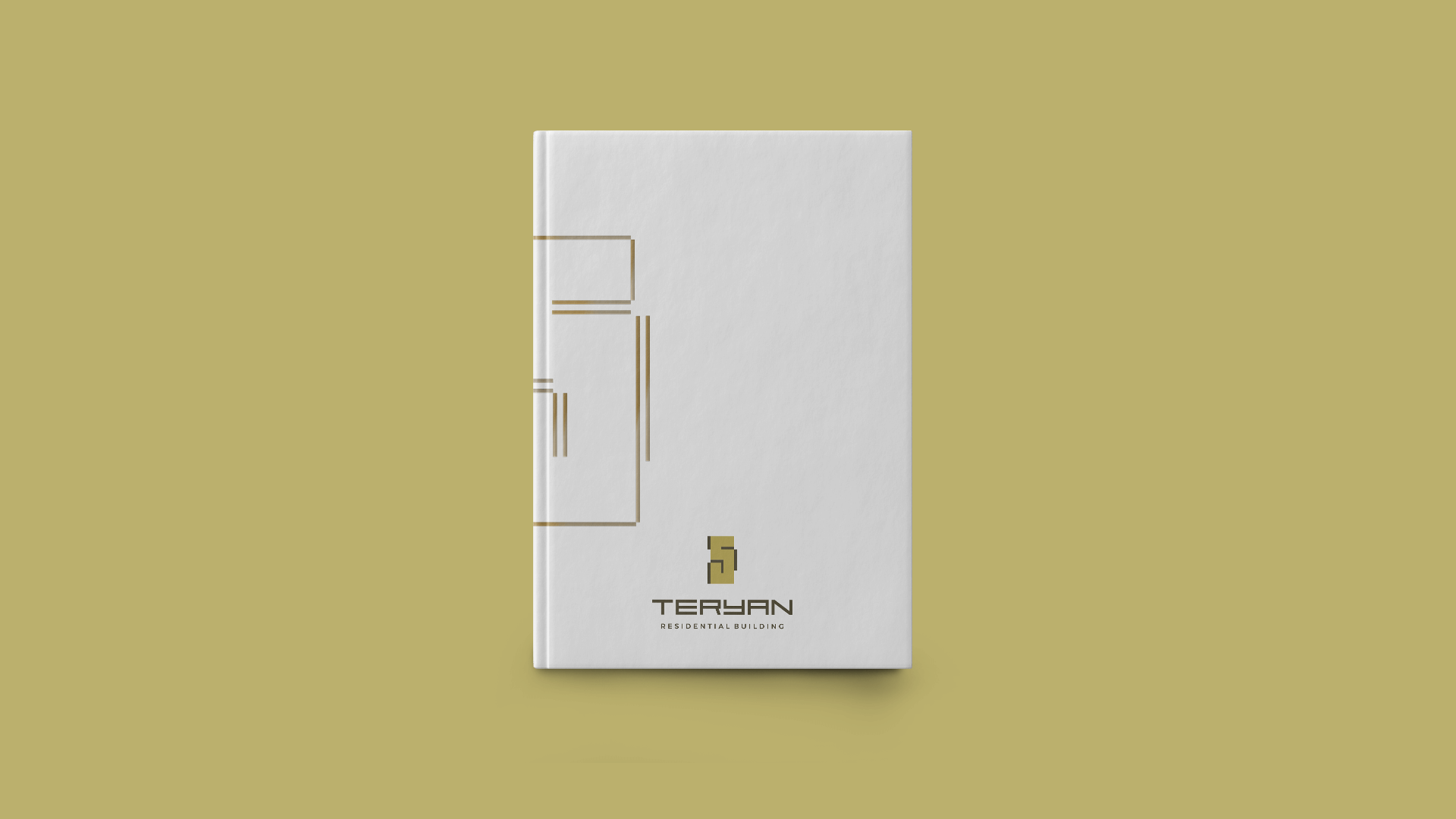
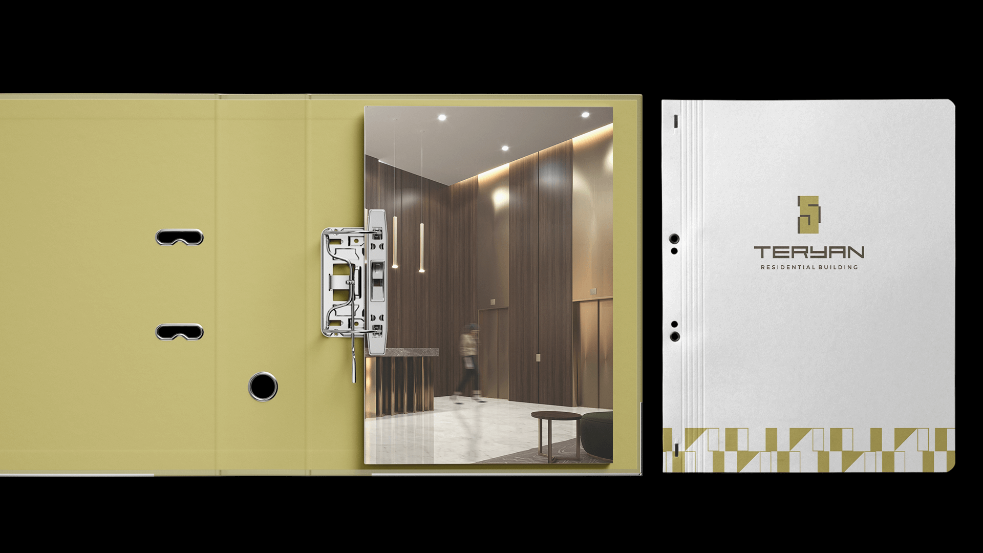
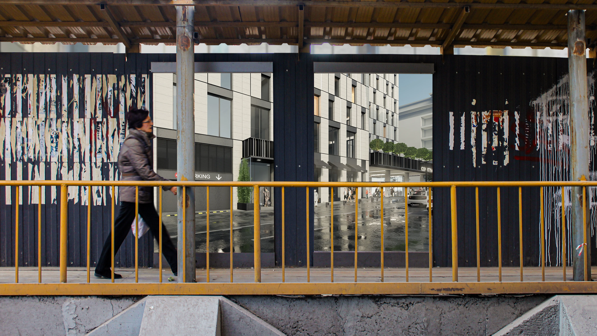
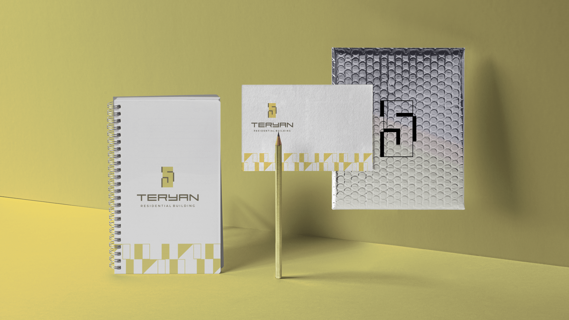
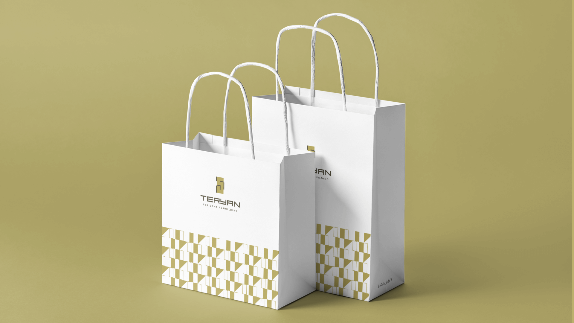
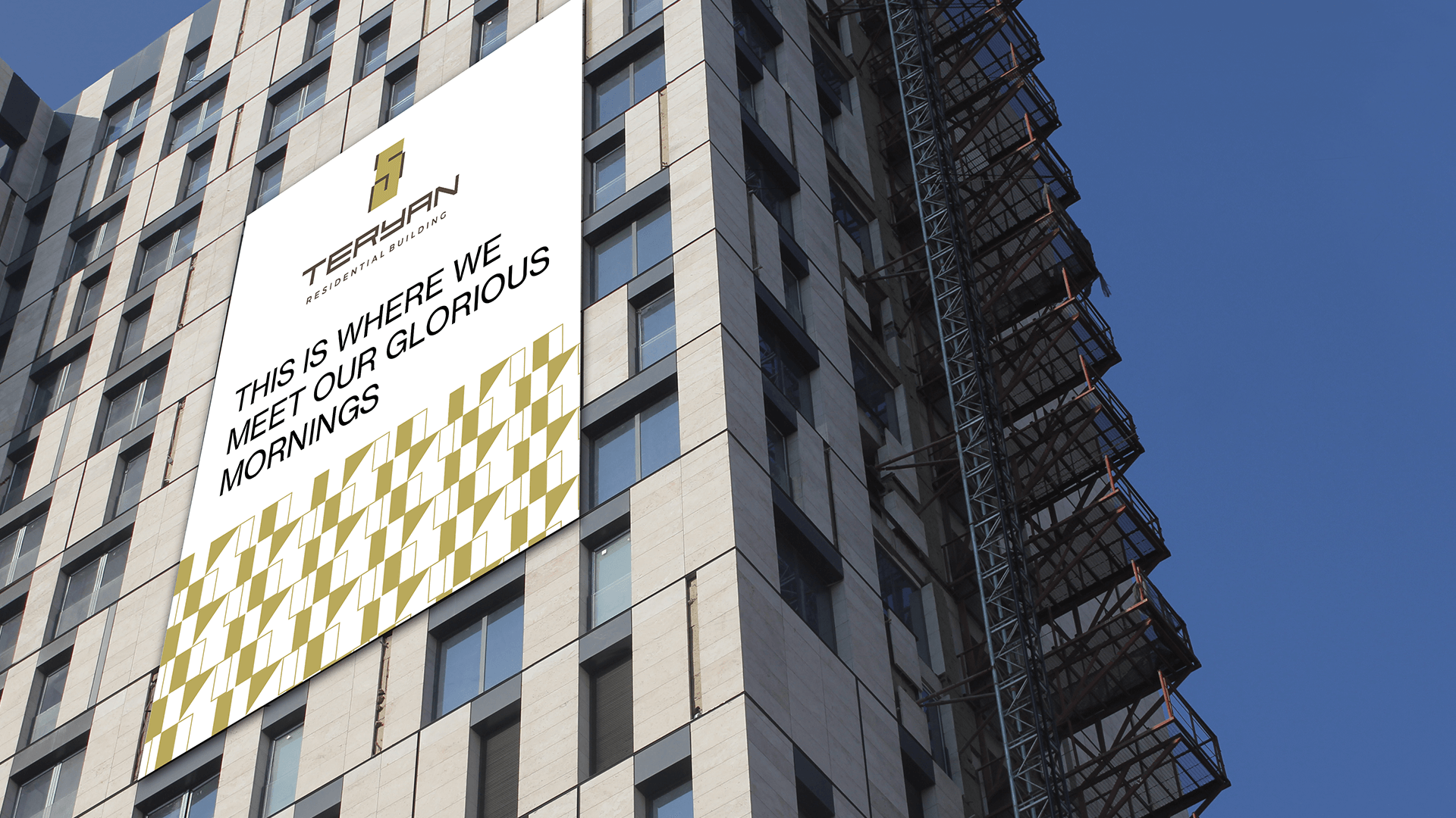
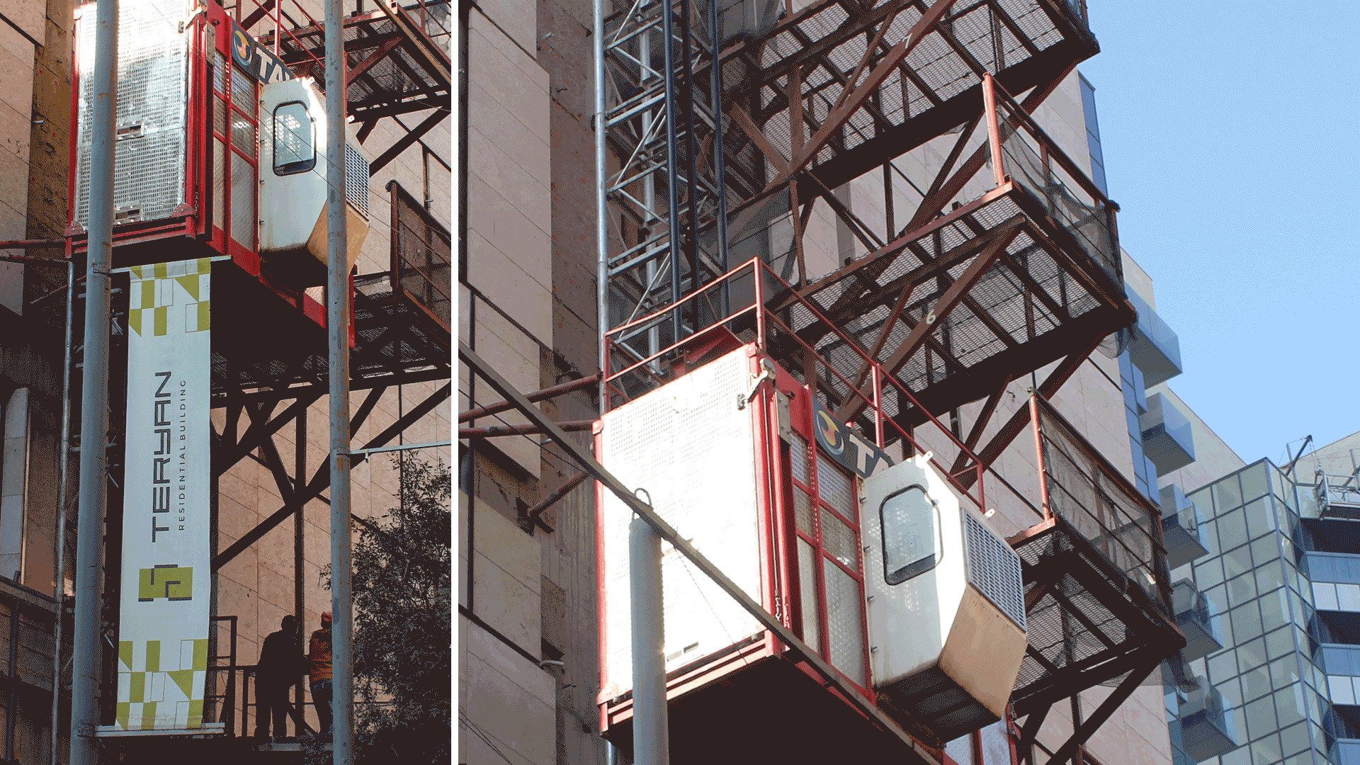
First logo and then the catalog of the exceptional Teryan 5 residential building where signature sophistication of architecture meets versatile functionality to deliver quality lifestyle in the beating heart of Yerevan. Logo design inspiration came from the architectural detail that makes the building stand out and remain in the memory if seen once, the rectangular narrow windows. What else pushed us to make the logo as it is now were the apartment plans. As a main brand color was chosen that elegant, rich, intelligent and trendy olive that was going to be revealed in the print catalog. Besides the minimalistic and clean style we created the brand pattern, icons and numbers that can furtherly show up on the building floors and interior.
- Creative Direction: Eduard Kankanyan
- Branding Director: Karen Babajanyan
- Project Management: Masha Hayrapetyan
- Graphic Designer: Ani Trajumanyan
- Portfolio Designer: Garik Ghazaryan